
ericjneumann
ericjneumann
Recently Published
feral_test2
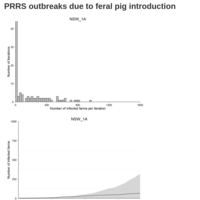
Two new charts per model: One, histogram of the total number of infected herds arising from each iteration; Two, an epidemic curve that represents the actual data by day, arising from the iteration with the median number of total infected herds for a given model. The gray area around the epidemic curve is the IQR for the 99 iterations of that model that were run.
PED_v7
updated plots and some parity analysis

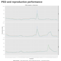
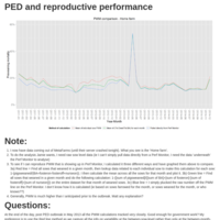
PED_v5
Plots with repro analysis
PED_v3
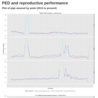
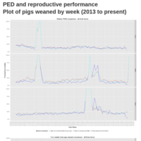
Weekly PWM
PED_v2 (28 Nov update)
28 November update
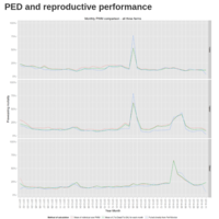
PED - Different ways to calculate PWM
Three methods to calculate PWM, I'm curious how they compare and which one to use for further analysis.