garynth41
Gary N Thomas
Recently Published

Wk4-Course Project.Practical Machine Learning
Gary N. Thomas
12/10/2019
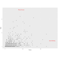
Plot 2.
Instead of mapping an aesthetic to an element of your data, you can use a constant value for it. For example, you may want to make all the points green in the World Cup scatterplot:
Plot 1.
4.1.5 Using multiple geoms
Several geoms can be added to the same ggplot object, which allows you to build up layers to create interesting graphs. For example, we previously made a scatterplot of time versus shots for World Cup 2010 data. You could make that plot more interesting by adding label points for noteworthy players with those players’ team names and positions. First, you can create a subset of data with the information for noteworthy players and add a column with the text to include on the plot. Then you can add a text geom to the previous ggplot object:
library(dplyr)
noteworthy_players <- worldcup %>% filter(Shots == max(Shots) |
Passes == max(Passes)) %>%
mutate(point_label = paste(Team, Position, sep = ", "))
ggplot(worldcup, aes(x = Passes, y = Shots)) +
geom_point() +
geom_text(data = noteworthy_players, aes(label = point_label),
vjust = "inward", hjust = "inward")
Using Keras to recognize handwritten digits from the MNIST dataset...By Gary N. Thomas, Data Analyst
Keras is a high-level neural networks API developed with a focus on enabling fast experimentation. Being able to go from idea to result with the least possible delay is key to doing good research. Keras has the following key features:
Allows the same code to run on CPU or on GPU, seamlessly.
User-friendly API which makes it easy to quickly prototype deep learning models.
Built-in support for convolutional networks (for computer vision), recurrent networks (for sequence processing), and any combination of both.
Supports arbitrary network architectures: multi-input or multi-output models, layer sharing, model sharing, etc. This means that Keras is appropriate for building essentially any deep learning model, from a memory network to a neural Turing machine.
Is capable of running on top of multiple back-ends including TensorFlow, CNTK, or Theano.

Peer Graded Assignment: Statistical Inference Course Project
In this project we will investigate the exponential distribution in R and compare it with the Central Limit Theorem.
Illustrate via simulation and associated explanatory text the properties of the distribution of the mean of 40 exponentials. Hereunder we are going to: * Show the sample mean and compare it to the theoretical mean of the distribution. * Show how variable the sample is (via variance) and compare it to the theoretical variance of the distribution. * Show that the distribution is approximately normal.
Peer Graded Assignment: Statistical Inference Course Project
In this project you will investigate the exponential distribution in R and compare it with the Central Limit Theorem. The exponential distribution can be simulated in R with rexp(n, lambda) where lambda is the rate parameter. The mean of exponential distribution is 1/lambda and the standard deviation is also 1/lambda. Set lambda = 0.2 for all of the simulations. You will investigate the distribution of averages of 40 exponentials. Note that you will need to do a thousand simulations.
Plot
> library(purrr)
>
> mtcars %>%
+ split(.$cyl) %>% # from base R
+ map(~ lm(mpg ~ wt, data = .)) %>%
+ map(summary) %>%
+ map_dbl("r.squared")
4 6 8
0.5086326 0.4645102 0.4229655
>
> plot(mtcars)
Plot 2.
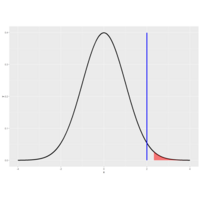
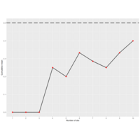
99th percentile to see if we would still reject H_0.

Plot. PValue
We rejected H_0 because our data (the test statistic actually) favored H_a. The test statistic 2 (shown by the vertical blue line) falls in the shaded portion of this figure because it exceeds the quantile. As you know, the shaded portion represents 5% of the area under the curve.
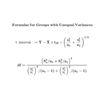
DofF
The formula for the degrees of freedom is a complicated fraction that no one remembers. The numerator is the SQUARE of the sum of the squared standard errors of the two sample means. Each has the form s^2/n. The denominator is the sum of two terms, one for each group. Each term has the same form. It is the standard error of the mean raised to the fourth power divided by the sample size-1. More precisely, each term looks like (s^4/n^2)/(n-1)
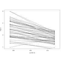
Plot 5.
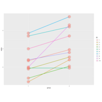
We see 20 entries, the first 10 show the results (extra) of the first drug (group 1) on each of the patients (ID), and the last 10 entries the results of the second drug (group 2) on each patient (ID).
| Here we've plotted the data in a paired way, connecting each patient's two results with a line, group 1 results on the left and group 2 on the right. See that purple line with the steep slope?
That's ID 9, with 0 result for group 1 and 4.6 for group 2.

Plot 4.
Now run myplot2 with an argument of 20.
> myplot2(20)
The quantiles are much closer together with the higher degrees of freedom. At the 97.5 percentile,
| though, the t quantile is still greater than the normal. Student's Rules!
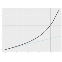
Plot 3.
Another way to look at these distributions is to plot their quantiles. From the slides, we've provided a second function for you, myplot2, which does this. It plots a lightblue reference line representing normal quantiles and a black line for the t quantiles. Both plot the quantiles starting at the 50th percentile which is 0 (since the distributions are symmetric about 0) and go to the 99th.
Plot 2.
You can see that the hump of t distribution (in blue) is not as high as the normal's. Consequently, the two tails of the t, distribution absorb the extra mass, so they're thicker than the normal's. Note that with 2 degrees of freedom, you only have 3 data points. Ha!
Talk about small sample sizes. Now try myplot with an input of 20.
> myplot(20)
The two distributions are almost right on top of each other using this higher degree of freedom.
Plot 1.
The function myplot, which takes the integer df as its input and plots the t distribution with df degrees of freedom. It also plots a standard normal distribution so you can see how they relate to one another.
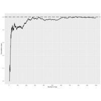
Plot 12. Statistics Inference
Here's another plot from the slides of the same experiment, this time using a biassed coin. We set the
| probability of a head to .9, so E(X)=.9 and the standard error is sqrt(.09/n) Again, the larger the sample size
| the more closely the distribution looks normal, although with this biassed coin the normal approximation isn't as
| good as it was with the fair coin.
Plot 11. Statistics Inference
Let's rephrase the CLT. Suppose X_1, X_2, ... X_n are independent, identically distributed random variables from
| an infinite population with mean mu and variance sigma^2. Then if n is large, the mean of the X's, call it X', is
| approximately normal with mean mu and variance sigma^2/n. We denote this as X'~N(mu,sigma^2/n).
Plot 10. Statistics Inference
coinPlot(10000)
Plot 9.
coinPlot(10000)
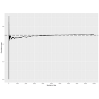
Plot 8.
To see this in action run the code coinPlot(10).....It takes an
| integer n which is the number of coin tosses that will be simulated. As coinPlot does these coin flips it
| computes the cumulative sum (assuming heads are 1 and tails 0), but after each toss it divides the cumulative sum
| by the number of flips performed so far. It then plots this value for each of the k=1...n tosses.
Plot 7.
The R function qnorm(prob) returns the value of x (quantile) for which the area under the standard normal
| distribution to the left of x equals the parameter prob. (Recall that the entire area under the curve is 1.) Use
| qnorm now to find the 10th percentile of the standard normal. Remember the argument prob must be between 0 and 1.
| You don't have to specify any of the other parameters since the default is the standard normal.
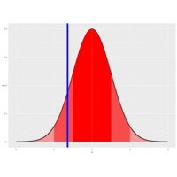
Plot 6.
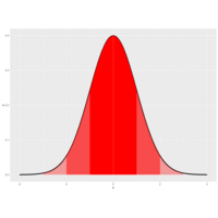
Approximately 68%, 95% and 99% of the normal density lie within 1, 2 and 3 standard deviations from the mean, | respectively. These are shown in the three shaded areas of the figure. For example, the darkest portion (between
| -1 and 1) represents 68% of the area.
Plot 5.
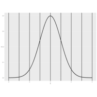
picture of the density function of a standard normal distribution. It's centered at its mean 0 and the vertical lines (at the integer points of the x-axis) indicate the standard deviations.
Plot 4.
Recall that the average of random samples from a population is itself a random variable with a distribution centered
| around the population mean. Specifically, E(X') = mu, where X' represents a sample mean and mu is the population
| mean.
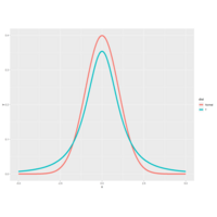
Plot 3.
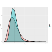
Here we do the same experiment but this time (the taller lump) each of the 10000 variances is over 20 standard
| normal samples. We've plotted over the first plot (the shorter lump) and you can see that the distribution of the
| variances is getting tighter and shifting closer to the vertical line.
Plot 2.
As with the sample mean, the sample variance is also a random variable with an associated population distribution.
| Its expected value or mean is the population variance and its distribution gets more concentrated around the
| population variance with more data. The sample standard deviation is the square root of the sample variance.
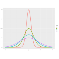
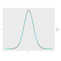
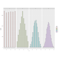
Plot1.
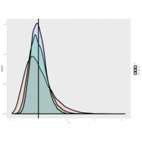
It shows several normal distributions all centered around a common mean 0, but with
| different standard deviations. As you can see from the color key on the right, the thinner the bell the smaller the
| standard deviation and the bigger the standard deviation the fatter the bell.
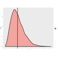
Documentational Review of the Health impact of weather events
The damaging cost and impact to weather phenomenon events.

Mastering R
The goal of this assignment is to take datasets that are either messy or simply not tidy and to make them tidy datasets. The objective is to gain some familiarity with the functions for reading in data into R and calculating basic summary statistics on the data. In particular, we will make use of the following packages: dplyr, tidyr, readr, and readxl.
GNT-Peer-graded Assignment: Course Project 1
It is now possible to collect a large amount of data about personal movement using activity monitoring devices such as a Fitbit, Nike Fuelband, or Jawbone Up. These type of devices are part of the “quantified self” movement – a group of enthusiasts who take measurements about themselves regularly to improve their health, to find patterns in their behavior, or because they are tech geeks. But these data remain under-utilized both because the raw data are hard to obtain and there is a lack of statistical methods and software for processing and interpreting the data.
This assignment makes use of data from a personal activity monitoring device. This device collects data at 5 minute intervals through out the day. The data consists of two months of data from an anonymous individual collected during the months of October and November, 2012 and include the number of steps taken in 5 minute intervals each day.
The data for this assignment can be downloaded from the course web site:
Dataset: Activity monitoring data [52K]
The variables included in this dataset are:
steps: Number of steps taking in a 5-minute interval (missing values are coded as \color{red}{\verb|NA|}NA)
date: The date on which the measurement was taken in YYYY-MM-DD format
interval: Identifier for the 5-minute interval in which measurement was taken
The dataset is stored in a comma-separated-value (CSV) file and there are a total of 17,568 observations in this dataset.
Review criterialess
Repo
Valid GitHub URL
At least one commit beyond the original fork
Valid SHA-1
SHA-1 corresponds to a specific commit
Commit containing full submission
Code for reading in the dataset and/or processing the data
Histogram of the total number of steps taken each day
Mean and median number of steps taken each day
Time series plot of the average number of steps taken
The 5-minute interval that, on average, contains the maximum number of steps
Code to describe and show a strategy for imputing missing data
Histogram of the total number of steps taken each day after missing values are imputed
Panel plot comparing the average number of steps taken per 5-minute interval across weekdays and weekends
All of the R code needed to reproduce the results (numbers, plots, etc.) in the report
Assignmentless
This assignment will be described in multiple parts. You will need to write a report that answers the questions detailed below. Ultimately, you will need to complete the entire assignment in a single R markdown document that can be processed by knitr and be transformed into an HTML file.
Throughout your report make sure you always include the code that you used to generate the output you present. When writing code chunks in the R markdown document, always use \color{red}{\verb|echo = TRUE|}echo=TRUE so that someone else will be able to read the code. This assignment will be evaluated via peer assessment so it is essential that your peer evaluators be able to review the code for your analysis.
For the plotting aspects of this assignment, feel free to use any plotting system in R (i.e., base, lattice, ggplot2)
Fork/clone the GitHub repository created for this assignment. You will submit this assignment by pushing your completed files into your forked repository on GitHub. The assignment submission will consist of the URL to your GitHub repository and the SHA-1 commit ID for your repository state.
NOTE: The GitHub repository also contains the dataset for the assignment so you do not have to download the data separately.
Loading and preprocessing the data
Show any code that is needed to
Load the data (i.e. \color{red}{\verb|read.csv()|}read.csv())
Process/transform the data (if necessary) into a format suitable for your analysis
What is mean total number of steps taken per day?
For this part of the assignment, you can ignore the missing values in the dataset.
Calculate the total number of steps taken per day
If you do not understand the difference between a histogram and a barplot, research the difference between them. Make a histogram of the total number of steps taken each day
Calculate and report the mean and median of the total number of steps taken per day
What is the average daily activity pattern?
Make a time series plot (i.e. \color{red}{\verb|type = "l"|}type="l") of the 5-minute interval (x-axis) and the average number of steps taken, averaged across all days (y-axis)
Which 5-minute interval, on average across all the days in the dataset, contains the maximum number of steps?
Imputing missing values
Note that there are a number of days/intervals where there are missing values (coded as \color{red}{\verb|NA|}NA). The presence of missing days may introduce bias into some calculations or summaries of the data.
Calculate and report the total number of missing values in the dataset (i.e. the total number of rows with \color{red}{\verb|NA|}NAs)
Devise a strategy for filling in all of the missing values in the dataset. The strategy does not need to be sophisticated. For example, you could use the mean/median for that day, or the mean for that 5-minute interval, etc.
Create a new dataset that is equal to the original dataset but with the missing data filled in.
Make a histogram of the total number of steps taken each day and Calculate and report the mean and median total number of steps taken per day. Do these values differ from the estimates from the first part of the assignment? What is the impact of imputing missing data on the estimates of the total daily number of steps?
Are there differences in activity patterns between weekdays and weekends?
For this part the \color{red}{\verb|weekdays()|}weekdays() function may be of some help here. Use the dataset with the filled-in missing values for this part.
Create a new factor variable in the dataset with two levels – “weekday” and “weekend” indicating whether a given date is a weekday or weekend day.
Make a panel plot containing a time series plot (i.e. \color{red}{\verb|type = "l"|}type="l") of the 5-minute interval (x-axis) and the average number of steps taken, averaged across all weekday days or weekend days (y-axis). See the README file in the GitHub repository to see an example of what this plot should look like using simulated data.
Submitting the Assignmentless
To submit the assignment:
Commit your completed \color{red}{\verb|PA1_template.Rmd|}PA1_template.Rmd file to the \color{red}{\verb|master|}master branch of your git repository (you should already be on the \color{red}{\verb|master|}master branch unless you created new ones)
Commit your PA1_template.md and PA1_template.html files produced by processing your R markdown file with knit2html() function in R (from the knitr package) by running the function from the console.
If your document has figures included (it should) then they should have been placed in the figure/ directory by default (unless you overrided the default). Add and commit the figure/ directory to your git repository so that the figures appear in the markdown file when it displays on github.
Push your \color{red}{\verb|master|}master branch to GitHub.
Submit the URL to your GitHub repository for this assignment on the course web site.
In addition to submitting the URL for your GitHub repository, you will need to submit the 40 character SHA-1 hash (as string of numbers from 0-9 and letters from a-f) that identifies the repository commit that contains the version of the files you want to submit. You can do this in GitHub by doing the following
Going to your GitHub repository web page for this assignment
Click on the “?? commits” link where ?? is the number of commits you have in the repository. For example, if you made a total of 10 commits to this repository, the link should say “10 commits”.
You will see a list of commits that you have made to this repository. The most recent commit is at the very top. If this represents the version of the files you want to submit, then just click the “copy to clipboard” button on the right hand side that should appear when you hover over the SHA-1 hash. Paste this SHA-1 hash into the course web site when you submit your assignment. If you don't want to use the most recent commit, then go down and find the commit you want and copy the SHA-1 hash.
A valid submission will look something like (this is just an example!)
Expected values are properties of distributions
Expected values are properties of distributions. The average, or mean, of random variables
| is itself a random variable and its associated distribution itself has an expected value. The center of
| this distribution is the same as that of the original distribution.
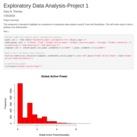
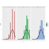
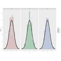
DocumentExploratory Data Analysis-Project 1
This assigment is intended to highlight my competence in exploratory data analysis using R Code and Rmarkdown. This will invole using R code to plotting 4 pre-defined plots.