suchit50785
Suchit D Kumbhare
Recently Published

Machine learning project
UCI Machine learning crime unnormalize data
Plot
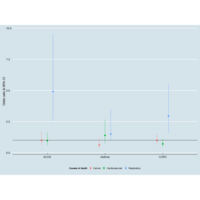
Creating Odds ratio plot comparing leading causes of death by airway disease
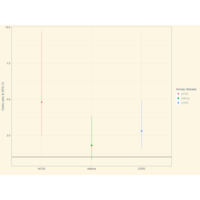
Comparison of Odds ratio and 95% CI for chronic respiratory causes of death by type of airway disease
Odds ratio were obtained from logistic regression model comparing chronic respiratory causes of death by type of airway disease controlling age, sex, and smoking status
Here is the table
airway_dis or lcl ucl
ACOS 4.8 2.4 9.6
Asthma 1.8 0.8 3.8
COPD 2.8 1.6 4.9
Code is given below:
library(readxl)
datf <- read_excel("~/Desktop/aCOS mortality/part III/Book2.xlsx")
View(datf)
library(ggplot2)
library (ggthemes)
ggplot(datf, aes(x = airway_dis, y = or, ymin = lcl, ymax = ucl)) +
geom_pointrange(aes(col = factor(airway_dis)),
position=position_dodge(width=0.30)) +
ylab("Odds ratio & 95% CI") + geom_hline(aes(yintercept = 1)) +
scale_color_discrete(name = "Airway disease") + xlab("") +
theme_solarized() + scale_fill_solarized()

Publish Document
My first flexdashboard by R