
travisadam0313
Travis LaBarre
Recently Published
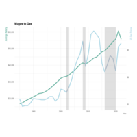
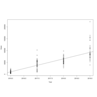
Gas to Salary
Part 2 of an economic series I'm working on overlaying average US gas prices per CNBC to BLS wages. I highlight 2002 - Start of Iraq War, 2008 - Housing Crisis, and 2016-2020 - Trump Era since these are economic events of interest.
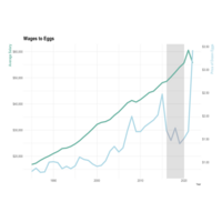
Eggs to Salary
Imagine all you spent your money on was eggs, you could have purchased 38,642 dozen eggs per year and the height of the divergence (2019), today (2022) you could only buy 16,269 dozen eggs, so your egg purchasing power 2022 vs 2019 in terms of eggs is 42%.
in2013dollars.com --egg data
bls.gov --salary data

Monongahela Flow
A little work with USGS data regarding the cubic feet of water per second discharge. Going on dives and boating in general can be extremely difficult in river conditions too far above the mean (for the Mon, around 6,000 cubic feet per second is the limit for a good dive).
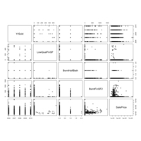
House Prices Competition Worst Correlations
These continuous variables had the worst correlations with sale price using cor.test()
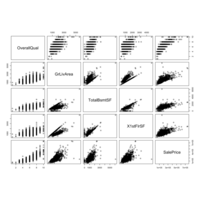
Kaggle House Prices Competition Best Correlations
These continuous variables had the best correlations to sale price using cor.test()
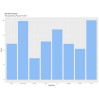
Bill Burr Apple Store Rant
Ha; had to make sure the anger calculator was working.
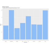
Bill Burr December
Bill Burr sentiment December.
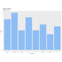
Podcast Sentiment: Bill Burr November
Playing with some of the datasets within the lexicon package to build a trending sentiment machine. Started with some discovery on one of my favorite podcasts on youtube.
libraries: youtubecaption, lexicon, ggplot2
lexicon dataset: nrc_emotions

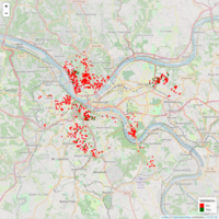
Sheriff Sale Postponed as of 4/15/20
Allegheny County Sheriff Sale Postponed List. Mapping courtesy of leaflet package. Realestate data http://www.sheriffalleghenycounty.com/realestate/sale_info.html. 'Zestimate' courtesy of Zillow API.
Pitt Lien Properties (Color Palette for Zestimate)
Same Validation Data for Pitt Lien Properties, color palette for Zestimate
Pitt Lien Properties with Zillow Zestimate
A map of city owned and/or significant tax liens property resourced from public city data. Zestimates provided via Zillow API for real time estimates of comparable properties.
Linear Model for Lot Area (Kaggle: House Prices)
Linear model for LotArea in regards to Zoning for SalePrice. (Outliers eliminated)
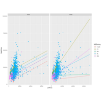
Zoning Implications and Lot Area (Kaggle: House Prices)
Linear models for SalePrices based on LotArea.
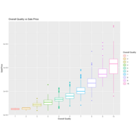
Overall Quality vs House Price (Kaggle: House Prices) CLR
A boxplot to visualize OverallQual to SalePrice
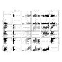
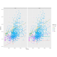
Pairs Plot (Kaggle: Housing)
A quick look at some continuous variables from the housing data to determine visibly significant characteristics/trends.
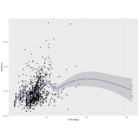
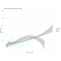
Lot Area (Kaggle: Houses Competition)
A view of LotArea to SalePrice (color coded to MSZoning) and filtered with a LotArea < 25000 to control for outliers. Residential Low Density and Residential Medium density are the largest portions of the population, therefore my original assumption of Lot Frontage needing to be accounted for can be scrapped (or significantly reduced in weight).
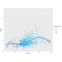
Lot Frontage (Kaggle: Houses Competition)
I am starting to tear into the House prices competition on Kaggle. First, I have populated the NAs in LotFrontage from the Training data using lm() standard linear regression to SalePrice. Next, I used ggplot() and geom_smooth() to identify trends in price to lot frontage. It looks as if there would be a call for a piecewise polynomial function if we are determining price from lot frontage alone. I am guessing lot frontage will become significant when coupled with MSZoning which will indicate urban/rural attributes which probably play a role in house price in the lower Lot Frontage numbers.
Jiu Jitsu PGH
How laid back are people who do Jiu Jitsu? They never leave a rating under 5 stars.
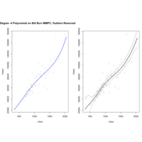
-4 Degree Polynomial Regression BBMMPC - Outliers Removed
Same drill on the BBMMPC Dataset, initial plot is 4th degree polynomial, second has knots at the 500, 1000, and 1500 Likes intervals as well as splines.
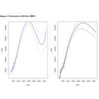
BBMMPC Polynomial Regression with Splines
This was a quick exercise to apply a polynomial regression calculation to a relatively messy set of data. This seeks to calculate Youtube 'Views' of the Monday Morning Podcast via 'Likes' using the a 4th degree polynomial function. It's pretty easy to see how this can make some wild assumptions in the areas thin with data. Beautiful chart but most likely useless information above 4,000 likes.
Addition of splines with knots at 500, 1000, and 1500 likes.
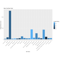
New York Bar Chart
"New York, New York, it's a helluva town!" -Frank Sinatra
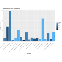
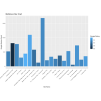
Bethlehem Bar Chart - Google
And one more for my old college town...
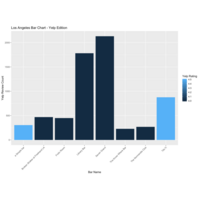
LA Bar Chart - Yelp
Los Angeles, Yelp Data
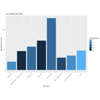
LA Bar Chart - Google
Same data extraction as Pittsburgh plot for Los Angeles
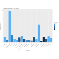
Pittsburgh Bar Chart Yelp
Same drill as first Pittsburgh bar survey, this time with data extracted from Yelp via the Fusion API and yelpr package from github.
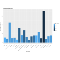
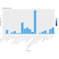
The Pittsburgh Bar Chart
Simple bar chart, the data extraction was from the google_places() API. Utilizing this package to explore groups of businesses and how they compare to one another.
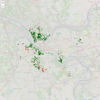
Strict Validation Pitt Liens Map
This validation procedure utilized random forests and continuous variables to determine if a house was truly a 'dead property' it performed quite well. Out of 903 original records, only 88 come back as 100% valid dead properties and upon looking up their addresses, they are all in quite a terrible state. The next step is to build out logic to determine desirable properties that fall between 'Completely Garbage' and 'Someone has probably acquired this already/Invalid find'. Doing so would require bucketing these truly terrible properties and establishing a threshold so as not to pull in 'unlikely' properties.
Pitt Liens Var Imp 2000 Trees
Variable importance over 2000 trees.
Pitt Liens Data Set Variable Importance
This is a revisited random forest to the Pitt Data set to consider continuous predictors as well as factor predictors.
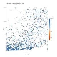
JRE_Acceptance
This is a simple ggplot2 dot chart of view count over time for the entire Joe Rogan Experience Channel over the last 6 years. All data was wrangled using library(tuber) to extract data from the individual videos from the channel since its start. There are ~2300 videos. The color legend sums the likes and dislikes and calculates acceptance based on what percent are positive for a given video.
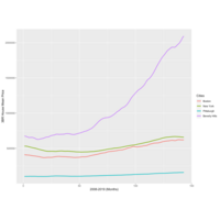
Plot of Pricing Trends for Major Cities
I was genuinely curious how different cities behaved after the housing crisis and went to Zillow for the data.
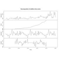
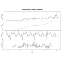
STLF_Seasonal
Bill Burr MMPC Data autoplot of Seasonally adjusted time series
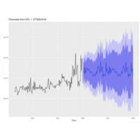
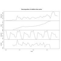
BillBurrMMPC_stlf
Autoplotting the BBMMPC Data utiliing stlf()
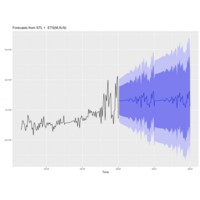
tbats on Bill Burr MMPC
Utiliizing tbats on the Bill Burr Monday Morning Podcast data to assess the differences from ARIMA.
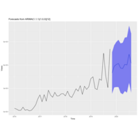
Weekly BillBurrMMPC ARIMA
Cleaned up weekly analysis for Bill Burr Monday Morning Podcast. Missing values substituted with closest values (Ex: He runs a Thursday afternoon podcast that's synonymous in format to the Monday Morning Podcast, where a Monday was missing, a Thursday was used)
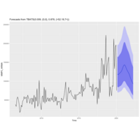
Bill Burr 2020 ARIMA Forecast
A plot predicting Bill Burr's Monday Morning Pod Cast using Auto-Regressive Integrated Moving Average, controlling for seasonality.
Bill Burr MMPC ARIMA by Month
Revisiting the Bill Burr MMPC viewership trends in hopes of doing an ARIMA predictive analysis on it. Instead of attempting to get the data sanitized at the 'week' level, I decided to run this analysis by month.
Bill Burr 2020 ARIMA Predictive Analysis
I uploaded the BillBurrMMPC plot to a Statistics Group I follow and I asked for ways to get a more solid predictive analysis going for 2020 rather than simple linear regression. ARIMA was the immediate suggestion, so here is the beginning stages of my predictive analysis for how many views Bill Burr's Monday Morning Podcast will receive in 2020.
Note: This analysis was not performed on actual time series data, therefore there are some fundamental flaws in the investigation on this type of data. This was done simply because the numbers behave 'enough' like times series data to work with ARIMA functions.
C_Forest Validation
This uses a different type of random forest to evaluate the properties using the same criteria. There will be subsequent analyses to examine the final results and create a side by side analysis.
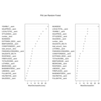
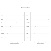
Random Forest Pitt Liens
Here is what the random forest came up with for the Pitt Liens dataset. It tended to rate 'Yes' very liberally... Perhaps adding more factors and more noise control would allow this to perform better. Not impressed with the result set. (Factors: Number of Liens, Municipality, Use Description, Sale Description, Exterior, Condition Grade, Category
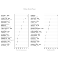
Pitt Lien Property Validation Random Forest
This uses randomForest in r to grow 2000 trees to display which factors play the most crucial roles. As expected, lien Volume and Municipal Ward play the largest role in whether a dead property is truly dead.
MMPC Linear Regression
Running a simple linear regression on the Bill Burr Monday Morning Podcast, I came up with Intercept of -55,322,525 and coefficient of 27,447. Assuming the trend continues, we could expect an average viewership of 120,415views per podcast in 2020, for a total view count of 6.26M. Confidence 2.5% =(Intercept: -60139840.08, Year: 25058.73), 97.5% = (Intercept: -50505209.57, Year: 29834.63)
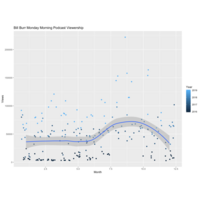
Bill Burr MMPC by Month
Same plot as Bill Burr Monday Morning Podcast only the month and year have been transposed to see if there is a viewership trend by month. Bill Burr likes to provide commentary on football and I would generally expect podcasts to escalate in popularity over the fall/winter months because of their duration and nature.
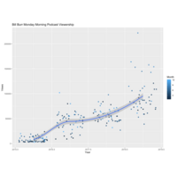
Bill Burr Viewership Plot
A revisit to my Bill Burr Youtube channel analysis
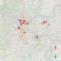
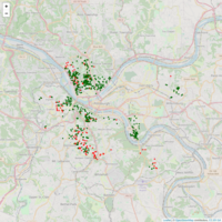
ValidationMap
This is the first pass of the validation process using the most basic decision making process (rpart). The interactive map allows you to quick take a look at whether the a property was determined a 'Valid dead property' or 'Not a valid dead property'. The tool tip allows you to decipher if I came to this conclusion manually (Manual Validation) or if the decision tree was able to find it. So far, as expected, I've seen about 66% accuracy in the decision tree process. The next step will be to re-examine the factors in the decision making process and run a more complex decision making process using random forests.
It is important to note that, at a glance, you would expect to see more valid dead properties (green) in depressed neighborhoods and more non-valid dead properties (red) in more desirable neighborhoods due to being acquired recently/more likely to be paid up by interested parties.
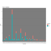
Ward to Validation Test Results
Another view of how the test results came back with a look at validation by ward.
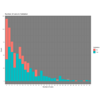
Number of Liens to Validation Test
This is the first look at the results of the decision tree's results for the test set. Upon review a few of them manually, it appears to have done a pretty good job. The only way to truly validate is to manually validate each record to identify weaknesses.
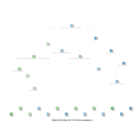
Class Decision Tree
Decision tree built with rpart() used to determine validation by the factors I found to be most telling (Number of Liens, Municipality, Use Description, SaleDesc, Exterior, Condition, Size Category). Next I will use this tree built using the training set, on the remaining 900 (my test set) from the 1,300 sample of the Pittsburgh Tax Lien Dataset. This tree is all factors, I will run one decision tree example, then one random forest example. If the results are not acceptable, I will move a more continuous model using the "anova" method.
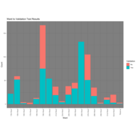
Year Built to Validation
Though it is cumbersome to plot this way, it is still one of the easier ways to identify where the cut-off is for the year of construction that determines whether it is likely to be a valid property or not. It is intuitive that more recently built structures will remain more desirable and thus not make it to the 'Dead Property' inventory. The cut off appears to be somewhere between 1930 and 1950 where, anything here or prior tends to be a valid dead property, and anything built after this period is much less likely to be available for purchase from the city. It is also important to observe that when a property's real age is difficult to determine, the go-to answer appears to be '1900'.
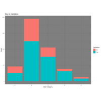
Size Cat to Validation
This process broke the houses up into categories by 'Liveable Square Feet' attribute. A= < 1,000 sqft, B = 1,000-1,500 sqft, C=1,500-2,000 sqft, D = 2,000-2,500 sqft, E > 2,500 sqft.
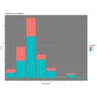
Total Rooms Validation
Validation by Total Rooms Pittsburgh Lien Dataset
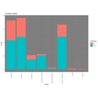
Grade to Validation
Continuation of factor exploration for Pittsburgh Lien Dataset.
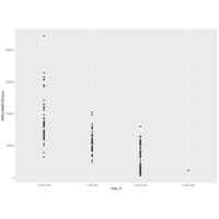
Number of Lien to Zestimate Trend
This is an attempt to see if there are any correlations between Zestimate trends and Lien dollar amounts by plotting Zestimates against Lien Volume. While there may be some interesting similarities here, there does not appear to be anything worth getting excited about.
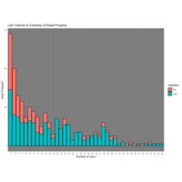
Liens to Dollar Amount of Liens
This plot is an attempt to investigate if any trends are occurring with the dollar amounts of the liens vs the number of liens on the validation set. Assuming that Non-Validation implies the property was not truly dead and or purchased, it may be possible to make assumptions that if a property accumulates liens but maintains a lower dollar amount, it may be in a less-desired area. For instance, if a higher-taxed area had a property went delinquent, the dollar amounts would stack up faster than a property in a lower-taxed area where it would reside under the radar longer due to being located in a less-desired/undesired area.
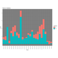
Ward Validation %
Ward Validation update with percentages for readability.
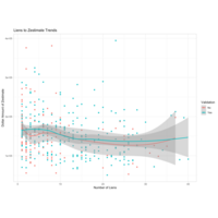
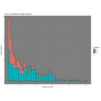
Lien Count and Validation
Earlier, I gathered a break out of property types and their lien volumes and did not come up with anything 'interesting' or immediately actionable. However, in doing the validation process, I seemed to notice a trend in lien counts where there tended to be a sweet spot between ~12 and ~30 liens that signaled a valid property. As the chart reflects, this range has less likely hood of a non-validation. This characteristic will likely play a stronger role in the decision making algorithms later.
Decision Tree Plot
Using the mentioned characteristics; (Number of Liens , Use Description, Sale Description, Municipal Description)
I used the rpart decision tree package to build a formula to validate the remaining properties in the Pittsburgh Tax Lien Dataset. I will utilize this to test accuracy on my training set, then my test set. I will then use random forests for the same tasks and will compare the outcomes.
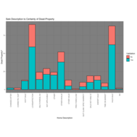
Sale Description to Validation
Sale Description to Validation Break Out
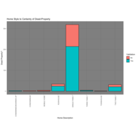
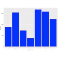
Use Description Validation
This plot breaks out the types of properties and how they tend to fall in terms of validation. A vast majority are 'Single Family' structures, 'Two Family' and 'Row House'. Because I am not certain of how my sample will reflect bigger and bigger populations, I will manually validate the other categories (Townhouse, Three Family, Condemned, etc) in the test set, as there are only 27 and I don't believe there is enough validated data at this point to make accurate calls. They will be included once the 1,300 set is validated for use on the 14,000 set.
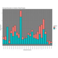
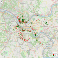
Validation By Ward
Dead property validation by Ward for Pittsburgh Tax Delinquencies. An interesting takeaway from this is the 32nd ward, where there is a high count of properties as well as a high percentage of Not-Valid search results. Knowing a bit about the area, I would assume this is because the particular neighborhood is very accessible to the city and its surroundings have decent value property, making it a good area to invest. Therefore, those who know how to acquire these properties, appear to be doing so.
Dead Property Validation
In order to successfully identify desirable houses from the Pittsburgh Tax Lien dataset, I used Zillow data and filtering to narrow 14,000 records down to 1,300. I then manually searched ~400 addresses to develop a useful sample. This process creates a picture of what a dead property looks like in terms of the data. The process I used:
-Search the Address
-View the google street view, 'Does it look dead?', 'Does it look lived in?', etc.
-If it looks dead, check Zillow, Trulia, Redfin, et al. to make sure it hasn't been purchased in the past 2 years (to rule out dated google street views)
-Is there reasonable certainty the property is dead? Validation column gets a "Yes", otherwise "No".
These 400 records are now isolated as a training set for data exploration and to test factors in the Pittsburgh Lien Dataset for significance.
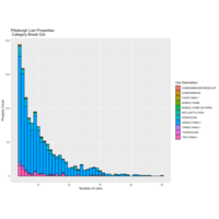
PGH Lien Property Categories
Data: Public tax delinquency data for residential properties in Pittsburgh
This property data was first filtered to rule out outliers such as too many rooms to be a 'normal' residence, and vacant land parcels.
Next, their bedroom count attributes and zip codes were cross referenced with Zillow data to extract 'normal' price range situations between $100,000 and $200,000 'Zestimate'. This process takes an original count of ~14,000 tax delinquent properties down to the ~1,300 most desirable/acquirable properties.
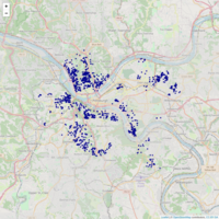
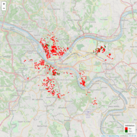
Lien Volume and Zestimate
Interactive map that utilizes public lien data from the city of Pittsburgh, and API data from Zillow.com to produce Zestimates on tax delinquent properties that can be purchased from the city.

PGH Lien Volume
Public Lien Data for Pittsburgh as of January, 2019. The goal of this project will be to build a manually validated training set to use on the entire 14,000-record dataset to determine which properties A.) Can be purchased from the city B.) Are desirable (I.E. Fixer upper homes that will have value once fixed, not vacant land or houses in depressed neighborhoods)
Bill Burr MMPC Vieweship
View clusters for Bill Burr Monday Morning Podcast (November, 2019).

Joe Rogan Viewership
Viewership of Joe Rogan podcasts November, 2019 represented in font size vs guest.
Armada Styles
Average Pricing for Nissan Armada Styles VIA cars.com for 11/2019 within 250 mile radius of Bethlehem, PA.