
Neka
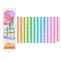
Neka
Recently Published
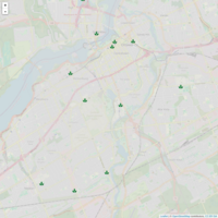
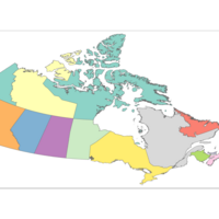
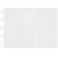
Leaflet of Interesting Places in Ottawa
Step 1 : Define the icon
Step 2. Parse data frame of long and lat
Step3 Define the Popups
Step 4 Put it together by piping the data to the leaflet object on a tile
Note: It will run offline but without a geo plane
Challange : Save Street map Geoplane and render the plane
cap_Icon<-makeIcon(
iconUrl = "C:/RProgram/RWork/leafy.png",
iconWidth = 20*1, iconHeight = 20,
iconAnchorX =0+1, iconAnchorY = 0+1
)
##Capsite
capSites <-c(
"
<a href ='http://www.statcan.gc.ca/'><b> Statistics Canada,</b></a>
<br>Jean Talon Building
170 Tunney's Pastrure Driveway Ottawa",
#.. All thirteen of them in this format)
cap_Region<- read_csv("C:/RProgram/RWork/InterestCapRegion.csv") # import csv file with data
head(cap_Region) # veiw the data
# Leaflet Executes
cap_Region %>%
leaflet()%>%
addTiles()%>%## # Street map
addMarkers( icon = cap_Icon,popup = capSites)
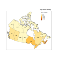
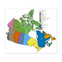
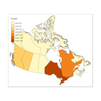
Plot Choropleth Population Density
#Problem - units - no idea where it got it from ;-(
################
## Loading packages
library(rgdal)
library(plyr)
library(rgeos)
library(maps)
library(maptools)
library(mapdata)
library(ggplot2)
library(RColorBrewer)
library(foreign)
library(sp)
library(scales)
library(readr)
library(tmap)# function qtm
library(tmaptools)
getwd()
setwd("C:/RProgram/RWork")
#Step 1
myProv <- readOGR(dsn="Prov", layer="provFile")
#https://en.wikipedia.org/wiki/Demographics_of_Canada
myProvgeo <- read_shape(file= "Prov/provFile.shp", as.sf = TRUE)
ProvCenDataC <- read_csv("Prov/ProvCenDataC.csv") # u must order the data
myProv.fort <- fortify(myProv, region = "PRUID") # Long time; #creastes more observ.
idList <- myProv@data$PRUID
centroids.df <- as.data.frame(coordinates(myProv))
names(centroids.df) <- c("Longitude", "Latitude") #more sensible column names
mydataC.df <-data.frame(id=idList, ProvCenDataC, centroids.df)
#TRY PLOTTING MAP
#################################
#Plotting individual Provincies
#qtm(myProv.fort) # Cannot be plotted by qtm
selmyProvgeo <- myProvgeo[myProv$PRUID ==10,]# select NewFoundland
###########################################
#Make the datatype identical
myProvgeo$PRUID <- as.character(myProvgeo$PRUID)
mydataC.df$PRUID <- as.character(mydataC.df$PRUID)
myProv$PRUID <- as.character(myProv$PRUID)
#Order the rows BUt already ordered
myProvgeo<- myProvgeo[order(myProvgeo$PRUID),]
mydataC.df <- mydataC.df[order(mydataC.df$PRUID),]
#Then Compare
identical(myProvgeo$PRUID,mydataC.df$PRUID)
identical(myProv$PRUID,mydataC.df$PRUID)
#Then apppend data
provMap <-append_data(myProvgeo, mydataC.df, key.shp ="PRUID", key.data= "PRUID") # not working
provMap <-append_data(myProv, mydataC.df, key.shp ="PRUID", key.data= "PRUID")
#https://cran.r-project.org/web/packages/tmap/vignettes/tmap-nutshell.html
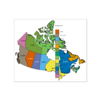
############ CHOROPLETH PLOT B ############################
#qtm(Europe, fill="well_being", text="iso_a3", text.size="AREA", format="Europe", style="gray",
# text.root=5, fill.title="Well-Being Index", fill.textNA="Non-European countries")
qtm(provMap, fill="Desity", text="PREABBR",
text.root=5, fill.title="People per SqKm")+
tm_legend(legend.position = c("right", "top"),
main.title = "Population Density",
main.title.position = "right")
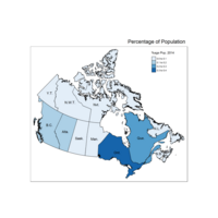
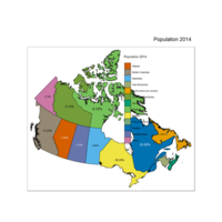
Plot Choropleth of Proportion of Proportion of Population
#No units
################
## Loading packages
library(rgdal)
library(plyr)
library(rgeos)
library(maps)
library(maptools)
library(mapdata)
library(ggplot2)
library(RColorBrewer)
library(foreign)
library(sp)
library(scales)
library(readr)
library(tmap)# function qtm
library(tmaptools)
getwd()
#Step 1
myProv <- readOGR(dsn="Prov", layer="provFile")
myProvgeo <- read_shape(file= "Prov/provFile.shp", as.sf = TRUE)
ProvCenDataC <- read_csv("Prov/ProvCenDataC.csv") # u must order the data
myProv.fort <- fortify(myProv, region = "PRUID") # Long time; #creastes more observ.
idList <- myProv@data$PRUID
centroids.df <- as.data.frame(coordinates(myProv))
names(centroids.df) <- c("Longitude", "Latitude") #more sensible column names
mydataC.df <-data.frame(id=idList, ProvCenDataC, centroids.df)
#TRY PLOTTING MAP
ggplot(myProv.fort, aes(long, lat))+
geom_polygon(data= NULL, aes(group = group), colour = 'blue', fill=NA ) +
geom_text(data = mydataC.df, aes(Longitude, Latitude, label = Population), size =4, colour ='red')
#################################
#Plotting individual Provincies
qtm(myProv) #produces map
qtm(myProvgeo) # produces a map
#qtm(myProv.fort) # Cannot be plotted by qtm
selmyProv <- myProv[myProv$PRUID ==10,]# select NewFoundland
qtm(selmyProv) #Draw NewFoundland
selmyProv <- myProv[myProv$PRUID ==11,]# Prince Edward
qtm(selmyProv) #Draw PEI
selmyProv <- myProv[myProv$PRUID ==12,]# Nova Scotia
qtm(selmyProv) #Draw NSc
selmyProv <- myProv[myProv$PRUID ==13,]# New Brunswick
qtm(selmyProv) #Draw NB
selmyProv <- myProv[myProv$PRUID ==24,]# Qubec
qtm(selmyProv) #Draw QC
selmyProv <- myProv[myProv$PRUID ==35,]# Ontario
qtm(selmyProv) #Draw On
selmyProv <- myProv[myProv$PRUID ==46,]# Manitoba
qtm(selmyProv) #Draw MB
selmyProv <- myProv[myProv$PRUID ==47,]# Saska
qtm(selmyProv) #Draw SW
selmyProv <- myProv[myProv$PRUID ==48,]# AB
qtm(selmyProv) #Draw AB
selmyProv <- myProv[myProv$PRUID ==59,]# BC
qtm(selmyProv) #Draw BC
selmyProv <- myProv[myProv$PRUID ==60,]# YK
qtm(selmyProv) #Draw YK
selmyProv <- myProv[myProv$PRUID ==61,]# NW
qtm(selmyProv) #Draw NW
selmyProv <- myProv[myProv$PRUID ==62,]# NT
qtm(selmyProv) #Draw NT
############################
qtm(myProv) #produces map
qtm(myProvgeo) # produces a map
#qtm(myProv.fort) # Cannot be plotted by qtm
selmyProvgeo <- myProvgeo[myProv$PRUID ==10,]# select NewFoundland
qtm(selmyProvgeo) #Draw NewFoundland
###########################################
#Make the datatype identical
myProvgeo$PRUID <- as.character(myProvgeo$PRUID)
mydataC.df$PRUID <- as.character(mydataC.df$PRUID)
myProv$PRUID <- as.character(myProv$PRUID)
#Order the rows BUt already ordered
myProvgeo<- myProvgeo[order(myProvgeo$PRUID),]
mydataC.df <- mydataC.df[order(mydataC.df$PRUID),]
#Then Compare
identical(myProvgeo$PRUID,mydataC.df$PRUID)
identical(myProv$PRUID,mydataC.df$PRUID)
#Then apppend data
provMap <-append_data(myProvgeo, mydataC.df, key.shp ="PRUID", key.data= "PRUID") # not working
provMap <-append_data(myProv, mydataC.df, key.shp ="PRUID", key.data= "PRUID")
#https://cran.r-project.org/web/packages/tmap/vignettes/tmap-nutshell.html
qtm(provMap, "PRUID",text ="Prop", text.size= "AREA", style="gray",
text.root=5, fill.title="Population 2014", fill.textNA="Nothing")
#works give strange uniits
# qtm(Europe, fill="well_being", text="iso_a3", text.size="AREA", format="Europe", style="gray",
# text.root=5, fill.title="Well-Being Index", fill.textNA="Non-European countries")
# make a categorical map
# qtm(Europe, fill="economy", title=paste("Style:", tmap_style()))
qtm(provMap, fill= "Name" ,title=paste("Style:", tmap_style()), fill.title="Population 2014" ,text ="Prop", text.size= "AREA")
## current tmap style is "white"
#change Position of Legend
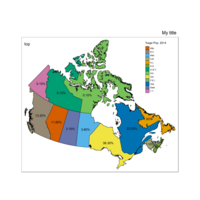
qtm(provMap, fill = "economy", format = "World", style = "col_blind") +
tm_legend(legend.position = c("left", "bottom"),
main.title = "My title",
main.title.position = "right")
##### THIS IS THE CODE THAT CREATED PLOT########
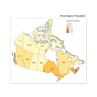
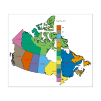
qtm(provMap, fill = "Prop", style = "col_blind",text ="PREABBR", text.root=2, text.col = "black", fill.title="%age Pop. 2014") +
tm_legend(legend.position = c("right", "top"),
main.title = "Percentage of Population",
main.title.position = "right")
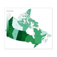
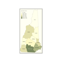
Plot of Choropleth by Population Density
Lighter is more

Plot Choropleth Population Proportion B
Code is in last portion

Plot Choropleth Population Proportion
#Problem - units - no idea where it got it from ;-(
################
## Loading packages
library(rgdal)
library(plyr)
library(rgeos)
library(maps)
library(maptools)
library(mapdata)
library(ggplot2)
library(RColorBrewer)
library(foreign)
library(sp)
library(scales)
library(readr)
library(tmap)# function qtm
library(tmaptools)
getwd()
#Step 1
myProv <- readOGR(dsn="Prov", layer="provFile")
myProvgeo <- read_shape(file= "Prov/provFile.shp", as.sf = TRUE)
ProvCenDataC <- read_csv("Prov/ProvCenDataC.csv") # u must order the data
myProv.fort <- fortify(myProv, region = "PRUID") # Long time; #creastes more observ.
idList <- myProv@data$PRUID
centroids.df <- as.data.frame(coordinates(myProv))
names(centroids.df) <- c("Longitude", "Latitude") #more sensible column names
mydataC.df <-data.frame(id=idList, ProvCenDataC, centroids.df)
#TRY PLOTTING MAP
ggplot(myProv.fort, aes(long, lat))+
geom_polygon(data= NULL, aes(group = group), colour = 'blue', fill=NA ) +
geom_text(data = mydataC.df, aes(Longitude, Latitude, label = Population), size =4, colour ='red')
#################################
#Plotting individual Provincies
qtm(myProv) #produces map
qtm(myProvgeo) # produces a map
#qtm(myProv.fort) # Cannot be plotted by qtm
selmyProv <- myProv[myProv$PRUID ==10,]# select NewFoundland
qtm(selmyProv) #Draw NewFoundland
selmyProv <- myProv[myProv$PRUID ==11,]# Prince Edward
qtm(selmyProv) #Draw PEI
selmyProv <- myProv[myProv$PRUID ==12,]# Nova Scotia
qtm(selmyProv) #Draw NSc
selmyProv <- myProv[myProv$PRUID ==13,]# New Brunswick
qtm(selmyProv) #Draw NB
selmyProv <- myProv[myProv$PRUID ==24,]# Qubec
qtm(selmyProv) #Draw QC
selmyProv <- myProv[myProv$PRUID ==35,]# Ontario
qtm(selmyProv) #Draw On
selmyProv <- myProv[myProv$PRUID ==46,]# Manitoba
qtm(selmyProv) #Draw MB
selmyProv <- myProv[myProv$PRUID ==47,]# Saska
qtm(selmyProv) #Draw SW
selmyProv <- myProv[myProv$PRUID ==48,]# AB
qtm(selmyProv) #Draw AB
selmyProv <- myProv[myProv$PRUID ==59,]# BC
qtm(selmyProv) #Draw BC
selmyProv <- myProv[myProv$PRUID ==60,]# YK
qtm(selmyProv) #Draw YK
selmyProv <- myProv[myProv$PRUID ==61,]# NW
qtm(selmyProv) #Draw NW
selmyProv <- myProv[myProv$PRUID ==62,]# NT
qtm(selmyProv) #Draw NT
############################
qtm(myProv) #produces map
qtm(myProvgeo) # produces a map
#qtm(myProv.fort) # Cannot be plotted by qtm
selmyProvgeo <- myProvgeo[myProv$PRUID ==10,]# select NewFoundland
qtm(selmyProvgeo) #Draw NewFoundland
###########################################
#Make the datatype identical
myProvgeo$PRUID <- as.character(myProvgeo$PRUID)
mydataC.df$PRUID <- as.character(mydataC.df$PRUID)
myProv$PRUID <- as.character(myProv$PRUID)
#Order the rows BUt already ordered
myProvgeo<- myProvgeo[order(myProvgeo$PRUID),]
mydataC.df <- mydataC.df[order(mydataC.df$PRUID),]
#Then Compare
identical(myProvgeo$PRUID,mydataC.df$PRUID)
identical(myProv$PRUID,mydataC.df$PRUID)
#Then apppend data
provMap <-append_data(myProvgeo, mydataC.df, key.shp ="PRUID", key.data= "PRUID") # not working
provMap <-append_data(myProv, mydataC.df, key.shp ="PRUID", key.data= "PRUID")
#https://cran.r-project.org/web/packages/tmap/vignettes/tmap-nutshell.html
qtm(provMap, "Population",text ="Prop", text.size= "AREA", style="gray",
text.root=5, fill.title="Population 2014", fill.textNA="Nothing")
#works give strange uniits
# qtm(Europe, fill="well_being", text="iso_a3", text.size="AREA", format="Europe", style="gray",
# text.root=5, fill.title="Well-Being Index", fill.textNA="Non-European countries")
# make a categorical map
# qtm(Europe, fill="economy", title=paste("Style:", tmap_style()))
qtm(provMap, fill= "Name" ,title=paste("Style:", tmap_style()), fill.title="Population 2014" ,text ="Prop", text.size= "AREA")
## current tmap style is "white"
#change Position of Legend
qtm(provMap, fill = "economy", format = "World", style = "col_blind") +
tm_legend(legend.position = c("left", "bottom"),
main.title = "My title",
main.title.position = "right")
##### THIS IS THE CODE THAT CREATED PLOT########
qtm(provMap, fill = "Prop", style = "col_blind",text ="PREABBR", text.root=2, text.col = "black", fill.title="%age Pop. 2014") +
tm_legend(legend.position = c("right", "top"),
main.title = "Percentage of Population",
main.title.position = "right")
############ CHOROPLETH############################
#qtm(Europe, fill="well_being", text="iso_a3", text.size="AREA", format="Europe", style="gray",
# text.root=5, fill.title="Well-Being Index", fill.textNA="Non-European countries")
qtm(provMap, fill="Prop", text="PREABBR", text.size="AREA",
text.root=5, fill.title="Population Proportion", fill.textNA="No value")+
tm_legend(legend.position = c("right", "top"),
main.title = "Percentage of Population",
main.title.position = "right")
Plot different view
#The plot
############ CHOROPLETH############################
#qtm(Europe, fill="well_being", text="iso_a3", text.size="AREA", format="Europe", style="gray",
# text.root=5, fill.title="Well-Being Index", fill.textNA="Non-European countries")
qtm(provMap, fill="Prop", text="PREABBR", text.size="AREA",
text.root=5, fill.title="Population Proportion", fill.textNA="No value")+
tm_legend(legend.position = c("right", "top"),
main.title = "Percentage of Population",
main.title.position = "right")
Plot Legend based on %age
Same code
############ CHOROPLETH############################
#qtm(Europe, fill="well_being", text="iso_a3", text.size="AREA", format="Europe", style="gray",
# text.root=5, fill.title="Well-Being Index", fill.textNA="Non-European countries")
qtm(provMap, fill="Prop", text="PREABBR", text.size="AREA",
text.root=5, fill.title="Population Proportion", fill.textNA="No value")+
tm_legend(legend.position = c("right", "top"),
main.title = "Percentage of Population",
main.title.position = "right")
Plot of Percentage Change in Population
#This is not a choropleth
#Problem - units - no idea where it got it from ;-(
################
## Loading packages
library(rgdal)
library(plyr)
library(rgeos)
library(maps)
library(maptools)
library(mapdata)
library(ggplot2)
library(RColorBrewer)
library(foreign)
library(sp)
library(scales)
library(readr)
library(tmap)# function qtm
library(tmaptools)
getwd()
#Step 1
myProv <- readOGR(dsn="Prov", layer="provFile")
myProvgeo <- read_shape(file= "Prov/provFile.shp", as.sf = TRUE)
ProvCenDataC <- read_csv("Prov/ProvCenDataC.csv") # u must order the data
myProv.fort <- fortify(myProv, region = "PRUID") # Long time; #creastes more observ.
idList <- myProv@data$PRUID
centroids.df <- as.data.frame(coordinates(myProv))
names(centroids.df) <- c("Longitude", "Latitude") #more sensible column names
mydataC.df <-data.frame(id=idList, ProvCenDataC, centroids.df)
#TRY PLOTTING MAP
ggplot(myProv.fort, aes(long, lat))+
geom_polygon(data= NULL, aes(group = group), colour = 'blue', fill=NA ) +
geom_text(data = mydataC.df, aes(Longitude, Latitude, label = Population), size =4, colour ='red')
#################################
#Plotting individual Provincies
qtm(myProv) #produces map
qtm(myProvgeo) # produces a map
#qtm(myProv.fort) # Cannot be plotted by qtm
selmyProv <- myProv[myProv$PRUID ==10,]# select NewFoundland
qtm(selmyProv) #Draw NewFoundland
selmyProv <- myProv[myProv$PRUID ==11,]# Prince Edward
qtm(selmyProv) #Draw PEI
selmyProv <- myProv[myProv$PRUID ==12,]# Nova Scotia
qtm(selmyProv) #Draw NSc
selmyProv <- myProv[myProv$PRUID ==13,]# New Brunswick
qtm(selmyProv) #Draw NB
selmyProv <- myProv[myProv$PRUID ==24,]# Qubec
qtm(selmyProv) #Draw QC
selmyProv <- myProv[myProv$PRUID ==35,]# Ontario
qtm(selmyProv) #Draw On
selmyProv <- myProv[myProv$PRUID ==46,]# Manitoba
qtm(selmyProv) #Draw MB
selmyProv <- myProv[myProv$PRUID ==47,]# Saska
qtm(selmyProv) #Draw SW
selmyProv <- myProv[myProv$PRUID ==48,]# AB
qtm(selmyProv) #Draw AB
selmyProv <- myProv[myProv$PRUID ==59,]# BC
qtm(selmyProv) #Draw BC
selmyProv <- myProv[myProv$PRUID ==60,]# YK
qtm(selmyProv) #Draw YK
selmyProv <- myProv[myProv$PRUID ==61,]# NW
qtm(selmyProv) #Draw NW
selmyProv <- myProv[myProv$PRUID ==62,]# NT
qtm(selmyProv) #Draw NT
############################
qtm(myProv) #produces map
qtm(myProvgeo) # produces a map
#qtm(myProv.fort) # Cannot be plotted by qtm
selmyProvgeo <- myProvgeo[myProv$PRUID ==10,]# select NewFoundland
qtm(selmyProvgeo) #Draw NewFoundland
###########################################
#Make the datatype identical
myProvgeo$PRUID <- as.character(myProvgeo$PRUID)
mydataC.df$PRUID <- as.character(mydataC.df$PRUID)
myProv$PRUID <- as.character(myProv$PRUID)
#Order the rows BUt already ordered
myProvgeo<- myProvgeo[order(myProvgeo$PRUID),]
mydataC.df <- mydataC.df[order(mydataC.df$PRUID),]
#Then Compare
identical(myProvgeo$PRUID,mydataC.df$PRUID)
identical(myProv$PRUID,mydataC.df$PRUID)
#Then apppend data
provMap <-append_data(myProvgeo, mydataC.df, key.shp ="PRUID", key.data= "PRUID") # not working
provMap <-append_data(myProv, mydataC.df, key.shp ="PRUID", key.data= "PRUID")
#https://cran.r-project.org/web/packages/tmap/vignettes/tmap-nutshell.html
qtm(provMap, "Population",text ="Prop", text.size= "AREA", style="gray",
text.root=5, fill.title="Population 2014", fill.textNA="Nothing")
#works give strange uniits
# qtm(Europe, fill="well_being", text="iso_a3", text.size="AREA", format="Europe", style="gray",
# text.root=5, fill.title="Well-Being Index", fill.textNA="Non-European countries")
# make a categorical map
# qtm(Europe, fill="economy", title=paste("Style:", tmap_style()))
qtm(provMap, fill= "Name" ,title=paste("Style:", tmap_style()), fill.title="Population 2014" ,text ="Prop", text.size= "AREA")
## current tmap style is "white"
#change Position of Legend
qtm(provMap, fill = "economy", format = "World", style = "col_blind") +
tm_legend(legend.position = c("left", "bottom"),
main.title = "My title",
main.title.position = "right")
##### THIS IS THE CODE THAT CREATED PLOT########
qtm(provMap, fill = "Prop", style = "col_blind",text ="PREABBR", text.root=2, text.col = "black", fill.title="%age Pop. 2014") +
tm_legend(legend.position = c("right", "top"),
main.title = "Percentage of Population",
main.title.position = "right")
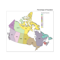
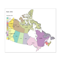
Plot Prov Legend Percent text
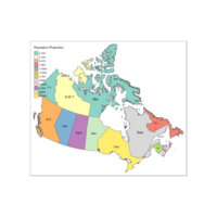
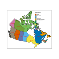
qtm(provMap, fill = "PREABBR", style = "col_blind",text ="Prop", text.root=2, text.col = "black", fill.title="%age Pop. 2014") +
tm_legend(legend.position = c("right", "top"),
main.title = "My title",
main.title.position = "right", "top")

Plot Percentage Population
Percentage Population and Province Name
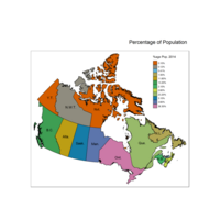
Plot with Right Legend
Some provinces have no data
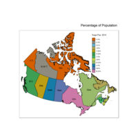
Plot Legend moved
Legend moved showing percentage of population
Plot of Custom Legend
Legend title Choropleth
Plot in a Different Multi Hue
# Colorbrewer2.org
#Code also shows how to save as jpg
################
## Loading packages
library(rgdal)
library(plyr)
library(rgeos)
library(maps)
library(maptools)
library(mapdata)
library(ggplot2)
library(RColorBrewer)
library(foreign)
library(sp)
library(scales)
library(readr)
library(tmap)
library(tmaptools)
getwd()
#Step 1
myProv <- readOGR(dsn="Prov", layer="provFile")
myProvgeo <- read_shape(file= "Prov/provFile.shp", as.sf = TRUE)
ProvCenDataC <- read_csv("Prov/ProvCenDataC.csv") # u must order the data
myProv.fort <- fortify(myProv, region = "PRUID") # Long time; #creastes more observ.
idList <- myProv@data$PRUID
centroids.df <- as.data.frame(coordinates(myProv))
names(centroids.df) <- c("Longitude", "Latitude") #more sensible column names
mydataC.df <-data.frame(id=idList, ProvCenDataC, centroids.df)
#TRY PLOTTING MAP
ggplot(myProv.fort, aes(long, lat))+
geom_polygon(data= NULL, aes(group = group), colour = 'blue', fill=NA ) +
geom_text(data = mydataC.df, aes(Longitude, Latitude, label = Population), size =4, colour ='red')
#################################
qtm(myProv) #produces map
qtm(myProvgeo) # produces a map
#qtm(myProv.fort) # Cannot be plotted by qtm
selmyProv <- myProv[myProv$PRUID ==10,]# select NewFoundland
qtm(selmyProv) #Draw NewFoundland
selmyProv <- myProv[myProv$PRUID ==11,]# Prince Edward
qtm(selmyProv) #Draw PEI
selmyProv <- myProv[myProv$PRUID ==12,]# Nova Scotia
qtm(selmyProv) #Draw NSc
selmyProv <- myProv[myProv$PRUID ==13,]# New Brunswick
qtm(selmyProv) #Draw NB
selmyProv <- myProv[myProv$PRUID ==24,]# Qubec
qtm(selmyProv) #Draw QC
selmyProv <- myProv[myProv$PRUID ==35,]# Ontario
qtm(selmyProv) #Draw On
selmyProv <- myProv[myProv$PRUID ==46,]# Manitoba
qtm(selmyProv) #Draw MB
selmyProv <- myProv[myProv$PRUID ==47,]# Saska
qtm(selmyProv) #Draw SW
selmyProv <- myProv[myProv$PRUID ==48,]# AB
qtm(selmyProv) #Draw AB
selmyProv <- myProv[myProv$PRUID ==59,]# BC
qtm(selmyProv) #Draw BC
selmyProv <- myProv[myProv$PRUID ==60,]# YK
qtm(selmyProv) #Draw YK
selmyProv <- myProv[myProv$PRUID ==61,]# NW
qtm(selmyProv) #Draw NW
selmyProv <- myProv[myProv$PRUID ==62,]# NT
qtm(selmyProv) #Draw NT
############################
qtm(myProv) #produces map
qtm(myProvgeo) # produces a map
#qtm(myProv.fort) # Cannot be plotted by qtm
selmyProvgeo <- myProvgeo[myProv$PRUID ==10,]# select NewFoundland
qtm(selmyProvgeo) #Draw NewFoundland
###########################################
#Make the datatype identical
myProvgeo$PRUID <- as.character(myProvgeo$PRUID)
mydataC.df$PRUID <- as.character(mydataC.df$PRUID)
myProv$PRUID <- as.character(myProv$PRUID)
#Order the rows BUt already ordered
myProvgeo<- myProvgeo[order(myProvgeo$PRUID),]
mydataC.df <- mydataC.df[order(mydataC.df$PRUID),]
#Then Compare
identical(myProvgeo$PRUID,mydataC.df$PRUID)
identical(myProv$PRUID,mydataC.df$PRUID)
#nhmap <- append_data(nhgeo, nhdata, key.shp = "NAME", key.data="County")
provMapB <-append_data(myProvgeo, mydataC.df, key.shp ="PRUID", key.data= "PRUID")
provMap <-append_data(myProv, mydataC.df, key.shp ="PRUID", key.data= "PRUID")
qtm(provMapB, "Population") #quick map strange units
qtm(provMap, "Prop") #quick map strange units
#############MORE CONTROL ####################
#
tm_shape(provMap) +
tm_fill("Prop", title = "Provincial Population", palette ="BuPu") +
tm_borders(alpha=.5) +
tm_text("Population", size = 0.5)#+
# tm_style_classic()
#put plot in variable
provMapVari <- tm_shape(provMap) +
tm_fill("Growth", title = "Provincial Population", palette = "BuGn") +
tm_borders(alpha=.5) +
tm_text("Population", size = 0.5)#+
#tm_style_classic()
provMapVari #call the plotting variable
save_tmap(provMapVari, filename="provMapVari.jpg") # then save the plot
Plot with Multi hue Scheme
Note Commented Plot
################
## Loading packages
library(rgdal)
library(plyr)
library(rgeos)
library(maps)
library(maptools)
library(mapdata)
library(ggplot2)
library(RColorBrewer)
library(foreign)
library(sp)
library(scales)
library(readr)
library(tmap)
library(tmaptools)
getwd()
#Step 1
myProv <- readOGR(dsn="Prov", layer="provFile")
myProvgeo <- read_shape(file= "Prov/provFile.shp", as.sf = TRUE)
ProvCenDataC <- read_csv("Prov/ProvCenDataC.csv") # u must order the data
myProv.fort <- fortify(myProv, region = "PRUID") # Long time; #creastes more observ.
idList <- myProv@data$PRUID
centroids.df <- as.data.frame(coordinates(myProv))
names(centroids.df) <- c("Longitude", "Latitude") #more sensible column names
mydataC.df <-data.frame(id=idList, ProvCenDataC, centroids.df)
#TRY PLOTTING MAP
ggplot(myProv.fort, aes(long, lat))+
geom_polygon(data= NULL, aes(group = group), colour = 'blue', fill=NA ) +
geom_text(data = mydataC.df, aes(Longitude, Latitude, label = Population), size =4, colour ='red')
#################################
qtm(myProv) #produces map
qtm(myProvgeo) # produces a map
#qtm(myProv.fort) # Cannot be plotted by qtm
selmyProv <- myProv[myProv$PRUID ==10,]# select NewFoundland
qtm(selmyProv) #Draw NewFoundland
selmyProv <- myProv[myProv$PRUID ==11,]# Prince Edward
qtm(selmyProv) #Draw PEI
selmyProv <- myProv[myProv$PRUID ==12,]# Nova Scotia
qtm(selmyProv) #Draw NSc
selmyProv <- myProv[myProv$PRUID ==13,]# New Brunswick
qtm(selmyProv) #Draw NB
selmyProv <- myProv[myProv$PRUID ==24,]# Qubec
qtm(selmyProv) #Draw QC
selmyProv <- myProv[myProv$PRUID ==35,]# Ontario
qtm(selmyProv) #Draw On
selmyProv <- myProv[myProv$PRUID ==46,]# Manitoba
qtm(selmyProv) #Draw MB
selmyProv <- myProv[myProv$PRUID ==47,]# Saska
qtm(selmyProv) #Draw SW
selmyProv <- myProv[myProv$PRUID ==48,]# AB
qtm(selmyProv) #Draw AB
selmyProv <- myProv[myProv$PRUID ==59,]# BC
qtm(selmyProv) #Draw BC
selmyProv <- myProv[myProv$PRUID ==60,]# YK
qtm(selmyProv) #Draw YK
selmyProv <- myProv[myProv$PRUID ==61,]# NW
qtm(selmyProv) #Draw NW
selmyProv <- myProv[myProv$PRUID ==62,]# NT
qtm(selmyProv) #Draw NT
############################
qtm(myProv) #produces map
qtm(myProvgeo) # produces a map
#qtm(myProv.fort) # Cannot be plotted by qtm
selmyProvgeo <- myProvgeo[myProv$PRUID ==10,]# select NewFoundland
qtm(selmyProvgeo) #Draw NewFoundland
###########################################
#Make the datatype identical
myProvgeo$PRUID <- as.character(myProvgeo$PRUID)
mydataC.df$PRUID <- as.character(mydataC.df$PRUID)
myProv$PRUID <- as.character(myProv$PRUID)
#Order the rows BUt already ordered
myProvgeo<- myProvgeo[order(myProvgeo$PRUID),]
mydataC.df <- mydataC.df[order(mydataC.df$PRUID),]
#Then Compare
identical(myProvgeo$PRUID,mydataC.df$PRUID)
identical(myProv$PRUID,mydataC.df$PRUID)
#nhmap <- append_data(nhgeo, nhdata, key.shp = "NAME", key.data="County")
provMapB <-append_data(myProvgeo, mydataC.df, key.shp ="PRUID", key.data= "PRUID")
provMap <-append_data(myProv, mydataC.df, key.shp ="PRUID", key.data= "PRUID")
qtm(provMapB, "Population") #quick map strange units
qtm(provMap, "Prop") #quick map strange units
#############MORE CONTROL ####################
#
tm_shape(provMap) +
tm_fill("Prop", title = "Provincial Population", palette ="BuPu") +
tm_borders(alpha=.5) +
tm_text("Population", size = 0.5)#+
# tm_style_classic()

Plot To view my Shinny apps
Links
1.https://neka.shinyapps.io/01_hello/
Plot Population and Percentage as variables
#Provincial Population is text and Percentage is Color
################
## Loading packages
library(rgdal)
library(plyr)
library(rgeos)
library(maps)
library(maptools)
library(mapdata)
library(ggplot2)
library(RColorBrewer)
library(foreign)
library(sp)
library(scales)
library(readr)
library(tmap)
library(tmaptools)
getwd()
#Step 1
myProv <- readOGR(dsn="Prov", layer="provFile")
myProvgeo <- read_shape(file= "Prov/provFile.shp", as.sf = TRUE)
ProvCenDataC <- read_csv("Prov/ProvCenDataC.csv") # u must order the data
myProv.fort <- fortify(myProv, region = "PRUID") # Long time; #creastes more observ.
idList <- myProv@data$PRUID
centroids.df <- as.data.frame(coordinates(myProv))
names(centroids.df) <- c("Longitude", "Latitude") #more sensible column names
mydataC.df <-data.frame(id=idList, ProvCenDataC, centroids.df)
#TRY PLOTTING MAP
ggplot(myProv.fort, aes(long, lat))+
geom_polygon(data= NULL, aes(group = group), colour = 'blue', fill=NA ) +
geom_text(data = mydataC.df, aes(Longitude, Latitude, label = Population), size =4, colour ='red')
#################################
qtm(myProv) #produces map
qtm(myProvgeo) # produces a map
#qtm(myProv.fort) # Cannot be plotted by qtm
selmyProv <- myProv[myProv$PRUID ==10,]# select NewFoundland
qtm(selmyProv) #Draw NewFoundland
selmyProv <- myProv[myProv$PRUID ==11,]# Prince Edward
qtm(selmyProv) #Draw PEI
selmyProv <- myProv[myProv$PRUID ==12,]# Nova Scotia
qtm(selmyProv) #Draw NSc
selmyProv <- myProv[myProv$PRUID ==13,]# New Brunswick
qtm(selmyProv) #Draw NB
selmyProv <- myProv[myProv$PRUID ==24,]# Qubec
qtm(selmyProv) #Draw QC
selmyProv <- myProv[myProv$PRUID ==35,]# Ontario
qtm(selmyProv) #Draw On
selmyProv <- myProv[myProv$PRUID ==46,]# Manitoba
qtm(selmyProv) #Draw MB
selmyProv <- myProv[myProv$PRUID ==47,]# Saska
qtm(selmyProv) #Draw SW
selmyProv <- myProv[myProv$PRUID ==48,]# AB
qtm(selmyProv) #Draw AB
selmyProv <- myProv[myProv$PRUID ==59,]# BC
qtm(selmyProv) #Draw BC
selmyProv <- myProv[myProv$PRUID ==60,]# YK
qtm(selmyProv) #Draw YK
selmyProv <- myProv[myProv$PRUID ==61,]# NW
qtm(selmyProv) #Draw NW
selmyProv <- myProv[myProv$PRUID ==62,]# NT
qtm(selmyProv) #Draw NT
############################
qtm(myProv) #produces map
qtm(myProvgeo) # produces a map
#qtm(myProv.fort) # Cannot be plotted by qtm
selmyProvgeo <- myProvgeo[myProv$PRUID ==10,]# select NewFoundland
qtm(selmyProvgeo) #Draw NewFoundland
###########################################
#Make the datatype identical
myProvgeo$PRUID <- as.character(myProvgeo$PRUID)
mydataC.df$PRUID <- as.character(mydataC.df$PRUID)
myProv$PRUID <- as.character(myProv$PRUID)
#Order the rows BUt already ordered
myProvgeo<- myProvgeo[order(myProvgeo$PRUID),]
mydataC.df <- mydataC.df[order(mydataC.df$PRUID),]
#Then Compare
identical(myProvgeo$PRUID,mydataC.df$PRUID)
identical(myProv$PRUID,mydataC.df$PRUID)
#nhmap <- append_data(nhgeo, nhdata, key.shp = "NAME", key.data="County")
provMapB <-append_data(myProvgeo, mydataC.df, key.shp ="PRUID", key.data= "PRUID")
provMap <-append_data(myProv, mydataC.df, key.shp ="PRUID", key.data= "PRUID")
qtm(provMapB, "Population") #quick map strange units
qtm(provMap, "Prop") #quick map strange units
#############MORE CONTROL ####################
tm_shape(provMap) +
tm_fill("Prop", title = "Provincial Population", palette = "PRGn") +
tm_borders(alpha=.5) +
tm_text("Population", size = 0.5)+
tm_style_classic()

Plot Showing Provincial Population and by Percent
################
## Loading packages
library(rgdal)
library(plyr)
library(rgeos)
library(maps)
library(maptools)
library(mapdata)
library(ggplot2)
library(RColorBrewer)
library(foreign)
library(sp)
library(scales)
library(readr)
library(tmap)
library(tmaptools)
getwd()
#Step 1
myProv <- readOGR(dsn="Prov", layer="provFile")
myProvgeo <- read_shape(file= "Prov/provFile.shp", as.sf = TRUE)
ProvCenDataC <- read_csv("Prov/ProvCenDataC.csv") # u must order the data
myProv.fort <- fortify(myProv, region = "PRUID") # Long time; #creastes more observ.
idList <- myProv@data$PRUID
centroids.df <- as.data.frame(coordinates(myProv))
names(centroids.df) <- c("Longitude", "Latitude") #more sensible column names
mydataC.df <-data.frame(id=idList, ProvCenDataC, centroids.df)
#TRY PLOTTING MAP
ggplot(myProv.fort, aes(long, lat))+
geom_polygon(data= NULL, aes(group = group), colour = 'blue', fill=NA ) +
geom_text(data = mydataC.df, aes(Longitude, Latitude, label = Population), size =4, colour ='red')
#################################
qtm(myProv) #produces map
qtm(myProvgeo) # produces a map
#qtm(myProv.fort) # Cannot be plotted by qtm
selmyProv <- myProv[myProv$PRUID ==10,]# select NewFoundland
qtm(selmyProv) #Draw NewFoundland
selmyProv <- myProv[myProv$PRUID ==11,]# Prince Edward
qtm(selmyProv) #Draw PEI
selmyProv <- myProv[myProv$PRUID ==12,]# Nova Scotia
qtm(selmyProv) #Draw NSc
selmyProv <- myProv[myProv$PRUID ==13,]# New Brunswick
qtm(selmyProv) #Draw NB
selmyProv <- myProv[myProv$PRUID ==24,]# Qubec
qtm(selmyProv) #Draw QC
selmyProv <- myProv[myProv$PRUID ==35,]# Ontario
qtm(selmyProv) #Draw On
selmyProv <- myProv[myProv$PRUID ==46,]# Manitoba
qtm(selmyProv) #Draw MB
selmyProv <- myProv[myProv$PRUID ==47,]# Saska
qtm(selmyProv) #Draw SW
selmyProv <- myProv[myProv$PRUID ==48,]# AB
qtm(selmyProv) #Draw AB
selmyProv <- myProv[myProv$PRUID ==59,]# BC
qtm(selmyProv) #Draw BC
selmyProv <- myProv[myProv$PRUID ==60,]# YK
qtm(selmyProv) #Draw YK
selmyProv <- myProv[myProv$PRUID ==61,]# NW
qtm(selmyProv) #Draw NW
selmyProv <- myProv[myProv$PRUID ==62,]# NT
qtm(selmyProv) #Draw NT
############################
qtm(myProv) #produces map
qtm(myProvgeo) # produces a map
#qtm(myProv.fort) # Cannot be plotted by qtm
selmyProvgeo <- myProvgeo[myProv$PRUID ==10,]# select NewFoundland
qtm(selmyProvgeo) #Draw NewFoundland
###########################################
#Make the datatype identical
myProvgeo$PRUID <- as.character(myProvgeo$PRUID)
mydataC.df$PRUID <- as.character(mydataC.df$PRUID)
myProv$PRUID <- as.character(myProv$PRUID)
#Order the rows BUt already ordered
myProvgeo<- myProvgeo[order(myProvgeo$PRUID),]
mydataC.df <- mydataC.df[order(mydataC.df$PRUID),]
#Then Compare
identical(myProvgeo$PRUID,mydataC.df$PRUID)
identical(myProv$PRUID,mydataC.df$PRUID)
#nhmap <- append_data(nhgeo, nhdata, key.shp = "NAME", key.data="County")
provMapB <-append_data(myProvgeo, mydataC.df, key.shp ="PRUID", key.data= "PRUID")
provMap <-append_data(myProv, mydataC.df, key.shp ="PRUID", key.data= "PRUID")
qtm(provMapB, "Population") #quick map strange units
qtm(provMap, "Prop") #quick map strange units
#############MORE CONTROL ####################
tm_shape(provMap) +
tm_fill("Prop", title = "Provincial Population", palette = "RdYlGn") +
tm_borders(alpha=.5) +
tm_text("Population", size = 0.5)+
tm_style_classic()
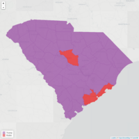
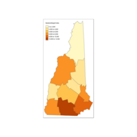
Provicial Percentage of Canada Population
#How do i move the legend???
################
## Loading packages
library(rgdal)
library(plyr)
library(rgeos)
library(maps)
library(maptools)
library(mapdata)
library(ggplot2)
library(RColorBrewer)
library(foreign)
library(sp)
library(scales)
library(readr)
library(tmap)
library(tmaptools)
getwd()
#Step 1
myProv <- readOGR(dsn="Prov", layer="provFile")
myProvgeo <- read_shape(file= "Prov/provFile.shp", as.sf = TRUE)
ProvCenDataC <- read_csv("Prov/ProvCenDataC.csv") # u must order the data
myProv.fort <- fortify(myProv, region = "PRUID") # Long time; #creastes more observ.
idList <- myProv@data$PRUID
centroids.df <- as.data.frame(coordinates(myProv))
names(centroids.df) <- c("Longitude", "Latitude") #more sensible column names
mydataC.df <-data.frame(id=idList, ProvCenDataC, centroids.df)
#TRY PLOTTING MAP
ggplot(myProv.fort, aes(long, lat))+
geom_polygon(data= NULL, aes(group = group), colour = 'blue', fill=NA ) +
geom_text(data = mydataC.df, aes(Longitude, Latitude, label = Population), size =4, colour ='red')
#################################
qtm(myProv) #produces map
qtm(myProvgeo) # produces a map
#qtm(myProv.fort) # Cannot be plotted by qtm
selmyProv <- myProv[myProv$PRUID ==10,]# select NewFoundland
qtm(selmyProv) #Draw NewFoundland
selmyProv <- myProv[myProv$PRUID ==11,]# Prince Edward
qtm(selmyProv) #Draw PEI
selmyProv <- myProv[myProv$PRUID ==12,]# Nova Scotia
qtm(selmyProv) #Draw NSc
selmyProv <- myProv[myProv$PRUID ==13,]# New Brunswick
qtm(selmyProv) #Draw NB
selmyProv <- myProv[myProv$PRUID ==24,]# Qubec
qtm(selmyProv) #Draw QC
selmyProv <- myProv[myProv$PRUID ==35,]# Ontario
qtm(selmyProv) #Draw On
selmyProv <- myProv[myProv$PRUID ==46,]# Manitoba
qtm(selmyProv) #Draw MB
selmyProv <- myProv[myProv$PRUID ==47,]# Saska
qtm(selmyProv) #Draw SW
selmyProv <- myProv[myProv$PRUID ==48,]# AB
qtm(selmyProv) #Draw AB
selmyProv <- myProv[myProv$PRUID ==59,]# BC
qtm(selmyProv) #Draw BC
selmyProv <- myProv[myProv$PRUID ==60,]# YK
qtm(selmyProv) #Draw YK
selmyProv <- myProv[myProv$PRUID ==61,]# NW
qtm(selmyProv) #Draw NW
selmyProv <- myProv[myProv$PRUID ==62,]# NT
qtm(selmyProv) #Draw NT
############################
qtm(myProv) #produces map
qtm(myProvgeo) # produces a map
#qtm(myProv.fort) # Cannot be plotted by qtm
selmyProvgeo <- myProvgeo[myProv$PRUID ==10,]# select NewFoundland
qtm(selmyProvgeo) #Draw NewFoundland
###########################################
#Make the datatype identical
myProvgeo$PRUID <- as.character(myProvgeo$PRUID)
mydataC.df$PRUID <- as.character(mydataC.df$PRUID)
myProv$PRUID <- as.character(myProv$PRUID)
#Order the rows BUt already ordered
myProvgeo<- myProvgeo[order(myProvgeo$PRUID),]
mydataC.df <- mydataC.df[order(mydataC.df$PRUID),]
#Then Compare
identical(myProvgeo$PRUID,mydataC.df$PRUID)
identical(myProv$PRUID,mydataC.df$PRUID)
#nhmap <- append_data(nhgeo, nhdata, key.shp = "NAME", key.data="County")
provMapB <-append_data(myProvgeo, mydataC.df, key.shp ="PRUID", key.data= "PRUID")
provMap <-append_data(myProv, mydataC.df, key.shp ="PRUID", key.data= "PRUID")
qtm(provMapB, "Population") #quick map strange units
qtm(provMap, "Prop") #quick map strange units

Plot of Percentage Change
No Idea why it is truncated
################
## Loading packages
library(rgdal)
library(plyr)
library(rgeos)
library(maps)
library(maptools)
library(mapdata)
library(ggplot2)
library(RColorBrewer)
library(foreign)
library(sp)
library(scales)
library(readr)
library(tmap)
library(tmaptools)
getwd()
#Step 1
myProv <- readOGR(dsn="Prov", layer="provFile")
myProvgeo <- read_shape(file= "Prov/provFile.shp", as.sf = TRUE)
ProvCenDataC <- read_csv("Prov/ProvCenDataC.csv") # u must order the data
myProv.fort <- fortify(myProv, region = "PRUID") # Long time; #creastes more observ.
idList <- myProv@data$PRUID
centroids.df <- as.data.frame(coordinates(myProv))
names(centroids.df) <- c("Longitude", "Latitude") #more sensible column names
mydataC.df <-data.frame(id=idList, ProvCenDataC, centroids.df)
#TRY PLOTTING MAP
ggplot(myProv.fort, aes(long, lat))+
geom_polygon(data= NULL, aes(group = group), colour = 'blue', fill=NA ) +
geom_text(data = mydataC.df, aes(Longitude, Latitude, label = Population), size =4, colour ='red')
#################################
qtm(myProv) #produces map
qtm(myProvgeo) # produces a map
#qtm(myProv.fort) # Cannot be plotted by qtm
selmyProv <- myProv[myProv$PRUID ==10,]# select NewFoundland
qtm(selmyProv) #Draw NewFoundland
selmyProv <- myProv[myProv$PRUID ==11,]# Prince Edward
qtm(selmyProv) #Draw PEI
selmyProv <- myProv[myProv$PRUID ==12,]# Nova Scotia
qtm(selmyProv) #Draw NSc
selmyProv <- myProv[myProv$PRUID ==13,]# New Brunswick
qtm(selmyProv) #Draw NB
selmyProv <- myProv[myProv$PRUID ==24,]# Qubec
qtm(selmyProv) #Draw QC
selmyProv <- myProv[myProv$PRUID ==35,]# Ontario
qtm(selmyProv) #Draw On
selmyProv <- myProv[myProv$PRUID ==46,]# Manitoba
qtm(selmyProv) #Draw MB
selmyProv <- myProv[myProv$PRUID ==47,]# Saska
qtm(selmyProv) #Draw SW
selmyProv <- myProv[myProv$PRUID ==48,]# AB
qtm(selmyProv) #Draw AB
selmyProv <- myProv[myProv$PRUID ==59,]# BC
qtm(selmyProv) #Draw BC
selmyProv <- myProv[myProv$PRUID ==60,]# YK
qtm(selmyProv) #Draw YK
selmyProv <- myProv[myProv$PRUID ==61,]# NW
qtm(selmyProv) #Draw NW
selmyProv <- myProv[myProv$PRUID ==62,]# NT
qtm(selmyProv) #Draw NT
############################
qtm(myProv) #produces map
qtm(myProvgeo) # produces a map
#qtm(myProv.fort) # Cannot be plotted by qtm
selmyProvgeo <- myProvgeo[myProv$PRUID ==10,]# select NewFoundland
qtm(selmyProvgeo) #Draw NewFoundland
###########################################
#Make the datatype identical
myProvgeo$PRUID <- as.character(myProvgeo$PRUID)
mydataC.df$PRUID <- as.character(mydataC.df$PRUID)
myProv$PRUID <- as.character(myProv$PRUID)
#Order the rows BUt already ordered
myProvgeo<- myProvgeo[order(myProvgeo$PRUID),]
mydataC.df <- mydataC.df[order(mydataC.df$PRUID),]
#Then Compare
identical(myProvgeo$PRUID,mydataC.df$PRUID)
identical(myProv$PRUID,mydataC.df$PRUID)
#nhmap <- append_data(nhgeo, nhdata, key.shp = "NAME", key.data="County")
provMap <-append_data(myProvgeo, mydataC.df, key.shp ="PRUID", key.data= "PRUID")
provMap <-append_data(myProv, mydataC.df, key.shp ="PRUID", key.data= "PRUID")
qtm(provMap, "Population") #quick map strange units
qtm(provMap, "Prop") #quick map strange units
Plot Percentage of Popultaiton
No idea where units are coming from
Need more packages
################
## Loading packages
library(rgdal)
library(plyr)
library(rgeos)
library(maps)
library(maptools)
library(mapdata)
library(ggplot2)
library(RColorBrewer)
library(foreign)
library(sp)
library(scales)
library(readr)
library(tmap)
library(tmaptools)
getwd()
#Step 1
myProv <- readOGR(dsn="Prov", layer="provFile")
myProvgeo <- read_shape(file= "Prov/provFile.shp", as.sf = TRUE)
ProvCenDataC <- read_csv("Prov/ProvCenDataC.csv") # u must order the data
myProv.fort <- fortify(myProv, region = "PRUID") # Long time; #creastes more observ.
idList <- myProv@data$PRUID
centroids.df <- as.data.frame(coordinates(myProv))
names(centroids.df) <- c("Longitude", "Latitude") #more sensible column names
mydataC.df <-data.frame(id=idList, ProvCenDataC, centroids.df)
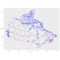
#TRY PLOTTING MAP
ggplot(myProv.fort, aes(long, lat))+
geom_polygon(data= NULL, aes(group = group), colour = 'blue', fill=NA ) +
geom_text(data = mydataC.df, aes(Longitude, Latitude, label = Population), size =4, colour ='red')
#################################
qtm(myProv) #produces map
qtm(myProvgeo) # produces a map
#qtm(myProv.fort) # Cannot be plotted by qtm
selmyProv <- myProv[myProv$PRUID ==10,]# select NewFoundland
qtm(selmyProv) #Draw NewFoundland
selmyProv <- myProv[myProv$PRUID ==11,]# Prince Edward
qtm(selmyProv) #Draw PEI
selmyProv <- myProv[myProv$PRUID ==12,]# Nova Scotia
qtm(selmyProv) #Draw NSc
selmyProv <- myProv[myProv$PRUID ==13,]# New Brunswick
qtm(selmyProv) #Draw NB
selmyProv <- myProv[myProv$PRUID ==24,]# Qubec
qtm(selmyProv) #Draw QC
selmyProv <- myProv[myProv$PRUID ==35,]# Ontario
qtm(selmyProv) #Draw On
selmyProv <- myProv[myProv$PRUID ==46,]# Manitoba
qtm(selmyProv) #Draw MB
selmyProv <- myProv[myProv$PRUID ==47,]# Saska
qtm(selmyProv) #Draw SW
selmyProv <- myProv[myProv$PRUID ==48,]# AB
qtm(selmyProv) #Draw AB
selmyProv <- myProv[myProv$PRUID ==59,]# BC
qtm(selmyProv) #Draw BC
selmyProv <- myProv[myProv$PRUID ==60,]# YK
qtm(selmyProv) #Draw YK
selmyProv <- myProv[myProv$PRUID ==61,]# NW
qtm(selmyProv) #Draw NW
selmyProv <- myProv[myProv$PRUID ==62,]# NT
qtm(selmyProv) #Draw NT
############################
qtm(myProv) #produces map
qtm(myProvgeo) # produces a map
#qtm(myProv.fort) # Cannot be plotted by qtm
selmyProvgeo <- myProvgeo[myProv$PRUID ==10,]# select NewFoundland
qtm(selmyProvgeo) #Draw NewFoundland
###########################################
#Make the datatype identical
myProvgeo$PRUID <- as.character(myProvgeo$PRUID)
mydataC.df$PRUID <- as.character(mydataC.df$PRUID)
myProv$PRUID <- as.character(myProv$PRUID)
#Order the rows BUt already ordered
myProvgeo<- myProvgeo[order(myProvgeo$PRUID),]
mydataC.df <- mydataC.df[order(mydataC.df$PRUID),]
#Then Compare
identical(myProvgeo$PRUID,mydataC.df$PRUID)
identical(myProv$PRUID,mydataC.df$PRUID)
#nhmap <- append_data(nhgeo, nhdata, key.shp = "NAME", key.data="County")
provMap <-append_data(myProvgeo, mydataC.df, key.shp ="PRUID", key.data= "PRUID")
provMap <-append_data(myProv, mydataC.df, key.shp ="PRUID", key.data= "PRUID")
qtm(provMap, "Population") #quick map strange units
qtm(provMap, "Prop") #quick map strange units
Plot Canada by Population
Problem - units - no idea where it got it from ;-(
################
## Loading packages
library(rgdal)
library(plyr)
library(rgeos)
library(maps)
library(maptools)
library(mapdata)
library(ggplot2)
library(RColorBrewer)
library(foreign)
library(sp)
library(scales)
library(readr)
library(tmap)
library(tmaptools)
getwd()
#Step 1
myProv <- readOGR(dsn="Prov", layer="provFile")
myProvgeo <- read_shape(file= "Prov/provFile.shp", as.sf = TRUE)
ProvCenDataC <- read_csv("Prov/ProvCenDataC.csv") # u must order the data
myProv.fort <- fortify(myProv, region = "PRUID") # Long time; #creastes more observ.
idList <- myProv@data$PRUID
centroids.df <- as.data.frame(coordinates(myProv))
names(centroids.df) <- c("Longitude", "Latitude") #more sensible column names
mydataC.df <-data.frame(id=idList, ProvCenDataC, centroids.df)
#TRY PLOTTING MAP
ggplot(myProv.fort, aes(long, lat))+
geom_polygon(data= NULL, aes(group = group), colour = 'blue', fill=NA ) +
geom_text(data = mydataC.df, aes(Longitude, Latitude, label = Population), size =4, colour ='red')
#################################
#Plotting individual Provincies
qtm(myProv) #produces map
qtm(myProvgeo) # produces a map
#qtm(myProv.fort) # Cannot be plotted by qtm
selmyProv <- myProv[myProv$PRUID ==10,]# select NewFoundland
qtm(selmyProv) #Draw NewFoundland
selmyProv <- myProv[myProv$PRUID ==11,]# Prince Edward
qtm(selmyProv) #Draw PEI
selmyProv <- myProv[myProv$PRUID ==12,]# Nova Scotia
qtm(selmyProv) #Draw NSc
selmyProv <- myProv[myProv$PRUID ==13,]# New Brunswick
qtm(selmyProv) #Draw NB
selmyProv <- myProv[myProv$PRUID ==24,]# Qubec
qtm(selmyProv) #Draw QC
selmyProv <- myProv[myProv$PRUID ==35,]# Ontario
qtm(selmyProv) #Draw On
selmyProv <- myProv[myProv$PRUID ==46,]# Manitoba
qtm(selmyProv) #Draw MB
selmyProv <- myProv[myProv$PRUID ==47,]# Saska
qtm(selmyProv) #Draw SW
selmyProv <- myProv[myProv$PRUID ==48,]# AB
qtm(selmyProv) #Draw AB
selmyProv <- myProv[myProv$PRUID ==59,]# BC
qtm(selmyProv) #Draw BC
selmyProv <- myProv[myProv$PRUID ==60,]# YK
qtm(selmyProv) #Draw YK
selmyProv <- myProv[myProv$PRUID ==61,]# NW
qtm(selmyProv) #Draw NW
selmyProv <- myProv[myProv$PRUID ==62,]# NT
qtm(selmyProv) #Draw NT
############################
qtm(myProv) #produces map
qtm(myProvgeo) # produces a map
#qtm(myProv.fort) # Cannot be plotted by qtm
selmyProvgeo <- myProvgeo[myProv$PRUID ==10,]# select NewFoundland
qtm(selmyProvgeo) #Draw NewFoundland
###########################################
#Make the datatype identical
myProvgeo$PRUID <- as.character(myProvgeo$PRUID)
mydataC.df$PRUID <- as.character(mydataC.df$PRUID)
myProv$PRUID <- as.character(myProv$PRUID)
#Order the rows BUt already ordered
myProvgeo<- myProvgeo[order(myProvgeo$PRUID),]
mydataC.df <- mydataC.df[order(mydataC.df$PRUID),]
#Then Compare
identical(myProvgeo$PRUID,mydataC.df$PRUID)
identical(myProv$PRUID,mydataC.df$PRUID)
#Then apppend data
provMap <-append_data(myProvgeo, mydataC.df, key.shp ="PRUID", key.data= "PRUID") # not working
provMap <-append_data(myProv, mydataC.df, key.shp ="PRUID", key.data= "PRUID")
qtm(provMap, "Population") #works give strange uniits
Plot Individual Provinces
################
## Loading packages
library(rgdal)
library(plyr)
library(rgeos)
library(maps)
library(maptools)
library(mapdata)
library(ggplot2)
library(RColorBrewer)
library(foreign)
library(sp)
library(scales)
library(readr)
library(tmap)
getwd()
#Step 1
myProv <- readOGR(dsn="Prov", layer="provFile")
myProvgeo <- read_shape(file= "Prov/provFile.shp", as.sf = TRUE)
ProvCenDataC <- read_csv("Prov/ProvCenDataC.csv") # u must order the data
myProv.fort <- fortify(myProv, region = "PRUID") # Long time; #creastes more observ.
idList <- myProv@data$PRUID
centroids.df <- as.data.frame(coordinates(myProv))
names(centroids.df) <- c("Longitude", "Latitude") #more sensible column names
mydataC.df <-data.frame(id=idList, ProvCenDataC, centroids.df)
#TRY PLOTTING MAP
ggplot(myProv.fort, aes(long, lat))+
geom_polygon(data= NULL, aes(group = group), colour = 'blue', fill=NA ) +
geom_text(data = mydataC.df, aes(Longitude, Latitude, label = Population), size =4, colour ='red')
#################################
qtm(myProv) #produces map
qtm(myProvgeo) # produces a map
#qtm(myProv.fort) # Cannot be plotted by qtm
selmyProv <- myProv[myProv$PRUID ==10,]# select NewFoundland
qtm(selmyProv) #Draw NewFoundland
selmyProv <- myProv[myProv$PRUID ==11,]# Prince Edward
qtm(selmyProv) #Draw PEI
selmyProv <- myProv[myProv$PRUID ==12,]# Nova Scotia
qtm(selmyProv) #Draw NSc
selmyProv <- myProv[myProv$PRUID ==13,]# New Brunswick
qtm(selmyProv) #Draw NB
selmyProv <- myProv[myProv$PRUID ==24,]# Qubec
qtm(selmyProv) #Draw QC
selmyProv <- myProv[myProv$PRUID ==35,]# Ontario
qtm(selmyProv) #Draw On
selmyProv <- myProv[myProv$PRUID ==46,]# Manitoba
qtm(selmyProv) #Draw MB
selmyProv <- myProv[myProv$PRUID ==47,]# Saska
qtm(selmyProv) #Draw SW
selmyProv <- myProv[myProv$PRUID ==48,]# AB
qtm(selmyProv) #Draw AB
selmyProv <- myProv[myProv$PRUID ==59,]# BC
qtm(selmyProv) #Draw BC
selmyProv <- myProv[myProv$PRUID ==60,]# YK
qtm(selmyProv) #Draw YK
selmyProv <- myProv[myProv$PRUID ==61,]# NW
qtm(selmyProv) #Draw NW
selmyProv <- myProv[myProv$PRUID ==62,]# NT
qtm(selmyProv) #Draw NT

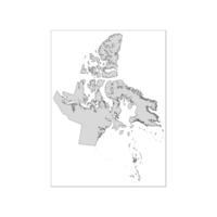
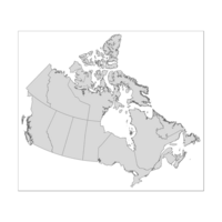
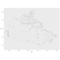
Plot using qtm function of tmap package
# This also produces a shape file
myProvgeo <- read_shape(file= "Prov/provFile.shp", as.sf = TRUE)
qtm(myProvgeo) #this makes a shape file that produces a map
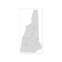
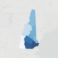
Plot of New Hamshire
USing Subset of World map
Plot stil no additional data
## Loading packages
library(rgdal)
library(plyr)
library(rgeos)
library(maps)
library(maptools)
library(mapdata)
library(ggplot2)
library(RColorBrewer)
library(foreign)
library(sp)
library(scales)
library(readr)
getwd()
##Steps
#1. Read shapefie -- sahpe file-- xD
#2. Fortify Shape file name using .fort - table - 2d
#3. Get ID list from data portion -- file 1D
#4. Get Centroids and name it -- 2D
#5. Get Data from @Data$Col of Interest ---file 1D
#6. Combine and rename id, center and data (pop) -- 2D
#7. Plot the stupid map already
##
#Step 1
myProv <- readOGR(dsn="Prov", layer="provFile")
#Step2
# Change "data" to your path in the above!
myProv.fort <- fortify(myProv, region = "PRUID") # Long time; #creastes more observ.
# Fortifying a map makes the data frame ggplot uses to draw the map outlines.
# "region" or "id" identifies those polygons, and links them to your data.
# Look at head(worldMap@data) to see other choices for id.
# Your data frame needs a column with matching ids to set as the map_id aesthetic in ggplot.
#Step 1B - Data file
#Source https://en.wikipedia.org/wiki/List_of_Canadian_provinces_and_territories_by_population
# Format to clean and save as csv; Note use text to column under data to split column
ProvCenDataC <- read_csv("Prov/ProvCenDataC.csv") # u must order the data
# Step 3 Create ID column
idList <- myProv@data$PRUID
#Step 4 - Get Centroids; name columns
# "coordinates" extracts centroids of the polygons, in the order listed at worldMap@data
centroids.df <- as.data.frame(coordinates(myProv))
names(centroids.df) <- c("Longitude", "Latitude") #more sensible column names
#Step 5 - Assemble Data
# This shapefile contained population data, let's plot it.
mydataC.df <-data.frame(id=idList, ProvCenDataC, centroids.df)
#TRY PLOTTING MAP
ggplot(myProv.fort, aes(long, lat))+
geom_polygon(data= NULL, aes(group = group), colour = 'blue', fill=NA ) +
geom_text(data = mydataC.df, aes(Longitude, Latitude, label = Population), size =4, colour ='red')
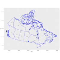
Plot Works Blue Outline
#Size = size of font
## Loading packages
library(rgdal)
library(plyr)
library(rgeos)
library(maps)
library(maptools)
library(mapdata)
library(ggplot2)
library(RColorBrewer)
library(foreign)
library(sp)
library(scales)
library(readr)
getwd()
##Steps
#1. Read shapefie -- sahpe file-- xD
#2. Fortify Shape file name using .fort - table - 2d
#3. Get ID list from data portion -- file 1D
#4. Get Centroids and name it -- 2D
#5. Get Data from @Data$Col of Interest ---file 1D
#6. Combine and rename id, center and data (pop) -- 2D
#7. Plot the stupid map already
##
#Step 1
myProv <- readOGR(dsn="Prov", layer="provFile")
#Step2
# Change "data" to your path in the above!
myProv.fort <- fortify(myProv, region = "PRUID") # Long time; #creastes more observ.
# Fortifying a map makes the data frame ggplot uses to draw the map outlines.
# "region" or "id" identifies those polygons, and links them to your data.
# Look at head(worldMap@data) to see other choices for id.
# Your data frame needs a column with matching ids to set as the map_id aesthetic in ggplot.
#Step 1B - Data file
#Source https://en.wikipedia.org/wiki/List_of_Canadian_provinces_and_territories_by_population
# Format to clean and save as csv; Note use text to column under data to split column
#ProvCenData <- read_csv("ProvCenData.csv")
ProvCenData <- read_csv("Prov/ProvCenData.csv")# unordered
ProvCenDataB <- read_csv("Prov/ProvCenDataB.csv") # u must order the data
ProvCenDataC <- read_csv("Prov/ProvCenDataC.csv") # u must order the data
# Step 3 Create ID column
idList <- myProv@data$PRUID
#Step 4 - Get Centroids; name columns
# "coordinates" extracts centroids of the polygons, in the order listed at worldMap@data
centroids.df <- as.data.frame(coordinates(myProv))
names(centroids.df) <- c("Longitude", "Latitude") #more sensible column names
#Step 5 - Assemble Data
# This shapefile contained population data, let's plot it.
#popList <- worldMap@data$POP2005
#pop.df <- data.frame(id = idList, population = popList, centroids.df)
mydata.df <-data.frame(id=idList, ProvCenData, centroids.df)
mydataC.df <-data.frame(id=idList, ProvCenDataC, centroids.df)
#TRY PLOTTING MAP
ggplot(myProv.fort, aes(long, lat))+
geom_polygon(aes(group = group), colour = 'blue', fill=NA ) +
geom_text(data = mydataC.df, aes(Longitude, Latitude, label = Population), size =2)
Plot Using Canada Data
The code works
The rest is to figure aesthetics
Plot colored
Table still showing
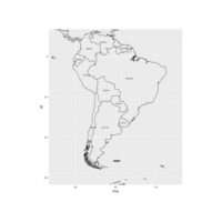
Plot of Brazil Population No color
# Trying this https://stackoverflow.com/questions/22038640/labeling-center-of-map-polygons-in-r-ggplot
## Loading packages
library(rgdal)
library(plyr)
library(rgeos)
library(maps)
library(maptools)
library(mapdata)
library(ggplot2)
library(RColorBrewer)
library(foreign)
library(sp)
library(scales)
##Steps
#1. Read shapefie -- sahpe file-- xD
#2. Fortify Shape file name using .fort - table - 2d
#3. Get ID list from data portion -- file 1D
#4. Get Centroids and name it -- 2D
#5. Get Data from @Data$Col of Interest ---file 1D
#6. Combine and rename id, center and data (pop) -- 2D
#7. Plot the stupid map already
##
# Data from http://thematicmapping.org/downloads/world_borders.php.
# Direct link: http://thematicmapping.org/downloads/TM_WORLD_BORDERS_SIMPL-0.3.zip
# Unpack and put the files in a dir 'data'
worldMap <- readOGR(dsn="data", layer="TM_WORLD_BORDERS_SIMPL-0.3")
# Change "data" to your path in the above!
worldMap.fort <- fortify(world.map, region = "ISO3")
# Fortifying a map makes the data frame ggplot uses to draw the map outlines.
# "region" or "id" identifies those polygons, and links them to your data.
# Look at head(worldMap@data) to see other choices for id.
# Your data frame needs a column with matching ids to set as the map_id aesthetic in ggplot.
idList <- worldMap@data$ISO3
# "coordinates" extracts centroids of the polygons, in the order listed at worldMap@data
centroids.df <- as.data.frame(coordinates(worldMap))
names(centroids.df) <- c("Longitude", "Latitude") #more sensible column names
# This shapefile contained population data, let's plot it.
popList <- worldMap@data$POP2005
pop.df <- data.frame(id = idList, population = popList, centroids.df)
#TRY PLOTTING MAP
ggplot(worldMap.fort, aes(long, lat))+
geom_polygon(aes(group = group), colour = 'black', fill=NA ) +
geom_text(data = pop.df, aes(Longitude, Latitude, label = population), size =2)+
coord_equal(xlim = c(-90,-30), ylim = c(-60, 10))

Plot No idea
What is here
Plot with Population Data
# Trying this https://stackoverflow.com/questions/22038640/labeling-center-of-map-polygons-in-r-ggplot
## Loading packages
library(rgdal)
library(plyr)
library(rgeos)
library(maps)
library(maptools)
library(mapdata)
library(ggplot2)
library(RColorBrewer)
library(foreign)
library(sp)
library(scales)
##Steps
#1. Read shapefie -- sahpe file-- xD
#2. Fortify Shape file name using .fort - table - 2d
#3. Get ID list from data portion -- file 1D
#4. Get Centroids and name it -- 2D
#5. Get Data from @Data$Col of Interest ---file 1D
#6. Combine and rename id, center and data (pop) -- 2D
#7. Plot the stupid map already
##
# Data from http://thematicmapping.org/downloads/world_borders.php.
# Direct link: http://thematicmapping.org/downloads/TM_WORLD_BORDERS_SIMPL-0.3.zip
# Unpack and put the files in a dir 'data'
worldMap <- readOGR(dsn="data", layer="TM_WORLD_BORDERS_SIMPL-0.3")
# Change "data" to your path in the above!
worldMap.fort <- fortify(world.map, region = "ISO3")
# Fortifying a map makes the data frame ggplot uses to draw the map outlines.
# "region" or "id" identifies those polygons, and links them to your data.
# Look at head(worldMap@data) to see other choices for id.
# Your data frame needs a column with matching ids to set as the map_id aesthetic in ggplot.
idList <- worldMap@data$ISO3
# "coordinates" extracts centroids of the polygons, in the order listed at worldMap@data
centroids.df <- as.data.frame(coordinates(worldMap))
names(centroids.df) <- c("Longitude", "Latitude") #more sensible column names
# This shapefile contained population data, let's plot it.
popList <- worldMap@data$POP2005
pop.df <- data.frame(id = idList, population = popList, centroids.df)
#TRY PLOTTING MAP
ggplot(worldMap.fort, aes(long, lat))+
geom_polygon(aes(group = group), colour = 'black', fill=NA ) +
geom_text(data = pop.df, aes(Longitude, Latitude, label = population), size =2)
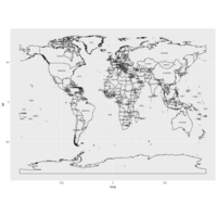
Plot - of World with no Background
Take away - we can control text layer - but not pretty :-)
###
# Trying this https://stackoverflow.com/questions/22038640/labeling-center-of-map-polygons-in-r-ggplot
## Loading packages
library(rgdal)
library(plyr)
library(rgeos)
library(maps)
library(maptools)
library(mapdata)
library(ggplot2)
library(RColorBrewer)
library(foreign)
library(sp)
library(scales)
##Steps
#1. Read shapefie -- sahpe file-- xD
#2. Fortify Shape file name using .fort - table - 2d
#3. Get ID list from data portion -- file 1D
#4. Get Centroids and name it -- 2D
#5. Get Data from @Data$Col of Interest ---file 1D
#6. Combine and rename id, center and data (pop) -- 2D
#7. Plot the stupid map already
##
# Data from http://thematicmapping.org/downloads/world_borders.php.
# Direct link: http://thematicmapping.org/downloads/TM_WORLD_BORDERS_SIMPL-0.3.zip
# Unpack and put the files in a dir 'data'
worldMap <- readOGR(dsn="data", layer="TM_WORLD_BORDERS_SIMPL-0.3")
# Change "data" to your path in the above!
worldMap.fort <- fortify(world.map, region = "ISO3")
# Fortifying a map makes the data frame ggplot uses to draw the map outlines.
# "region" or "id" identifies those polygons, and links them to your data.
# Look at head(worldMap@data) to see other choices for id.
# Your data frame needs a column with matching ids to set as the map_id aesthetic in ggplot.
idList <- worldMap@data$ISO3
# "coordinates" extracts centroids of the polygons, in the order listed at worldMap@data
centroids.df <- as.data.frame(coordinates(worldMap))
names(centroids.df) <- c("Longitude", "Latitude") #more sensible column names
# This shapefile contained population data, let's plot it.
popList <- worldMap@data$POP2005
pop.df <- data.frame(id = idList, population = popList, centroids.df)
#TRY PLOTTING MAP
ggplot(worldMap.fort, aes(long, lat))+
geom_polygon(aes(group = group), colour = 'black', fill= NA ) +
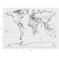
geom_text(data = pop.df, aes(Longitude, Latitude, label = id), size =2)
Plot GrayScale no fill
# Trying this https://stackoverflow.com/questions/22038640/labeling-center-of-map-polygons-in-r-ggplot
## Loading packages
library(rgdal)
library(plyr)
library(rgeos)
library(maps)
library(maptools)
library(mapdata)
library(ggplot2)
library(RColorBrewer)
library(foreign)
library(sp)
library(scales)
##Steps
#1. Read shapefie -- sahpe file-- xD
#2. Fortify Shape file name using .fort - table - 2d
#3. Get ID list from data portion -- file 1D
#4. Get Centroids and name it -- 2D
#5. Get Data from @Data$Col of Interest ---file 1D
#6. Combine and rename id, center and data (pop) -- 2D
#7. Plot the stupid map already
##
# Data from http://thematicmapping.org/downloads/world_borders.php.
# Direct link: http://thematicmapping.org/downloads/TM_WORLD_BORDERS_SIMPL-0.3.zip
# Unpack and put the files in a dir 'data'
worldMap <- readOGR(dsn="data", layer="TM_WORLD_BORDERS_SIMPL-0.3")
# Change "data" to your path in the above!
worldMap.fort <- fortify(world.map, region = "ISO3")
# Fortifying a map makes the data frame ggplot uses to draw the map outlines.
# "region" or "id" identifies those polygons, and links them to your data.
# Look at head(worldMap@data) to see other choices for id.
# Your data frame needs a column with matching ids to set as the map_id aesthetic in ggplot.
idList <- worldMap@data$ISO3
# "coordinates" extracts centroids of the polygons, in the order listed at worldMap@data
centroids.df <- as.data.frame(coordinates(worldMap))
names(centroids.df) <- c("Longitude", "Latitude") #more sensible column names
# This shapefile contained population data, let's plot it.
popList <- worldMap@data$POP2005
pop.df <- data.frame(id = idList, population = popList, centroids.df)
#TRY PLOTTING MAP
ggplot(worldMap.fort, aes(long, lat))+
geom_polygon(aes(group = group), colour = 'black', fil=id ) +
geom_text(data = pop.df, aes(Longitude, Latitude, label = id), size =2)
Plot What happend :-(
# Trying this https://stackoverflow.com/questions/22038640/labeling-center-of-map-polygons-in-r-ggplot
## Loading packages
library(rgdal)
library(plyr)
library(rgeos)
library(maps)
library(maptools)
library(mapdata)
library(ggplot2)
library(RColorBrewer)
library(foreign)
library(sp)
library(scales)
setwd("c:/RProgram/RWork")
getwd()
#Data Source
#http://thematicmapping.org/downloads/TM_WORLD_BORDERS_SIMPL-0.3.zip
#Read data
worldMap <- readOGR(dsn="worldBorderData", layer="TM_WORLD_BORDERS_SIMPL-0.3")
#View Data - notice same foramt as prov& Terr; 256 vs 13 observiations
#also noticed that the population was in the file
head(worldMap@data)
worldMap@data[200:250,] # look at a range of rows
worldMap.fort <- fortify(worldMap, region = "ISO3") #region is a column in the data secition
idList <- worldMap@data$ISO3
centroids.df <- as.data.frame(coordinates(worldMap)) #get center we did that
names(centroids.df) <- c("Longitude", "Latitude") #more sensible column names
# This shapefile contained population data, let's plot it.
popList <- worldMap@data$POP2005
pop.df <- data.frame(id = idList, population = popList, centroids.df)
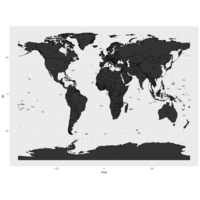
worldmapPlot <- ggplot(data = worldMap.fort, aes(x=long, y=lat, fill =id, group = group)) #"id" is col in your df, not in the map object
worldmapPlot <- worldmapPlot + geom_polygon(aes(fill=id, group =id))
worldmapPlot
Plot with Blue LInes
Changes Made to Code
# Trying this https://stackoverflow.com/questions/22038640/labeling-center-of-map-polygons-in-r-ggplot
## Loading packages
library(rgdal)
library(plyr)
library(rgeos)
library(maps)
library(maptools)
library(mapdata)
library(ggplot2)
library(RColorBrewer)
library(foreign)
library(sp)
library(scales)
setwd("c:/RProgram/RWork")
getwd()
#Data Source
#http://thematicmapping.org/downloads/TM_WORLD_BORDERS_SIMPL-0.3.zip
#Read data
worldMap <- readOGR(dsn="worldBorderData", layer="TM_WORLD_BORDERS_SIMPL-0.3")
#View Data - notice same foramt as prov& Terr; 256 vs 13 observiations
#also noticed that the population was in the file
head(worldMap@data)
worldMap@data[200:250,] # look at a range of rows
worldMap.fort <- fortify(worldMap, region = "ISO3") #region is a column in the data secition
idList <- worldMap@data$ISO3
centroids.df <- as.data.frame(coordinates(worldMap)) #get center we did that
names(centroids.df) <- c("Longitude", "Latitude") #more sensible column names
# This shapefile contained population data, let's plot it.
popList <- worldMap@data$POP2005
pop.df <- data.frame(id = idList, population = popList, centroids.df)
worldmapPlot <- ggplot(worldMap.fort, aes(x=long, y=lat, fill =id, group = group)) #"id" is col in your df, not in the map object
worldmapPlot <- worldmapPlot + geom_polygon
worldmapPlot <- worldmapPlot + geom_text(data = centroids.df, aes(label = id, x = Longitude, y = Latitude)) #add labels at centroids
worldmapPlot <- worldmapPlot +
worldmapPlot <- worldmapPlot + theme_bw()
worldmapPlot
Plot with Labels
Take away
Fortify
Data table
# Trying this Borrowed Code
#https://stackoverflow.com/questions/22038640/labeling-center-of-map-polygons-in-r-ggplot
## Loading packages
library(rgdal)
library(plyr)
library(rgeos)
library(maps)
library(maptools)
library(mapdata)
library(ggplot2)
library(RColorBrewer)
library(foreign)
library(sp)
library(scales)
setwd("c:/RProgram/RWork")
getwd()
#Data Source
#http://thematicmapping.org/downloads/TM_WORLD_BORDERS_SIMPL-0.3.zip
#Read data
worldMap <- readOGR(dsn="worldBorderData", layer="TM_WORLD_BORDERS_SIMPL-0.3")
#View Data - notice same foramt as prov& Terr; 256 vs 13 observiations
#also noticed that the population was in the file
head(worldMap@data)
worldMap@data[200:250,] # look at a range of rows
worldMap.fort <- fortify(worldMap, region = "ISO3") #region is a column in the data secition
idList <- worldMap@data$ISO3
centroids.df <- as.data.frame(coordinates(worldMap)) #get center we did that
names(centroids.df) <- c("Longitude", "Latitude") #more sensible column names
# This shapefile contained population data, let's plot it.
popList <- worldMap@data$POP2005
pop.df <- data.frame(id = idList, population = popList, centroids.df)
worldmapPlot <- ggplot(pop.df, aes(map_id = id)) #"id" is col in your df, not in the map object
worldmapPlot <- worldmapPlot + geom_map(aes(fill = population), colour= "grey", map = worldMap.fort)
worldmapPlot <- worldmapPlot + expand_limits(x = worldMap.fort$long, y = worldMap.fort$lat)
#worldmapPlot <- worldmapPlot + scale_fill_gradient(high = "red", low = "white", guide = "colorbar", labels = comma)
worldmapPlot <- worldmapPlot + geom_text(aes(label = id, x = Longitude, y = Latitude)) #add labels at centroids
worldmapPlot <- worldmapPlot + coord_equal(xlim = c(-90,-30), ylim = c(-60, 20)) #let's view South America
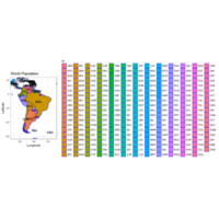
worldmapPlot <- worldmapPlot + labs(x = "Longitude", y = "Latitude", title = "World Population")
worldmapPlot <- worldmapPlot + theme_bw()
worldmapPlot
GGPlotC
Selective Plotting
GGPlotA
First plot from tutorial
Plot C
Third Map

Plot A
The first PLot

Plot B
Second plot