
JamisonCrawford
Jamison Crawford
Recently Published
Visualizing Statistics: Conclusion
Conclusion for "Visualizing Statistics", a summer workshop for the Center for the Advancement of Students & Alumni (CASA) teaching the basics of spreadsheet software for data manipulation, summary statistics, and best practices in data visualization. Chapters IV & V exceed the size limit for RPubs .Rmd files.
Visualizing Statistics: Ch. III
Chapter III for "Visualizing Statistics", a summer workshop for the Center for the Advancement of Students & Alumni (CASA) teaching the basics of spreadsheet software for data manipulation, summary statistics, and best practices in data visualization. Chapters IV & V exceed the size limit for RPubs .Rmd files.
Visualizing Statistics: Ch. II
Chapter II for "Visualizing Statistics", a summer workshop for the Center for the Advancement of Students & Alumni (CASA) teaching the basics of spreadsheet software for data manipulation, summary statistics, and best practices in data visualization. Chapters IV & V exceed the size limit for RPubs .Rmd files.
Visualizing Statistics: Ch. I
Chapter I for "Visualizing Statistics", a summer workshop for the Center for the Advancement of Students & Alumni (CASA) teaching the basics of spreadsheet software for data manipulation, summary statistics, and best practices in data visualization. Chapters IV & V exceed the size limit for RPubs .Rmd files.
Visualizing Statistics: Intro
Introduction for "Visualizing Statistics", a summer workshop for the Center for the Advancement of Students & Alumni (CASA) teaching the basics of spreadsheet software for data manipulation, summary statistics, and best practices in data visualization. Chapters IV & V exceed the size limit for RPubs .Rmd files.
Admissions Report (Sample Work Product)
All data have been randomly generated based off of real historical data to emulate seasonality, cyclicity, and reasonably realistic admissions rates for Georgia State University peer institutions. This report is dynamically generated using object oriented programming and reactive variables, allowing the introduction of new data to seamlessly reveal insights. Languages used include R, Markdown, HTML, CSS, and JavaScript.
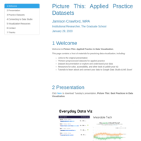
Picture This: Applied Practice in Data Visualization
The second workshop in a brief series on best practices in data visualization at the Graduate School at Georgia State University. This publication focuses mainly on the contents of the second workshop and practice datasets for visualization in Google Data Studio and other tooling.
A Little Bit About Me
A little about me...
Predicting Salaries with Personality (Interactive Slideshow & Shiny App)
This brief pitch outlines the functionality, predictive model, and data sources used to build a Shiny app that allows users to predict salaries based on their personality traits. The app is both embedded and linked in the final slide.

Game of Thrones: Sentiment Analysis (Interactive Slidedeck)
This presentation, complete with interactive visualizations in Plotly, features a bag-of-words analysis of Game of Thrones, Seasons 1-7. Using tidy dialogue captions retrieved from Kaggle, we can explore the house and character names most frequently mentioned, as well as positive and negative sentiments over time and, finally, the prevailing emotional themes of the series: Trust and Fear.
Indiscriminate Mass Shootings
This brief overview depicts and geospatially visualizes key data points related to "indiscriminate" mass shootings in the United States since 1982, where "indiscriminate" is defined as shootings which exclude those "stemming from more conventionally motivated crimes such as armed robbery or gang violence" (Follman et al. 2019).
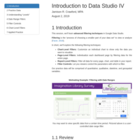
Introduction to Google Data Studio: Advanced Filtering
In our fourth session, using regional state park data from the Office of Parks, Recreation, & Historic Preservation, we learn the differences between report-, page-, and chart-level filters. We explore the different types of filters, including date ranges, "search all" filter controls, and list filter controls. Lastly, we briefly overview logical operators for filtering data based on multi-clause conditional statements.
Introduction to Google Data Studio: Tables, Score Cards, & New Fields
In our third session, using local adult literacy programs in Central New York from the National Literacy Directory, we learn how to create, modify, and stylize data tables, perform both quantitative and qualitative variable transformations by creating new fields, and use string manipulation and simple regular expressions to extract location intelligence that we convert into a dot map. Lastly, we introduce score cards using randomly generated client data for each literacy program.
Introduction to Google Data Studio: Choropleth Maps & Color Palettes
Our second session demonstrates how to connect two unique open data sources using the demographic data of Syracuse, New York from CNY Vitals Pro and Data USA. We'll explore how to create "Geo Maps" from geographic data, specifically interactive choropleth maps, and how to use gradient, divergent, and discrete color palettes and conventions for clarity in interpretation. Lastly, we explore some tips and tricks to create custom color scales form "hex" (hexadecimal) codes.
Introduction to Google Data Studio: Creating Reports
Our first session provides a brief overview of the history, functionality, and benefits of Google Data Studio, including examples and featured report galleries. We explore how to create and title a report, connect and modify data sources, and edit variable types. Lastly, we create an interactive visualization and data table using housing violations data from the Syracuse Open Data portal.
Visualization with ggplot2: Part III
This is the final introductory session on R package ggplot2. We’ll learn how to adjust scales and coordinates in the "Coordinates Layer", modify scales, labels, and other “Non-Data Ink” for clarity, create small multiples, i.e. trellis graphics, in the "Facets Layer", and overlay plots for even greater insights.
Practice data throughout the session uses public labor records from construction of the 2015 Lakeview Amphitheater and 2018 Hancock Airport renovations in Syracuse, NY.

Hancock: The Exodus of Wealth by Itinerant Workers
The following outlines the exodus of wealth from Onondaga County during the 2018 Hancock Airport renovations, when nearly 75 cents on the dollar left Onondaga County along with itinerant workers residing in 24 other counties.
These findings are completely reproducible from the raw data, provided by Syracuse Regional Airport Authority, and may be found in my GitHub Repository: https://github.com/jamisoncrawford/wealth.
While machine-readable code to reproduce the analysis is provided, human-readable text walks the reader through each step in preprocessing, analysis, visualization, and the staggering conclusions.
Health & Economic Impact of Catastrophic Weather
This report leverages catastrophic weather data from the National Weather Service to analyze the most physically hazardous and economically detrimental types of catastrophic weather. The following code, and its accompanying narrative, perform the following:
(1) Create a directory to where the weather data are downloaded and read into R, (2) Process the data via dimension reduction, formatting, and filtering;
Justify and transform variables to more accurately depict key data, (3) Aggregate and arrange weather events in order of health and economic impacts, and (4) Report and visualize the top 10 most catastrophic events by health and economy.
Reproducible Research: Human Activity Recognition Analysis
This analysis measures daily activity of an anonymous individual in the spirit of the “Quantified Self” movement. All data were collected via a personal activity monitoring device at 5-minute intervals throughout the day over a 2-month period from October to November, 2012.
This is the first peer-graded project of the “Reproducible Research” course, available on Coursera, part of the Data Science Specialization track authorized by Johns Hopkins University. The steps included are required in order to reproduce the analysis and fulfill submission requirements.
Visualization with ggplot2: Part II
In Part II of our introduction to "ggplot2", readers are further introduced to the "Geometries" layer, per the framework of the "Grammar of Graphics" (Wilkinson, 1999). "Geometries" are the forms visualizations assume to most effectively, efficiently, and ethically convey grand ideas. A brief discussion on how to consult colleagues for context in translating their ideas into graphics aids readers in finding the right form for the message, as well as how the classes of variables, e.g. continuous, categorical, datetims, etc. aid in these determinations. Scatter plots, bar charts, histograms, and time series are introduced, as well as addressing common pitfalls like necessary statistical transformations and coercing, or changing, variable classes, e.g. factors for categorical variables.
Visualization with ggplot2: Part I
This introduction to the popular "ggplot2" visualization library introduced the foundational theory of Leland Wilkinson's 1999 seminal work, "The Grammar of Graphics", or the "gg" in "ggplot2". Readers are introduced to the familiar territory of parts of speech in human languages, such as nouns, verbs, and adjectives, and how these parts of speech translate to the grammatical elements of data visualization, called "layers". Three essential layers are explored: (1) Data, (2) Aesthetics - i.e. "data ink" - or ways in which variables may be depicted, and (3) Geometries, or the "shape" or "form" of the visualization, e.g. line graphs or scatter plots. Lastly, the difference between data and non-data ink are defined, including how the former depict variables, while the latter aids in their interpretation and clarity.
Visualization in Base R
In this introduction to data visualization in R, readers receive a brief overview of data visualization and the most popular packages in R for visualization. Readers then learn the philosophy of the Base R "graphics" package, common functions and arguments, and advanced techniques like arranging multiple unique plots in a grid. Lecture data uses data from the Racial Equity Impact Statement in visualizing gross earnings and hourage of public works laborers.
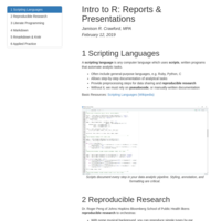
Intro to R: Reports & Presentations
This introductory R tutorial focuses on the importance of literate programming in creating professional, sleek reports and presentations using R packages "knitr" and "rmarkdown". It emphasizes the importance of reproducible research and shows R users the basics of Markdown, as well as how to publish their reports online.
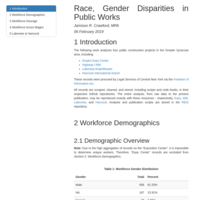
Race, Gender Disparities in Public Works
This is an exploratory data analysis (EDA) and visualization (EDV) dump for immediate access to cursory findings of public construction works in the Greater Syracuse Metropolitan Area, including renovations to Hancock International Airport and the I-690, as well as construction of the Lakeview Amphitheater and New York State Expo Center. Findings are reported in "Building Equity in the Construction Trades: A Racial Equity Impact Statement" (Croom, Crawford, et al. 2019) in collaboration with Legal Services of Central New York and Urban Jobs Task Force.
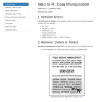
Intro to R: Data Manipulation
An introduction to data manipulation using the "dplyr" package, the workhorse of the Tidyverse. This tutorial begins with a brief recap on working with dates and times. The advantages and nuances of "dplyr" are mentioned, as well as the introduction to specialized data frames, or "tibbles", and the "pipe operator".
Lastly, four essential "dplyr" functions are introduced which manage reduction in high-dimensional data, perform easier to code and easy-to-understand filtering operations, variable transformations, and ordering variables conditioned on themselves or others.
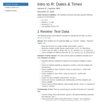
Intro to R: Dates & Times
An introduction to working with dates and times in R, new classes related to dates and times, e.g. "POSIXlt", "POSIXct", "Date", and "difftime" objects, how datetime variables store data "under the hood", and how to format dates and times to be recognizable by R. Powerful functions from Tidyverse package "lubridate" are introduced, such as easy-to-use formatting functions, date rounding, timestamps, and extracting specific units of time, e.g. days, weekdays, weeks, months, and years. Applied practice asks users to format dates, determine specific dates and duration, and tallying instances by month using real housing violation data in Syracuse.
Intro to R: Text Data
An introduction to working with text, i.e. "character" data in R. This tutorial explores the concept of coercing data classes, including how to coerce "character" variables into "factor", or categorical, variables. Fundamental base R functions are reviewed, as well as more powerful functions from the Tidyverse "stringr" package, designed for string manipulation. Applied practice asks learners to paste FIPS codes from Census Geocoder output, detect specific locations, and extract ZIP codes from real Syracuse crime data.
Introduction to R: Subsets & Indices
An introduction to using base R's subsetting and index syntax designed for users with little to no experience, "Subsets & Indices" is a culmination of previous introductions to arithmetic, relational, and logical operators, allowing R users to filter data based on highly-specific criteria. Data frames are introduces as the primary data structure in R, while values of class logical are also discussed as a means to determining whether data meet user-specified conditions. Section practices exercises use R's built-in 1972 Motor Trend car specs while applied practice incorporates DataCuse's housing code violations.
Intro to R: Operators
This tutorial is the first in a series of introductory R materials which teaches the basic building block of the R language while using local data from Central New York. "Intro to R: Operators" covers basic arithmetic operators, relational operators, and logical operators, including applied examples using Open Data from CNY Vitals Pro.
Practical Machine Learning: HAR Classification
The final project in "Practical Machine Learning", the eight of ten courses in Coursera's "Data Science Specialization", developed and proctored by the Johns Hopkins U. Bloomberg School of Public Health. This work fits three models, viz. classification tree, random forest, and GBM, to predict exercises using HAR data. Includes confusion matrices and k-folds cross-validation.
Intro to R: Nuts & Bolts
This is Version 1.1 of "Intro to R: Nuts & Bolts", a work currently in progress. It's intended as an on-ramping tool for the R language, not only to introduce the fundamental components of R in the context of base R and RStudio tooling, but a broader historical context in data science, including prevailing and emerging themes, a hardline defense of scripting languages, and strategies for self-teaching. This guide compress varying layers of resolution for both a broad overview and optional deep-dives for the most curious learners.
Intro to R: Directories & Reading Text Data
The first in a series of introductory R sessions by the Central New York Community Foundation, "Directories & Reading Text Data" explores some fundamental base R functions for manipulating directories, including automatically creating them to unzip and read in large data files, as well as base R, package "readr", and package "data.table" functions for reading in text data with specificity and precision.