Sign In
Username or Email
Password
Forgot your password?
R
Pubs
by RStudio
Sign in
Register
RSJ95
RSJ
Recently Published
HTML
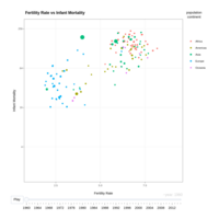
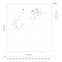
An animated plot which shows the relation over time between a nation's fertility and infant mortality rates. Used Tidyverse and Plotly to create and animate the graph and the data sourced from the gapmider dataset in the dslabs r package.
over 4 years ago
HTML
Infant mortality vs Fertility Rate overtime
over 4 years ago