
ashishjsharda
Ashish Sharda
Recently Published
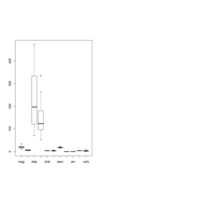
Using Outliers
Example using outliers
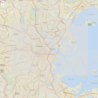
Weather Data
Using leaflet to show weather data
PopUp
Example using html tools and Popup
Leaflet-Add Circles
Example using leaflet
Add Circles
Using Ersi
Using leaflet and Ersi as a provider
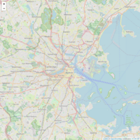
Leaflet -Open Map
Basic Example using Leaflet

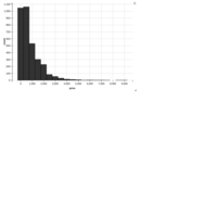
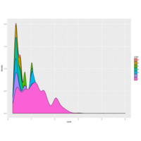
histogramusingggvis
Histogram using ggvis
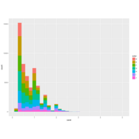
GeomPlotHistogram
Example using GeomPlot HIstogram

Layer_Smooth
Example using Layer_Smooth
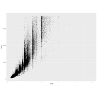
layer_points2
Using cocaine data set
LayerPoints
Using ggvis
ggvis
Example using ggvis
Economist Theme Plot
Ex using economist theme plot and scale
WSJ Theme
Power of ggplot using wsj theme
ScatterPlot All in One
Use Scatter Plot
Multiple Colors
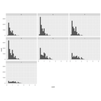
GGPlot Histogram
Example using ggplot histogram
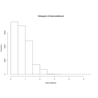
require(ggplot2)
head(diamonds)
summary(diamonds)
ggplot(diamonds,aes(x=carat))+geom_histogram()+facet_wrap(~color)
Using facet_grid
Example using facet_grid

GgPlot Example 7
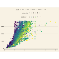
Diamond data set example.
Combination using different aes

Diamond Data Set
Ex using diamond data set
Using Scales and Lubridate
Use Economics data set and use the libs scales and lubridate to beautify

Scales
Using Scales and Economics data set

Economics Data Plot
Using Economics Data Plot and geom_line
Using Geom_Line Plot
Using geom_line data plot
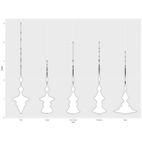
Geom_Jitter Plot
Using Geom_Jitter and Geom_Violin Plot

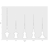
Point and Violin Plot
change the order of point and violin plot
Geom Point and Geom Violin
Example using diamond data set ,geom point and geom violin
Violin Plot
Using Violin Plot
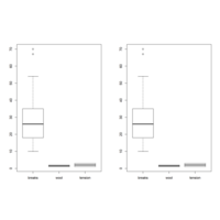
BoxPlot
Box Plot using Diamonds data set
ScatterPlot
Example using scatter plot ,diamonds data set

BoxPlot -Diamonds
Using Diamond data set, ggplot and plot a boxplot
GGPlot-Density
Using ggplot -density and diamonds collection
GGPlot -Histogram
Using Diamond Data Set and plotting histogram using ggplot
DiamondsBoxPlot
Example using Diamonds Box Plot

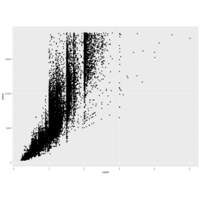
Price vs Carat
Using scatter plot to plot price vs Carat
Histogram 2
Histogram ,Add Main Title
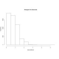
Histogram 1
Basic Histogram plot using diamond data set
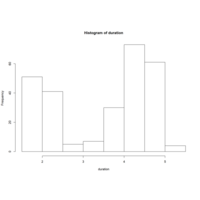
Histogram Using FaithFul Dataset
duration=faithful$eruptions
hist(duration,right = FALSE)

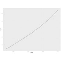
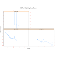
Regression of MPG on Weight
Source Code :
attach(mtcars)
plot(wt,mpg)
abline(lm(wt~mpg))
title("Regression of MPG on Weight")
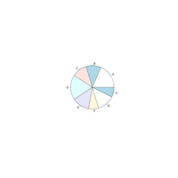
Pie Chart -> MASS
Pie chart using MASS libr
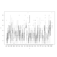
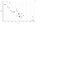
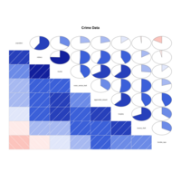
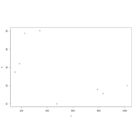
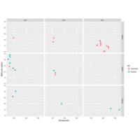
Plot TeamId and Rank
Eg to demonstrate scatter plot
"This dataset is choosen from :https://www.kaggle.com/open-source-sports/baseball-databank/data?select=Teams.csv"
data=read.csv("teams.csv")
attach(data)
summary(data)
plot(teamID,Rank)

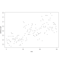
Iris Plot Petal Length
Plot Petal Length in Iris Data Set
Iris Plot
Publish categorical variable
#Histogram
import numpy as np
from matplotlib import pyplot as plt
a=np.array([5,2,8,10,12,18,20,28])
plt.hist(a,bins=[0,5,10,15,20,25,30])
plt.title("Histogram")
plt.show()
Using Plots
Using Plots and Iris Data Set
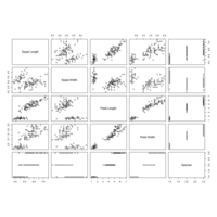
Iris Data Set
Basic Plot Using Iris Data Set
GGVis Basics
First install the package ggvis
Then run the below commands :
p <- ggvis(mtcars, x = ~wt, y = ~mpg)
p <- ggvis(mtcars, x = ~wt, y = ~mpg)
layer_points(p)

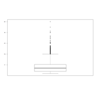
BoxPlot
BoxPlot using ggplot

ScatterPlot
ScatterPlot with individual data points
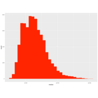
GGPlotUsingHistogram
library(ggplot2)
data(txhousing)
summary(txhousing)
ggplot(data= txhousing, aes(x=median))+geom_histogram(fill="red")
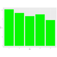
Plot using ggplot2 with colors
library(ggplot2)
data(midwest)
summary(midwest)
ggplot(data= midwest, aes(x=state))+geom_bar(fill="green")
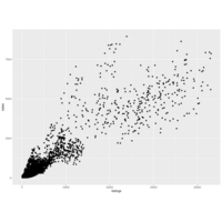
TexasHousingUsing
library(ggplot2)
ggplot(data= txhousing, aes(x=listings,y=sales))+geom_point()
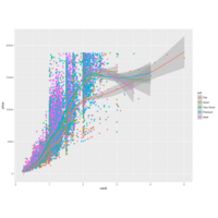
Plot using ggplot2
library(ggplot2)
ggplot(diamonds)
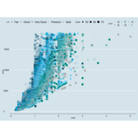
ggplot(diamonds) + geom_point(aes(x=carat, y=price, color=cut)) + geom_smooth(aes(x=carat, y=price, color=cut))
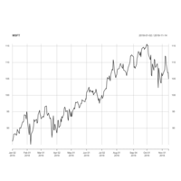
Microsoft2018
library(quantmod)
start<-as.Date("2018-01-01")
end<-as.Date("2018-11-15")
getSymbols("MSFT",src="yahoo",from=start,to=end)
print(head(MSFT))
plot(MSFT[,"MSFT.Close"],main = "MSFT")
candleChart(MSFT,up.col="black",down.col="red",theme = "white")
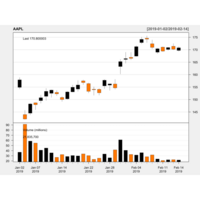
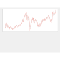
Apple Stock Chart 2019
library(quantmod)
start<-as.Date("2019-01-01")
end<-as.Date("2019-02-15")
getSymbols("AAPL",src="yahoo",from=start,to=end)
print(head(AAPL))
plot(AAPL[,"AAPL.Close"],main = "AAPL")
candleChart(AAPL,up.col="black",down.col="red",theme = "white")
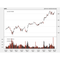
Apple Candlestick Chart Analysis using R
Plot Candlestick chart using R
library(quantmod)
start <- as.Date("2018-01-01")
end <- as.Date("2018-10-01")
getSymbols("AAPL", src = "yahoo", from = start, to = end)
print(head(AAPL))
plot(AAPL[,"AAPL.Close"],main="AAPL")
candleChart(AAPL,up.col="black",dn.col="red",theme="white")
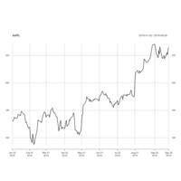
Stock Analysis
Plot Apple Stock Data :
library(quantmod)
start <- as.Date("2018-01-01")
end <- as.Date("2018-10-01")
getSymbols("AAPL", src = "yahoo", from = start, to = end)
print(head(AAPL))
plot(AAPL[,"AAPL.Close"],main="AAPL")

AirQuality Index
hist(airquality$Month,col = "orange")
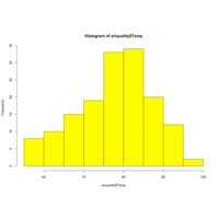
Histogram of AirQuality Temperature
hist(airquality$Temp,col = "yellow")
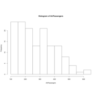
Histogram of AirLinePassengers
hist(AirPassengers)
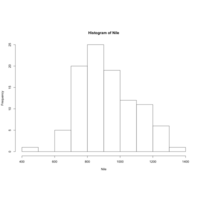
Niles Histogram
Niles Histogram
Auto MPG Data Plot
Auto MPG Data Plot
Project
Project Analysis

Using Plot and Box Plot
Using Plot and Box Plot
summary(cars)
plot(cars)
boxplot(cars)
head(cars)
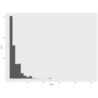
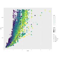
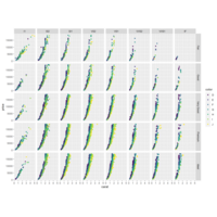
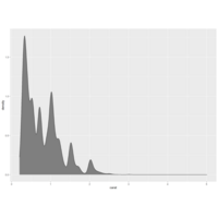
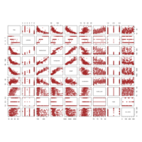
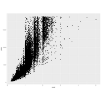
Carat Plot 15
Carat Plot 15
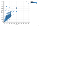
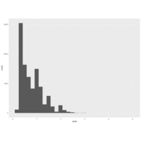
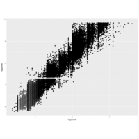
Carat Plot 12
Carat Plot 12

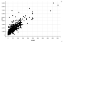
Carat Plot 11
Carat Plot 11

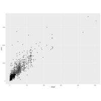
Carat Plot 7
Carat Plot 7
Carat Plot 6
Carat Plot 6

Carat Plot
Carat Plot 5
Carat Plot 4
Carat Plot 4
Carat Plot -2
Carat Plot

Carat Plot
Carat Plot

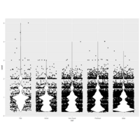
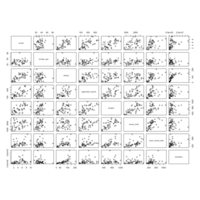
Histogram Plot
Histogram Plot
Corrgram Plot
Corrgram Plot
Scatter Plot
Scatter Plot
Scatter Plot
Scatter Plot3

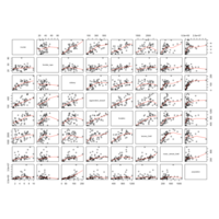
GGPlot2
GGPlot2
Correlation Plot
Correlation Plot

Scatter Plot
Scatter Plot
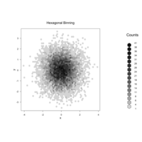
hexbin plot
hexbin plot

Proportions Plot
Proportions Plot
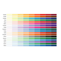
RColor Brewer Plot
RColor Brewer Plot
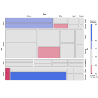
Mosaic Plot
Mosaic Plot
Probability Plot
Probability Plot
Lattice Plot
Lattice Plot
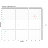
Scatterplots of MPG vs. Horsepower
Scatterplots of MPG vs. Horsepower

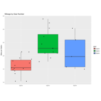
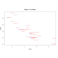
Mileage by Gear Number
Mileage by Gear Number

Regression of MPG on Weight
Regression of MPG on Weight
Miles per Gallon
Miles per Gallon
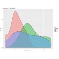
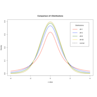
Distribution of Gas Milage
Distribution of Gas Milage
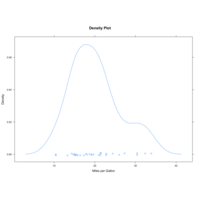
Density Plot
Density Plot
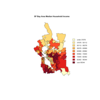
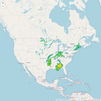
Map
Map

Wordcloud2
Wordcloud2
GGPlot2
GGPlot2
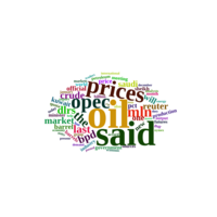
WordCloud
WordCloud
Johnson & Johnson stock price - decomposition
Johnson & Johnson stock price - decomposition
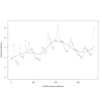
Unemployment Data - LOESS
Unemployment Data - LOESS
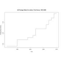
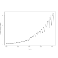
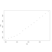
US Postage Rates for Letters, First Ounce, 1991-2009
US Postage Rates for Letters, First Ounce, 1991-2009
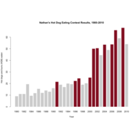
Activity One: Hot Dog Eating - bar graphs
Activity One: Hot Dog Eating - bar graphs
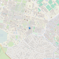
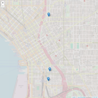
UsingLeaflet
Project Assignment
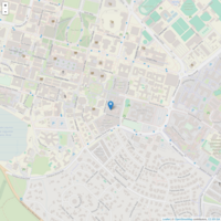
Plot using Leaflet
Plot using Leaflet
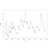
Time Series Plot2
Time Series Plot2 using quandl
Time Series Plot
Time Series Plot using Quandl
Plot mtcars
Plots created
Car Plot 4
Car Plot 4

Plot
Plotly plot