
brouwern
Nathan Brouwer
Recently Published

PCA for Analysis of SNPs
Overview of a series of RPubs lessons on using PCA to analyze SNPs.
Time series plots from vectors
An introduction to building time series plot from 2 vectors
BioSci 1540: What is Computational Biology
An introduction to computational biology, using AlphaFold2 as a case study.
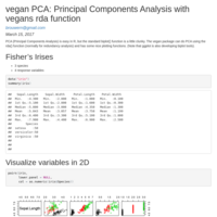
vegan PCA: Principal Components Analysis with vegans rda function
PCA with vegan's rda function
for() loops in R
Basic for loop examples, and debugging them using functions. Also an example of using them to run multiple regressions.
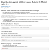
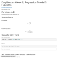
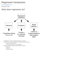
Duq Biostats Week 6 | Regression Tutorial 5: Functions
An introduction to writing function

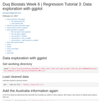
Duq Biostats Week 6 | Regression Tutorial 3: Data exploration with ggplot
Explore milk evolution data with ggplot
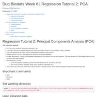
Duq Biostats Week 6 | Regression Tutorial 2: PCA
Exploring structure of milk evolution data with Principal Components Analysis
Duq Biostats Week 6 | Regression Tutorial 1: Data Cleaning
Load milk evolution data and clean.
Duq Lecture 6: Data cleaning (optional)
Data prep. for milk evolution dataset
Making 2-panel plots in base R and ggplot
Take regression data from Motulsky and make a 2 panel plot in base R (plot) and ggplot (qplot)
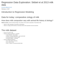
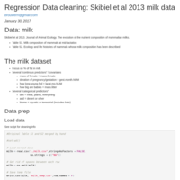
Regression Data cleaning: Skibiel et al 2013 milk data
Data set up for Skibiel et al 2013. Journal of Animal Ecology. The evolution of the nutrient composition of mammalian milks
Superscripts in R & Rmarkdown
Superscript in plots in R and RMarkdown text
Duq HW1: Plotting & t-testing data from Cell retraction saga
Plotting data from a paper recent retracted from Cell.
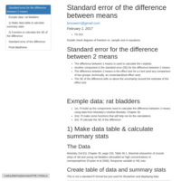
Duq Homework 2: Time2Knit: plotting, t-test, and Rmarkdown
We'll take the infamous rat bladder data and plot it as in Motulsky's book
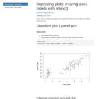
Improving plots: moving axes labels with mtext()
Adjust where axes labels go using the mtext() function.
Making t-test effect size plot
Make a polished effect size plot using output from t.test()
Class 2: Intro to R objects and lists
A very basic look at R objects, lists, and how to use them when plotting results of statistical tests.

Duq Lecture 1: Into to Course
Duq Lecture 1: Into to Course
Test 2 Take Home: worked example
Worked examples and notes for test 2 take home on t-tests and 1-way ANOVA
Independent Project: paired t-test example
Lion data set used as inspiration for a paired t-test example
plot.means(): plot means and 95%CIs
Simple function that plots means as individual points (not bars) & approx. 95% confidence intervals using user-supplied means & standard errors. (It can also take pre-calculated CIs). It provides some feed back via the console & on the plot itself regarding errors and how to make the plot more polished.
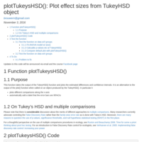
plotTukeysHSD(): Plot effect sizes from TukeyHSD object
Takes the output from R's TukeyHSD function for post-hoc comparisons & makes a prettier plot of the output than the default.
binom.CI(): function to calculate confidence intervals for binomial data
Implements Wilson's confidence interval for binomial proportions, such as number of deaths out of number of organisms in a toxicology experiment.
ENS 495 Test 3: Regression KEY
Key for test
Lecture 27b: Logistic regression example
Example of how to think about and analyze data that is binary or binomial.
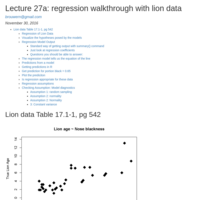
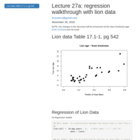
Lecture 27a: Regression walkthrough with lion data
Full example analysis of lion data, fitting model, inferance, and diagnostics.
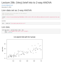
Lecture 29b: (Very) brief into to 2-way ANOVA
A very brief introduction to 2-way ANOVA using the lion data.
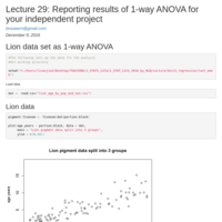
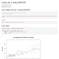
Lecture 29: Reporting results of 1-way ANOVA for your independent project
Lion data is re-formatted for use as a 1-way ANOVA to illustrate how to report results for you independent project.
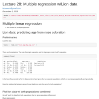
Lecture 28: Multiple regression w/Lion data
Fitting separate lions for each population of lions
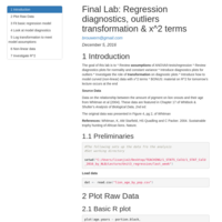
Final Lab: Regression diagnostics, outliers transformation & x^2 terms
The goal of this lab is to:
* Review assumptions of ANOVA/t-tests/regression * Review diagnostics plots for normality and constant variance * Introduce diagnostics plots for outliers
* Investigate the role of transformation on diagnostic plots * Introduce how to model curved (non-linear) data with x^2 terms
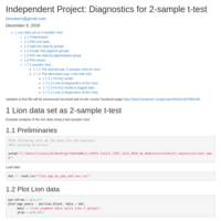
Independent Project: Diagnostics for 2-sample t-test
Shows how to do diagnostics for a 2-sample t-test. Uses reformated lion data as an example.
Independent Project: Sample Paper Using Lion Data
An example of how to format analyses & plots for a scientific paper, using data on the relationship between the amount of pigment on lion snouts & their age from Whitman et al (2004). These data are featured in Ch 17 of Whitlock & Shulter’s Analysis of Bio Data, 2nd ed. The original data was presented in Whitman et al. Sustainable trophy hunting of African lions. Nature.
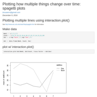
Plotting stuff over time: spagetti plots with interaction.plot()
This is a good function when the x axis is time and you are plotting a seperate line for each thing that is changing over time (the mean of a group, observations for individuals)
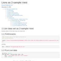
Lions as 2-sample t-test
Setting up lion data as a 2-sample t-test, then getting the residuals and doing diagnostics.
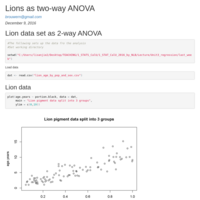
Final Lecture: Two-way ANOVA example with lions
Very brief introduction to 2-way ANOVA (aka factorial ANOVA). The lion data is set up to do this.
Final Lecture: 1-way ANOVA with Lions Data
How to write up results for you independet project if you are doing a 1-way ANOVA.
The lion data gets converted to be used w/ a 1-way ANOVA followed by Tukey's HSD.
Lab 12: Regression diagnostics and misc. topics
Regression diagnostics and other topics. R2 section was not covered.
Independent Project: Sample
Example of format for a scientific paper, using data from Whitman, K, AM Starfield, HS Quadling and C Packer. 2004. Sustainable trophy hunting of African lions. Nature.

Intro to ANOVA
Introduction to 1-way ANOVA using data on the effects of nutrition on deer antler growth
Analysis of binary data: logistic regression
Uses data from Table 17.9-1 of Whitlock & Shulter
Regression Tutorial
A walkthrough of a regression analysis
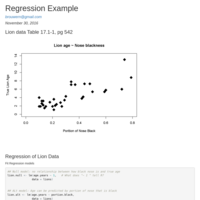
Regression Example
Basic regression example with Whitlock & Shulter's lion data from chapter 17
Simple function to plot means w/95% CIs
The is a simple function that plots means as individual points (not bars) & approximate 95% confidence intervals using user-supplied means & standard errors. It provides some feed back via the console & on the plot itself regarding errors and how to make the plot more polished.
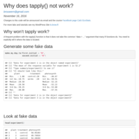
Why does tapply() not work?
tapply() doesn't have a "data = ..." argument and so needs to be told explicitly where to find your data.

Lab 9: ANOVA deer antler data
Code needed to generate the different antler datasets for analysis w/ANOVA (mass, basal circumference, main beam, etc)
plotTukeysHSD(): plot effect sizes from TukeyHSD object
Takes the output from R's TukeyHSD function for post-hoc comparisons & makes a prettier plot of the output than the default.
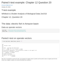
Paired t-test example: Chapter 12 Question 20
Whitlock and Shulter paired t-test example
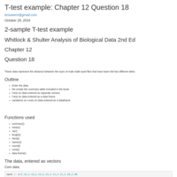
T-test example: Chapter 12 Question 18
2nd Ed Chapter 12 Question 18
Whitlock & Shulter Analysis of Biological Data
Data transformation
Brief introduction to data transformations (log and square root)
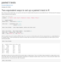
Paired t-tests: two equivalent ways
A brief walk through of two equivalent ways to conduct a paired t-test, depending on how the data are organized.
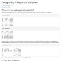
Designating Categorical Variables
Using the factor() command to designate a column as a categorical / grouping variable
Lab 6 in-class exercise
Practice loading data and plotting means
Impact of Sample Size on Precision
Illustrates impact of sample size on precision using data from Barro Colorado Island
Lab 5: Intro to t-tests
Intro to t-tests and review of plotting grouped data. Uses Ex 12.4 in Whitlock and Shulter's Analysis of Biological Data, 2nd Ed.
Setting plotting limits & Comparing distributions
Data from Whitlock & Schulter Chapter 3 question 28
Working with grouped data
Split up grouped data using subset() and tapply()
function plot2means
Basic function to plot 2 means w/ their 95% Confidence Intervals.
Boral notes
Notes on using the Bayesian ordination and modeling package boral, with particular reference to plotting
Rarefaction notes: iNEXT vs. vegan
General notes on rarefaction for confused pop. ecologists, and comparison of Chao's iNEXT package to vegan.
Plotting means & error bars in R: worked example
Plotting using the Hmisc::errbar() function when the means are already calculated.
test
test

Lab 3a: Math for stats in R
Practice calculating the var, SD, and SE by hand.
Load R code by hand
Source code for Frank E Harrell Jr Hmsic:errbar function.
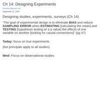
ENS 495 Lecture 6: Study Design
Based on Chapter 14 of Whitlock & Shulter
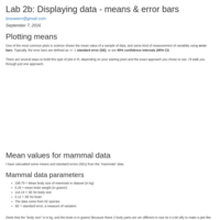
Lab 2b: Displaying Data - plotting means
Plotting means with error bars
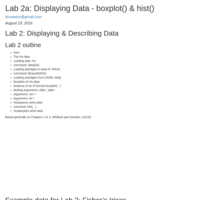
Lab 2a: Displaying Data - boxplot() & hist()
The Iris data
Loading data: iris
-data(iris)
Loading packages in base R: MASS
-library(MASS)
Loading packages from CRAN: doBy
Boxplots w/ iris data
-anatomy of an R function
-xlab, ylab
-cex
-lw
Histograms w/Iris data
-hist
Scatterplots w/iris data
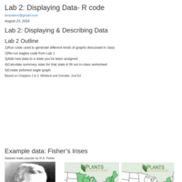
Lecture 4 ENS 495 Displaying & Describing Data
Displaying & Describing Data. Based on Chapters 2 & 3 in Whitlock & Shulter The Analysis of Biological Data
CalU.PA ENS 495: Lab 1- Intro to R
A first run through of R using data on bald eagles
Lecture 3 ENS 494
Lecture 3 ENS 494
Loading data into R
Draft/outline of introduction to loading nasty data into R
Paired T-test Walk Through
A rough draft of a walk through of a paired t-test
Basic R tools
A walk thru of basic data manipulation, graphing and t-tests with a small data set.
marked R package for mark recapture analysis
In this script I annotate the code for mark-recapture analysis in the R package marked provide in the paper
Laake, Johnson and Conn 2013. marked: an R package for maximumlikelihood and Markov ChainMonte Carlo analysis of capture–recapture data. Methods in Ecology and Evolution 4:885–890
and join it with other code produced by the authors in previous publications.