
kieroneil
Kier O Neil
Recently Published

The NC 2024 Kennedy Ballot Controversy
When Robert F. Kennedy Jr. suspended his campaign in August 2024, North Carolina had already printed its ballots. What followed was a fast‑moving legal battle through partisan courts, raising urgent questions about election law, judicial power, and the thin margins that decide battleground states.

Mapping the Structure of North Carolina’s 2024 Electorate: A County-Level Demographic Typology
North Carolina’s 2024 election was decided by a few percentage points — yet its counties fall into strikingly distinct demographic and political worlds. This project uses clustering and dimensional reduction to reveal the hidden structure of the state’s electorate.

Anomaly Detection in the 2024 North Carolina Presidential Election
This report examines whether observable statistical anomalies are present in the certified results of the 2024 Presidential Election in North Carolina.

Cracking the Code: Reverse Engineering the iRacing Championship Scoring Formula
This paper reverse engineers the iRacing championship points system using empirical modeling and out‑of‑sample validation. After normalizing for Strength of Field and finishing percentile, the scoring mechanism collapses to a simple geometric formula that explains over 99% of observed variance. The result reveals a clean multiplicative structure underlying what initially appears to be a complex rule set — and provides a closed-form equation anyone can compute with pencil and paper.

From Working Rich to Rentiers: How Capital Income Reclaimed the Top 1%
In their landmark paper Distributional National Accounts, Professors Saez and Zucman argue that the rise in top-end inequality since the late 1990s is driven not by wages, but by capital income — dividends, business profits, interest, and capital gains. This claim challenges the popular narrative of the “working rich” and suggests a return to a rentier-dominated elite.

The Great Divergence We Forgot to Notice
For decades, we’ve been arguing about inequality in America—how big it is, whether it’s growing, and what, if anything, we should do about it. But every so often, new data arrives that forces us to rethink not just the answers, but the questions themselves. And the latest reconstruction of pretax national income distribution—painstakingly assembled from historical microdata—does exactly that.
It reveals a story that is at once familiar and startling: familiar, because we’ve long known that inequality has risen since 1980; startling, because the scale and structure of the shift are far larger, far more systematic, and far more persistent than even many economists realized.
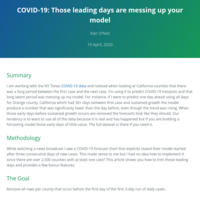
COVID-19: Those leading days are messing up your model
Optimize your forecast with run-length encoding
Economics in R: US Distributional National Accounts
A gentle introduction

Economics in R: US Distributional National Accounts
7. One Big Loading & Formatting function

Economics in R: US Distributional National Accounts
6. Creating Income & Wealth Distributions

Economics in R: US Distributional National Accounts
5. Creating proportions
Economics in R: US Distributional National Accounts
4. Reconciling the data
Economics in R: US Distributional National Accounts
3. Renaming the variables
Economics in R: US Distributional National Accounts
2. Getting the Data
Bulk Processing Zip Files
The power of functional programming in R
World Happiness Report - Prediction with tidymodels
Machine Learning, tidymodels, tidyverse

Does stress impact happiness?
Explores data from Gallup and World Happiness Report to determine correlation between two variables.

The Clash of Clans Curve - How MMO Strategy Games Get You Hooked
This curve is built into every successful MMO game for good reason.
Machine Learning - Decoding Happiness
This paper uses data from The Happiness Report which collects metrics from each country annually and produces a final score of happiness of the country's citizens.
The machine learning solution reverse-engineers the scoring algorithm used in The Happiness Report.
NCAA March Madness - How the Receptionist Wins the Office Brackets
Hypothesis testing of three general approaches to picking brackets.

Data Wrangling - Wine Reviews v2
I focus on getting the data into the optimal format for further exploratory analysis in this part.
I am using the 130,000 record file because it has a few more columns than the 150,000 record version.
The end-product has 115,000 records with no NA’s.

How to create 50,000 Argentines ... or more
This is about creating mock data. Popular names and a city, state, postal code lookup table help to create simulated Argentine customers that will look plausible to a citizen.
Fraud Detection with Machine Learning
In this paper, I use a publically available dataset of 6.3 million European Credit Card transactions to determine the best model fit between Recursive Partitioning, Random Forest, C5.0, and Support Vector Machines, based on accuracy and the prevalence of false-positives.,

Predictive Data Product - The Word Genie
Predict the next word of a short phrase using US News, Blogs, and Tweets supplied from Swiftkey.
Text Mining US Tweets, Blogs & News
In this analysis I look at a dataset of US news, blogs, and tweets to examine the most common words and as a whole and per source. This analysis includes charts for visualizing the data and comparing one set to another.
Mapping Census Data with tidycensus and leaflet
I was inspired by a blog from Julia Silge to explore tidycensus. I have an interest in demographics and economics so I wanted to see if it wold make my research easier. Yes it does.
What’s New in dplyr 0.7.0?
Executive Summary
The dplyr package is one of my workhorses when manipulating dataframes in R. The verb-based approach fits comfortably with my SQL background. It is a part of Hadley Wickham’s tidyverse which is a toolbox for almost anything a data scientist would need, with a common grammar. This paper exclusively walks through the new functionality and datasets available in the new version of dplyr. At the end we will look at dplyrs implementation of rlang functionality to better provide column-references for functions and apps.

Canadian Job Prospects through 2024
Executive Summary:
For Canadians looking at job opportunities, it is nice to have an idea how the job market will perform in the future for your chosen occupation or industry. Many countries have open data sets that offer this kind of data. In these exercises provided by Lauro Silva we will use R to analyze the future Canadian job prospects through 2024.
Officer Shinn, you have some explaining to do
This is derived from the San Francisco, CA, USA public employee dataset that includes income details of every person working for the city from 2011-2014.

Data Product - San Francisco Police, Fire, Nurse Pay Distribution
This is the documentation for a shiny application that uses a dataset of the pay distribution of all San Francisco public employees. It was filtered to only include people working in the Police, Nurse, and Fire professions. The app allows you to select any number of four years to use, the type of pay, and the income range to display. The output is a violin plot of the pay distribution in each profession. Enjoy.

Mapping US Hospital Ratings with Plotly
This deck shows a map of all US Hospitals that were reported with each marker colored to indicate their overall rating.

The Twitterverse of Good Mornings around the Globe
This geo-data uses a dataset of all of the twitter users who tweeted "Good Morning" on either Dec 7 or 8, 2016 and plots their locations on a map. This data was acquired from: https://www.kaggle.com/tentotheminus9/good-morning-tweets

Machine Learning Movement-Class based on 150 Variables
In this analysis of dumb bell lifting form I explore four different models to determine how best to predict the classe given 150+ variables.

Throwing Dice - Proving Regression toward the Mean
This example enhances upon the dice throwing function published by http://rpubs.com/Lionel/11497.
I mainly changed the variable names for clarity and changed the plotting type to barchart.
Exploratory Data Analysis - The Rise and Fall of Kaitlyn
Do you know a Kaitlyn? Of course you do. Find out when this baby name experienced it's growth and why it's headed to the scrapheap of history.
Uses the US Baby Names database
On the Greatness of People Named Kier born between 1968 and 1972
I got my hands on the database of US Baby Names from the Kaggle website. It covers babies born in the US between 1880 and 2014.
Initially I was interested to see how the popularity of the names that my siblings and parents changed over this period . I probably shouldn't have been surprised, but I was, that the popularity of their name peaked right around their birth year. For instance Ryan and Erin saw their name's greatest popularity in the years around their birth years, 1970 and 1971, respectively.
My name, Kier, has an unusual anomaly where there is a blip of popularity around my birth year, 1968, and then as we Kier's reach adulthood the popularity of the name continued to grow over time.
A reasonable conclusion to be inferred is that as the greatness of the late 1960's Kier's became to be recognized as they reached adulthood, more women were inspired to name their babies after them.
US Storm Damage to Health & Property
This analysis looks at damage to health and property caused by storms since 1950.