mattmacfa
Matt MacFarlane
Recently Published

Final Presentation
still a draft


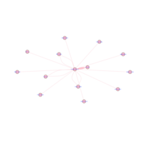


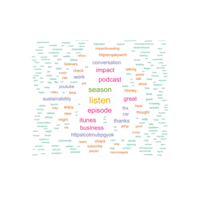
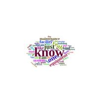
WDIPpodcast
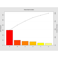
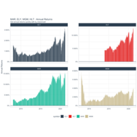
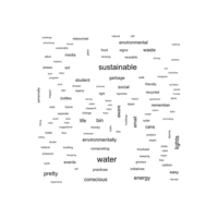
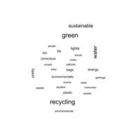
min freq = 2, statistically representative (size = frequency)
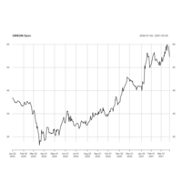
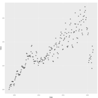
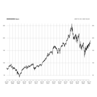
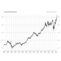
GM$GM.Open, 2020-01-01
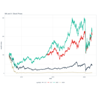
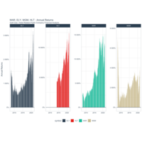
pandemic & recovery


chi
interview
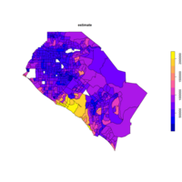
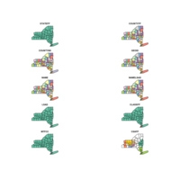
tidycensus
library(tidycensus)
library(tidyverse)
library(sf)
# Get dataset with geometry set to TRUE
orange_value <- get_acs(geography = "tract", state = "CA",
county = "Orange",
variables = "B25077_001",
geometry = TRUE)
# Plot the estimate to view a map of the data
plot(orange_value["estimate"])
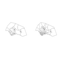
Compare changes in county lines from different census years
# Get a historic Census tract shapefile from 1990 for Williamson County, Texas
williamson90 <- tracts(state = "TX", county = "Williamson",
cb = TRUE, year = 1990)
# Compare with a current dataset for 2016
williamson16 <- tracts(state = "TX", county = "Williamson",
cb = TRUE, year = 2016)
# Plot the geometry to compare the results
par(mfrow = c(1, 2))
plot(williamson90$geometry)
plot(williamson16$geometry)
census data using tigris package. plot functions. note:
note - could be helpful in competitive intelligence
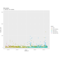
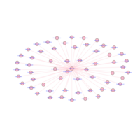
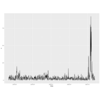
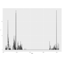
Exploratory GM Timeline output by source
note: discretized by source of tweet. Notice "Lithium Tech"? HUGE surge in retweets from this twitter provider. Clearly, something is going on with ev battery tech
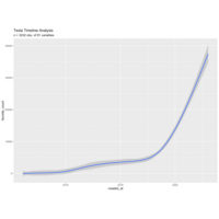
Tesla Twitter Timeline
n = 3232 obs. of 91 variables.
used: rtweet
ggplot2
applied a smoothing runction.
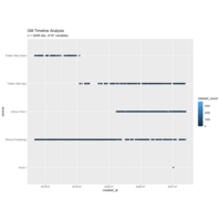
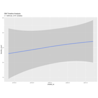
Twitter Analysis of General Motors "GE" User Timeline
rtweet package to get_timeline("GE")
tidyverse. ggplot2
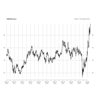
GM$GM.Open
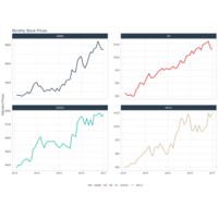
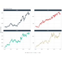
Time Series using quantmod package
Plot
Analyzing Social Media Data in R

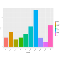
Sentiment Analysis of 6 Focus Groups
# Plot the sentiment scores
ggplot(data = score_df2, aes(x = sentiment, y = score, fill = sentiment)) +
geom_bar(stat = "identity") +
theme(axis.text.x = element_text(angle = 45, hjust = 1))
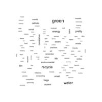
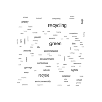
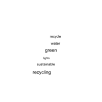
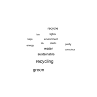
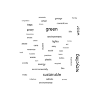
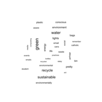
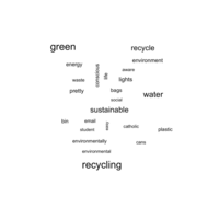
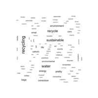
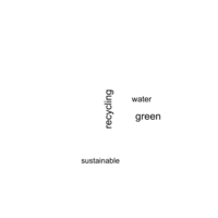
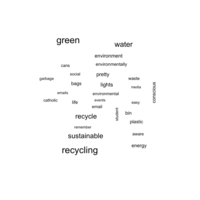
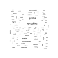
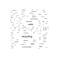
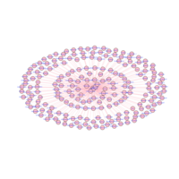
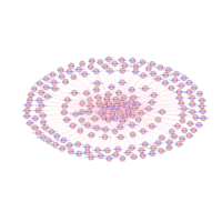
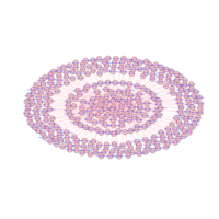
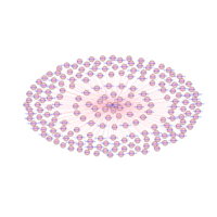
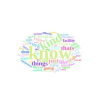
Victoria S. Wordcloud
2:21 am Wednesday March 17
SixSigma package R
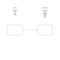
Inputs and Outputs
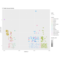
f1 twitter account info
just a visualization of activity
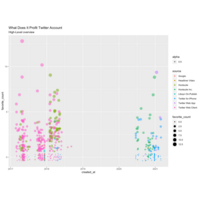
WDIP Twitter
Answers the same questions, in the same way, as previous
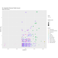
Dr. Carpenter Twitter Account
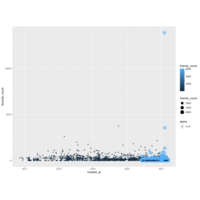
Which twitter publishing platform receives the most likes? Which receives the most retweets?
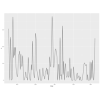
wdip time series plot
time series plot of what does it profit twitter account

dawn tweets
time series plot of dr. carpenter twitter account
Famoosh
Time Series plot of tweets (since inception).
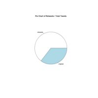
Pie chart of retweets / total tweets
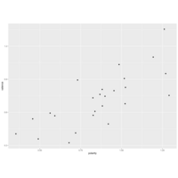
n = 31
simple random sample of 1% of sustainability
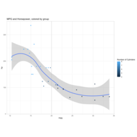
MPG in ggplot2
eh. kinda pretty.
Plotly & ggplotly HTML
ggplot(data=college) +
geom_bar(mapping=aes(x=region, fill=control)) +
theme_wsj()
install.packages("plotly")
library(plotly)
ggplotly()
ggthemes
> install.packages("ggthemes")
WARNING: Rtools is required to build R packages but is not currently installed. Please download and install the appropriate version of Rtools before proceeding:
https://cran.rstudio.com/bin/windows/Rtools/
Installing package into ‘C:/Users/Owner/Documents/R/win-library/4.0’
(as ‘lib’ is unspecified)
trying URL 'https://cran.rstudio.com/bin/windows/contrib/4.0/ggthemes_4.2.0.zip'
Content type 'application/zip' length 440134 bytes (429 KB)
downloaded 429 KB
package ‘ggthemes’ successfully unpacked and MD5 sums checked
The downloaded binary packages are in
C:\Users\Owner\AppData\Local\Temp\RtmpopyjfL\downloaded_packages
> library(ggthemes)
> ggplot(data=college) +
+ geom_bar(mapping=aes(x=region, fill=control)) +
+ theme_solarized()
> ggplot(data=college) +
+ geom_bar(mapping=aes(x=region, fill=control)) +
+ theme_excel()
> ggplot(data=college) +
+ geom_bar(mapping=aes(x=region, fill=control)) +
+ theme_excel_new()
> ggplot(data=college) +
+ geom_bar(mapping=aes(x=region, fill=control)) +
+ theme_wsj()
> ggplot(data=college) +
+ geom_bar(mapping=aes(x=region, fill=control)) +
+ theme_economist()
> ggplot(data=college) +
+ geom_bar(mapping=aes(x=region, fill=control)) +
+ theme_fivethirtyeight()
> ggplot(data=college) +
+ geom_bar(mapping=aes(x=region, fill=control)) +
+ theme_wsj()
>
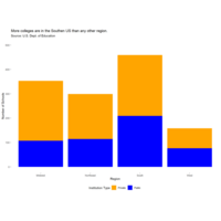
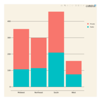
Plot - Adding Titles and subtitles
# bar chart again
ggplot(data=college) +
geom_bar(mapping=aes(x=region, fill=control)) +
theme(panel.background=element_blank()) +
theme(plot.background=element_blank()) +
scale_x_discrete(name="Region") +
scale_y_continuous(name="Number of Schools", limits=c(0,500)) +
scale_fill_manual(values=c("orange","blue"), guide=guide_legend(title="Institution Type")) +
theme(legend.position="bottom") +
ggtitle("More colleges are in the Southen US than any other region.",
subtitle = "Source: U.S. Dept. of Education")
Plot annotations!!
college <- college %>%
mutate(state=as.factor(state), region=as.factor(region),
highest_degree=as.factor(highest_degree),
control=as.factor(control), gender=as.factor(gender),
loan_default_rate=as.numeric(loan_default_rate))
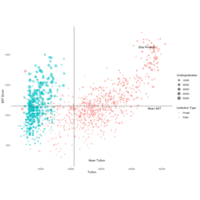
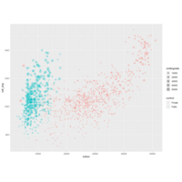
ggplot(data=college) +
geom_point(mapping=aes(x=tuition, y=sat_avg, color=control, size=undergrads),
alpha=1/2) +
annotate("text", label="Elite Privates", x=45000, y=1450) +
geom_hline(yintercept =mean(college$sat_avg)) +
annotate("text", label="Mean SAT", x=47500, y=mean(college$sat_avg)-15) +
geom_vline(xintercept=mean(college$tuition)) +
annotate("text", label="Mean Tuition", y=700, x=mean(college$tuition)+7500) +
theme(panel.background = element_blank(), legend.key = element_blank()) +
scale_color_discrete(name="Institution Type") +
scale_size_continuous(name="Undergraduates") +
scale_x_continuous(name="Tuition") +
scale_y_continuous(name="SAT Score")
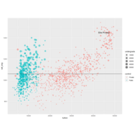
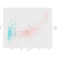
Scatterplot with Avg
college <- college %>%
mutate(state=as.factor(state), region=as.factor(region),
highest_degree=as.factor(highest_degree),
control=as.factor(control), gender=as.factor(gender),
loan_default_rate=as.numeric(loan_default_rate))
ggplot(data=college) +
geom_point(mapping=aes(x=tuition, y=sat_avg, color=control, size=undergrads),
alpha=1/2) +
annotate("text", label="Elite Privates", x=45000, y=1450) +
geom_hline(yintercept =mean(college$sat_avg))
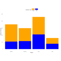
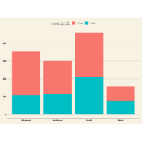
Plot
ggplot(data=college) +
geom_bar(mapping=aes(x=region, fill=control)) +
theme(panel.background=element_blank()) +
theme(plot.background=element_blank()) +
scale_x_discrete(name="Region") +
scale_y_continuous(name="Number of Schools", limits=c(0,500)) +
scale_fill_manual(values=c("orange", "blue"),
guide=guide_legend(title="Institution Type",
nrow=1, label.position = "bottom",
keywidth=2.5)) +
theme(legend.position="top")
Plot
ggplot(data=college) +
geom_bar(mapping=aes(x=region, fill=control)) +
theme(panel.background=element_blank()) +
theme(plot.background=element_blank()) +
scale_x_discrete(name="Region") +
scale_y_continuous(name="Number of Schools", limits=c(0,500)) +
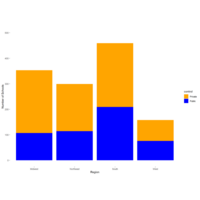
scale_fill_manual(values=c("orange", "blue"))
Plot
ggplot(data=college) +
geom_bar(mapping=aes(x=region, fill=control)) +
theme(panel.background=element_blank()) +
theme(plot.background=element_blank())
Plot
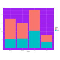
ggplot(data=college) +
geom_bar(mapping=aes(x=region, fill=control)) +
theme(panel.background=element_rect(fill='purple'))
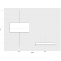
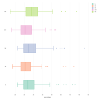
boxplot!
ggplot(data=college) +
geom_boxplot(mapping=aes(x=control, y=tuition))
Plot
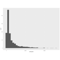
ggplot(data=college) +
geom_histogram(mapping=aes(x=undergrads))
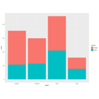
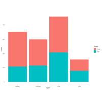
Stacked bar chart!
ggplot(data=college) +
geom_bar(mapping=aes(x=region, fill=control))
Plot
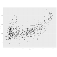
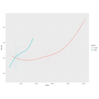
# Create the scatterplot
ggplot(data=college) +
geom_line(mapping=aes(x=tuition, y=sat_avg, color=control)) +
geom_point(mapping=aes(x=tuition, y=sat_avg, color=control))
ggplot(data=college, mapping=aes(x=tuition, y=sat_avg, color=control)) +
geom_smooth(se=FALSE) +
geom_point(alpha=1/25)
Plot
transparency! alpha=3/10