Recently Published

Demographic and Economic Changes in Lansdale, PA from 2013 to 2023
This map uses five-year estimates from the U.S. Census Bureau's American Community Survey to measure population, housing, and economic changes occurring in Lansdale, Pennsylvania between the years 2013 and 2023
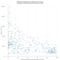
Philadelphia Neighborhoods' Median Home Value by Proportion of Black Residents
The following scatter plot details Philadelphia's 2020 census tracts by their median home value (y-axis) and each neighborhoods proportion of non-Hispanic Black residents. It demonstrates how historic and structural racism and contemporary prejudices devalue Black assets.
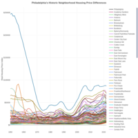
Philadelphia Neighborhoods Historic Housing Price Index 1950-2022
The line plot shows the historic neighborhood housing prices (indexed) for the City of Philadelphia and its neighborhoods from 1950 to 2022.
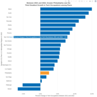
Change in Tech Occupations between 2021 and 2022
This bar chart uses Bureau of Labor Statistics estimates to compare how tech occupations have grown across U.S. metropolitan regions between 2021 and 2022.
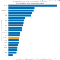
Tech Concentrations across U.S. Metropolitan Regions in 2022
This bar plot uses Bureau of Labor Statistic estimates to compare the concentration of tech occupations across U.S. metropolitan regions.
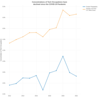
Greater Philadelphia's Tech Concentration from 2012 to 2022
This line graph shows the growth of the concentration of Greater Philadelphia's tech occupations in comparison with 20 peer U.S. metropolitan regions.
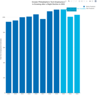
Greater Philadelphia's Tech Employment 2012 to 2022
This graph uses Bureau of Labor Statistics' estimates to monitor Greater Philadelphia's tech industry.
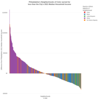
Philadelphia Wage Inequality by Census Tract 2021
Graph uses 2021 five-year American Community Survey estimates on demographic median earnings to compare across cities.
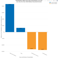
Philadelphia Median Earnings 2021
Graph uses 2021 five-year American Community Survey estimates on demographic median earnings to compare across cities.
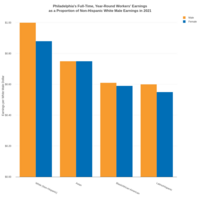
Philadelphia Wage Inequality 2021
Graph uses 2021 five-year American Community Survey estimates on demographic median earnings to compare across cities.
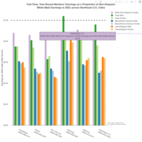
Northeast U.S. Cities Wage Inequality 2021
Graph uses 2021 five-year American Community Survey estimates on demographic median earnings to compare across cities.
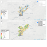
Proportional Racial and Ethnic Changes to Philadelphia Neighborhoods (2016-2021)
The map uses 2016 and 2021 five-year estimates of the U.S. Census Bureau's American Community Survey to show the change in the proportional distribution of residential populations by race and ethnicity.
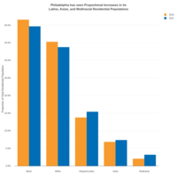
Proportional Changes to Philadelphia's Total Residential Population from 2016 to 2021 by Race and Ethnicity
The bar chart uses 2016 and 2021 five-year estimates of the U.S. Census Bureau's American Community Survey to show the change in the proportional distribution of residential populations by race and ethnicity.
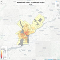
Historic Neighborhood Poverty of Philadelphia 1970-2010
This map uses aggregated estimates of the U.S. Census Bureau's decennial censuses as well as the ACS. Census tracts were aggregated to neighborhood polygons based on centroid.
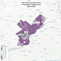
Historic White Flight in Philadelphia
This map uses aggregated estimates of the U.S. Census Bureau's decennial censuses as well as the ACS. Census tracts were aggregated to neighborhood polygons based on centroid.
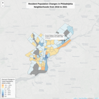
Philadelphia Total Neighborhood Populations Changes (2016 to 2021)
Residential population changes across Philadelphia's neighborhoods from 2016 to 2021.
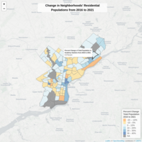
Philadelphia Neighborhood Changes 2016-2021: Total Population
Map details percent changes in total residential populations between 2016 and 2021 using the American Community Survey and the Economy League's Historic Neighborhood Shapefile
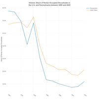
Historic Renter Rate in U.S. and PA from 1900 to 2020
Line plot of historic renter rate in U.S. and PA from 1900 to 2020.
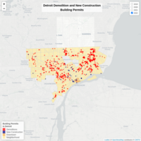
Demolition and New Construction Building Permits in Detroit (2019-2022)
This map shows the distribution of demolition and new construction building permits within the City of Detroit from January 1, 2019 to July 19, 2022.
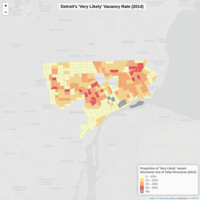
Detroit "Very Likely" Vacant Metric (2014)
This map utilized Data Driven Detroit's 2014 Vacancy Index to map the "very likely" proportion of vacant properties within Detroit's census tracts.
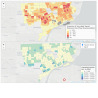
Detroit Vacancy Index (2014) with Population Density and Racial or Ethnic Majority (2020)
These maps detail Data Driven Detroit's 2014 vacancy index as well as 2020 American Community Survey estimates of population density, race, and ethnicity of the residential population.
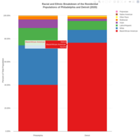
Philadelphia and Detroit Racial/Ethnic Breakdowns
The graph shows the racial and ethnic proportion of the residential populations of Philadelphia and Detroit in 2020
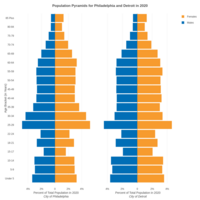
Detroit and Philadelphia Population Pyramids (2020)
The graph details population pyramids for Philadelphia and Detroit in 2020
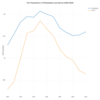
Populations of Philadelphia and Detroit (1900-2020)
This graph shows the residential population estimates of Philadelphia and Detroit for every decade between 1900 and 2020.
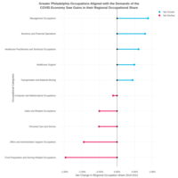
Greater Philadelphia Net Occupational Share Growth (May 2019 to May 2021)
This graph details the top and bottom five major occupational categories that saw their net regional occupational share (proportion of occupational category over total regional employment) increase or decrease the most.
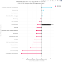
Philadelphia Industry Employment Gains and Losses (Feb 2020 to April 2022)
Graph details the net employment gains and losses of Philadelphia industries from February 2020 to April 2022
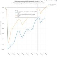
Employment in Philadelphia and the U.S. (Feb 2020 to Apr 2022)
This graph details indexed employment growth for the City of Philadelphia and the US from February 2020 to April 2022 (indexed to February 2020 levels).
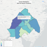
Greater Philadelphia's Tech Employee Residency 2020
This map uses the 2020 five-year estimates of the American Community Survey to map the concentration of “Computer and Mathematical" employees residency in Greater Philadelphia in 2020.
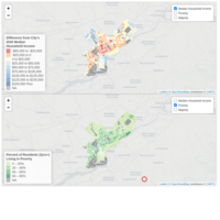
Income Inequality Across Philadelphia Neighborhoods 2020
This map details the difference between each census tract's median household income and the City of Philadelphia's overall median household income.
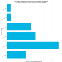
Philadelphia Household Income Brackets among Latinx Householders (2020)
Income brackets estimates of Philadelphia households among Latinx/Hispanic householders, using the five-year 2020 ACS.
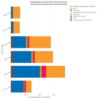
Philadelphia Household Income Brackets by Race of Householder (2020)
Income brackets estimates of Philadelphia households by race of householder, using the five-year 2020 ACS. NOTE: All racial categories include individuals who identify as Latinx/Hispanic.
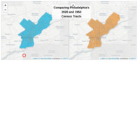
Comparing Philadelphia's 2020 and 1950 Census Tracts
This map compares Philadelphia's 1950 and 2020 census tracts.
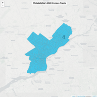
Philadelphia's 2020 Census Tracts
This map shows Philadelphia's 2020 census tracts.

Philadelphia Census Map 1950-2020
This map shows the Philadelphia neighborhoods created by Michael Shields using both the historic U.S. Census Bureau census tract shapefiles from 1950 to 2020 as well as Azavea's neighborhood shapefile made publicly available by OpenDataPhilly as guides.

Test
This is a test graph.
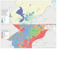
Philadelphia's New Construction Building Permits (2018-2021)
This map details the City of Philadelphia's the percent of new construction building permit parcels from each census tract's total parcel count as well as socioeconomic and demographic indicators.
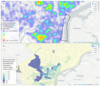
Philadelphia New Construction (Raw Density and Normalized) from 2018 to 2021
The synced maps show Philadelphia's reported New Construction building permits from 2018 to 2021. The first map is a heat map of dummy-coded permits per parcel per year while the second map normalizes by the total number of parcels within a census tract.
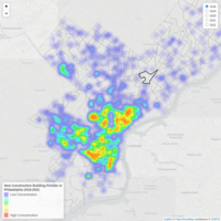
Philadelphia New Construction (Jan 2018 to Feb 15, 2022)
The heat map details new construction permits per parcel per year for the City of Philadelphia from January 1, 2018 to Feb 15, 2022.
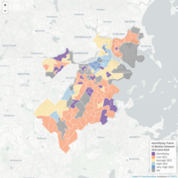
Gentrifying Tracts of Boston between 2014 and 2018
Map details the gentrifying census tracts of Boston, MA between 2014 and 2018 as well as the socioeconomic status (SES) of other non-gentrifying census tracts. Gentrification was operationalized as an above average rise in each tract's SES score during the five-year period.
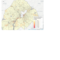
Metropolitan Philadelphia Poverty 2019
Map uses poverty estimates from five-year estimates of the 2019 American Community Survey to show concentrations of poverty in Greater Philadelphia.
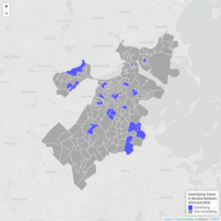
Gentrifying Tracts of Boston between 2014 and 2018
Map details the gentrifying census tracts of Boston, MA between 2014 and 2018. Gentrification was operationalized as an above average rise in each tract's SES score during the five-year period.

Inflation Inequality Tree Graph
This graph separate components of Greater Philadelphia's CPI into necessity and luxury goods.
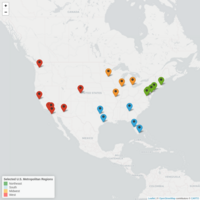
Inflation Metros
This map shows selected U.S. metropolitan regions used in an analysis of inflation.
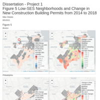
Dissertation Project 1: Figure 5 of both the SES Change and New Construction Building Permits Change of Low-SES Tracts
Figure detailing low-SES census tracts of 2014 and their change in both SES and concentration of new construction building permits from 2014 to 2018.

Dissertation Project 1: Figure 4 of both the SES Change and Asian Residential Concentration Change of Low-SES Tracts
Figure detailing low-SES census tracts of 2014 and their change in both SES and concentration of Asian residents from 2014 to 2018.
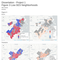
Dissertation Project 1: Figure 3 of Low-SES Tracts and SES Change
Figure detailing low-SES census tracts of 2014 and their change in SES from 2014 to 2018.
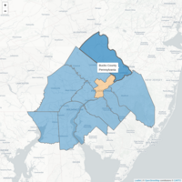
Greater Philadelphia Counties
Counties of Greater Philadelphia
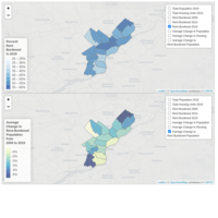
Philadelphia Rent Burden Change 2009-2019
Map depicts the rent burden change for Philadelphia neighborhoods from 2009 to 2019.
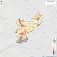
Philadelphia 2019 Tracts and Districts - Affordable Housing
The map depicts census tracts and planning districts of Philadelphia (used here as proxy neighborhood districts) and differentiates their population and housing affordability metrics.
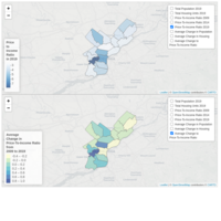
Philadelphia Price-to-Income Change 2009-2019
Map depicts the price-to-income ratio change for Philadelphia neighborhoods from 2009 to 2019.
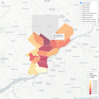
Map of Philadelphia Districts with Housing Data from 2019
The map depicts the planning districts of Philadelphia (used here as proxy neighborhood districts) and differentiates their population and housing affordability.
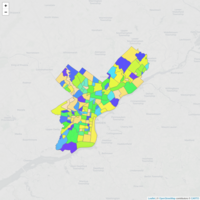
Map of Philadelphia Neighborhoods
Created by Azavea in 2016.
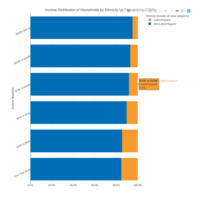
Income Distribution by Ethnicity in Philadelphia in 2019
This graph uses five-year estimates of the 2015-2019 American Community Survey to show the distribution of household income across ethnic groups in Philadelphia in 2019.
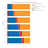
Income Distribution of Philadelphia Households in 2019 by Race
The bar graph uses five-year estimates from the 2015-2019 American Community Survey to show the distribution of household wealth across racial groups. NOTE: All racial groups include both persons of Latinx/Hispanic decent and persons of non-Latinx/Hispanic decent.
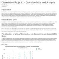
Dissertation Project 1: Methods and Analysis
This document details the progress of project 1.
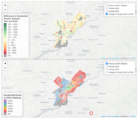
Change in Poverty in Philadelphia between 2014 and 2019
Map details the change in poverty among Philadelphia census tracts using the nonoverlapping 2014 and 2019 five-year estimates of the American Community Survey.
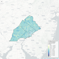
Mastercard Inclusive Growth Score - Average Annual Growth in Small Business Loans
This map shows the average annual percent change in small business loan growth for the Southeastern PA area from 2017 to 2019. Data were from the Master Center for Inclusive Growth (https://www.mastercardcenter.org/).
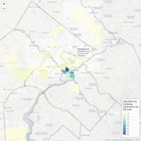
Well City Challenge Applicants 2020
This map details the number of 2020 Well City Challenge Applicants received within the Greater Philadelphia area.
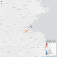
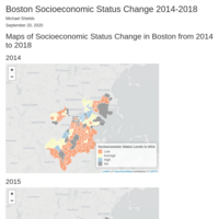
Boston SES Change 2014-2018
This map details the changes in socioeconomic status scores for census tracts across Boston from 2014 to 2018. The socioeconomic score is a composite score of extracted loadings from a factor analysis of median household income, occupational prestige, median property value, and educational attainment.
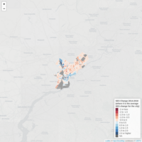
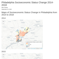
Philadelphia SES Change 2014-2018
This map details the changes in socioeconomic status scores for census tracts across Philadelphia from 2014 to 2018. The socioeconomic score is a composite score of extracted loadings from a factor analysis of median household income, occupational prestige, median property value, and educational attainment.
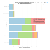
Income Distribution of Philadelphia Millennial Households in 2018 by Race
This graph uses five-year estimates of the 2018 American Community Survey to determine the distribution of races across income levels for Millennial households in Philadelphia.
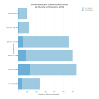
Income Distribution of Philadelphia Millennial Households in 2018 by Ethnicity
This graph uses five-year estimates of the 2018 American Community Survey to determine the distribution of ethnicities across income levels for Millennial households in Philadelphia.
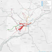
SEPTA's 2020 Service Reductions
This map details the proposed service reductions to SEPTA's transit if critical funding is not achieved by 2030
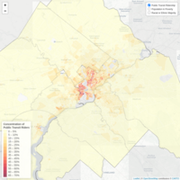
Greater Philadelphia's Public Transit Use
The map uses 5-year estimates from the American Community Survey top detail public transportation usage in the Greater Philadelphia metropolitan region at the census tract level.
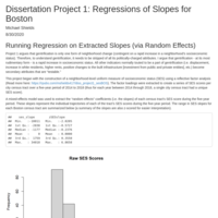
Dissertation Project 1: Regressions of Slopes (Boston)
Visualization of the extracted random effects of the independent SES variable and dependent variables of neighborhood change.
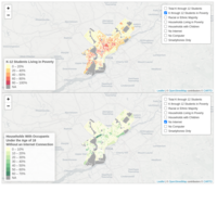
Philadelphia's Digital Divide 2018
Uses five-year estimates of the 2014-2018 ACS to show a spatial relationship of the digital divide in Philadelphia.
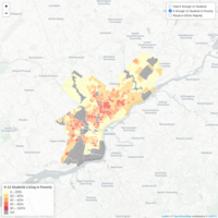
Philly's K through 12 Students in Poverty
The map uses five-year estimates from the 2014-2018 ACS to show the relationship between student poverty, race, and ethnicity.
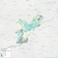
Philadelphia's School-Aged Population in 2018
The map uses the five-year 2018 American Community Survey estimates to show where Philadelphia's 5-to-19-year-olds are highly concentrated. Tracts with group quartering exceeding a third of the total population were excluded.

Income Distribution by Ethnicity in Philadelphia in 2018
This graph uses five-year estimates of the 2014-2018 American Community Survey to show the distribution of household income across ethnic groups in Philadelphia in 2018.
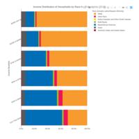
Income Distribution of Philadelphia Households in 2018 by Race
The bar graph uses five-year estimates from the 2014-2018 American Community Survey to show the distribution of household wealth across racial groups. NOTE: All racial groups include both persons of Latinx/Hispanic decent and persons of non-Latinx/Hispanic decent.
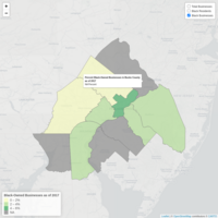
Greater Philadelphia Black-Owned Businesses
Map details Philadelphia's Black-owned enterprises by county in 2017.
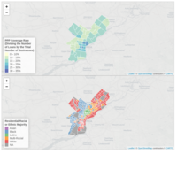
PPP Loan Coverage in Philadelphia
The PPP coverage rate in Philadelphia with the racial or ethnic majority of the census tract.

The Inequality of COVID-19
These maps compare racial, ethnic, insurance, COVID vulnerability, COVID cases, and COVID deaths in Philadelphia.

Health Disparities in Philadelphia
These maps detail various correlating measures of economic and health indicators that show health disparities in Philadelphia.
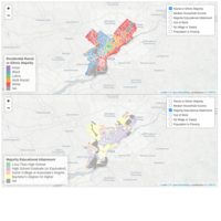
Educational and Employment Metrics in Philadelphia in 2018
This map shows various educational and employment metrics from five-year estimates of the U.S. Census Bureau's 2018 American Community Survey.
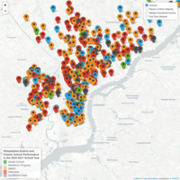
Philadelphia School Performance and Neighborhood Metrics
The map details the performance of Philadelphia's district and charter schools in the 2016-2017 school year with neighborhood metrics of race and ethnicity, income, and employment.
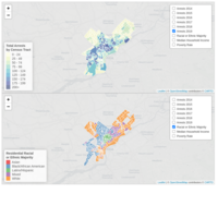
Total Arrests and Racial/Ethnic Majority Neighborhoods in Philadelphia
This map uses data from the Philadelphia District Attorney's Office and the American Community Survey to show the relationship between crime, race, and place.
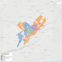
Racial/Ethnic Majority and Poverty Rate of Philadelphia Tracts (2018 Five-Year Estimates)
Using 2014-2018 American Community Survey estimates for Philadelphia, the map shows the racial and ethnic majority (residents who identify account for 50 percent of greater of the population) and the tracts poverty rate.
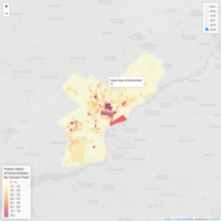
Future Years of Incarceration in Philadelphia from 2014 to 2019 by Census Tract
Data from the Philadelphia District Attorney's Office showing future years of incarceration in Philadelphia from 2014 to 2019 by census tract.
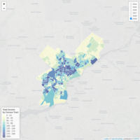
Total Arrests in Philadelphia from 2014 to 2019 by Census Tract
Data from the Philadelphia District Attorney's Office showing all arrests by census tract from 2014 to 2019.
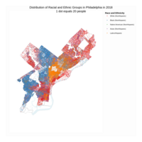
Racial Dot Density Map for Philadelphia in 2018
This is a racial dot density map for Philadelphia in 2018. One dot equals 20 people.
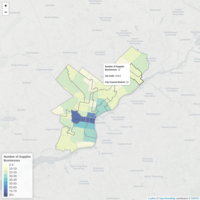
Supplier Business Landscape of Philadelphia (PAGE data)
Data for this map details the number of supplier businesses that are currently working (or have worked) with at least one PAGE-affiliated anchor institution.
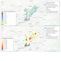
Health Disparities Experienced by Philadelphia's Latinx Community (A Comparison)
This map details various correlating measures of health and economics indicators that demonstrate the disproportionate health effects felt by Philadelphia's Latinx/Hispanic population.
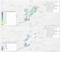
Health Disparities Experienced by Philadelphia's Black Community (A Comparison)
This map details various correlating measures of health and economics that demonstrate the disproportionate health effects felt by Philadelphia's African American population.
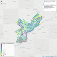
Health Disparities Experienced by Philadelphia's Black Community
This map details various correlating measures of health and economics that demonstrate the disproportionate health effects felt by Philadelphia's African American population.
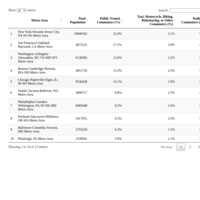
Public Transit Commuters by Metro Area (2018)
This table uses five-year estimates from the 2018 American Community Survey to rank the percent of the working population (16+) that primarily commutes via public transit.
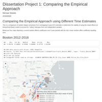
Comparing the Empirical Approach
Comparing random slopes extractions from overlapping 5-year ACS estimates to determine the viability of using the mixed effects (or hierarchical linear) model to account for “rolling” estimates from non-independent samples.
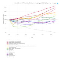
Indexed Growth of Philadelphia Employment by Industry (2008-2019)
This table illustrates Philadelphia's job growth by major industry from 2008 to 2019 (indexed to 2008).
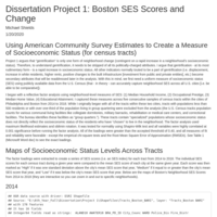
Dissertation Project 1: SES Scores and Tract-Level Change Boston
Visualization of socioeconomic status metric using factor analysis and measure of five-year change using a mixed effects model.
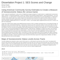
Dissertation Project 1: Philly SES Scores and Tract-Level Change
Visualization of socioeconomic status metric using factor analysis and measure of five-year change using a mixed effects model.
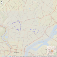
Basemap of Nicetown-Tioga and Harrowgate Neighborhoods in Philadelphia
Visualization of the neighborhoods of Nicetown-Tioga and Harrowgate within Philadelphia. This map is for reference.
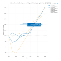
Indexed Change to Employment and Wages for Philly and US (2008-2018)
This interactive line graph shows indexed change of annual employment and wages in the City of Philadelphia and the U.S. from 2008 to 2018 (in 2018 real dollars) using 2008 as the reference year. The data were obtained from the Bureau of Labor Statistics' Quarterly Census of Employment and Wages (using only "private" ownership estimates).
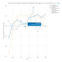
Year-Over-Year Change in Employment and Wages for Philly and US (2009-2018)
This interactive line graph shows year-over-year change to annual employment and wage estimates for the City of Philadelphia and the U.S. from 2009 to 2018 in constant dollars. The data were obtained from the Bureau of Labor Statistics' Quarterly Census of Employment and Wages (using only "private" ownership estimates).
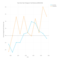
Total Year-Over-Year Change in Revenue Funds (2009-2019)
This interactive line graph shows year-over-year changes to total tax revenue funds of Philadelphia and a list of National League of Cities municipalities from 2009 to 2019 in constant dollars. The data were obtained from monthly revenue collection records from the City of Philadelphia's Department of Revenue and the NLC's Fiscal Conditions 2019 report.
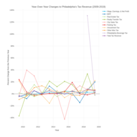
Year-Over-Year Change in Philadelphia Tax Revenue (2009-2019)
This interactive line graph shows year-over-year change of Philadelphia tax revenue funds from 2009 to 2019 in constant dollars. The data were obtained from monthly revenue collection records from the City of Philadelphia's Department of Revenue and detail fiscal-year-to-date revenue funds for June of the given calendar year.
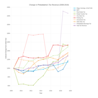
Indexed Change of Philly Tax Revenue (2008-2019)
This interactive line graph shows the indexed growth of the City of Philadelphia's tax revenue funds from 2009 to 2019. The data were obtained from monthly revenue collection records from the City of Philadelphia's Department of Revenue and use 2008 as the comparative year (except for the "Philadelphia Beverage Tax" which uses its initial collection year of 2017).
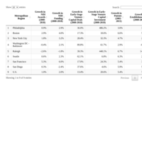
Growth in Biotechnology among U.S. Metros
The following interactive table details various growth metrics of success in the biotech field. Data were obtained from the National Institutes of Health, PwC Moneytree Report, U.S. Patent and Trademark Office, and the Bureau of Labor Statistics' Quarterly Census of Employment and Wages.
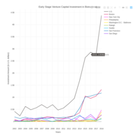
Early Stage Venture Capital Investment in Biotechnology
This interactive graph details the amount of Seed/Angel, Series A, and Series B venture capital funding local biotechnology firms received between 2002 and 2018. Data were obtained from PwC Moneytree Report.
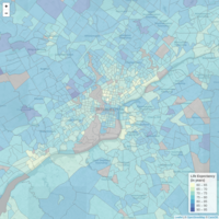
Life Expectancy and Median Household Income by Neighborhood in Greater Philadelphia
The following choropleth details the life expectancy and median household income of census tracts within Greater Philadelphia. Life expectancy data comes from the National Center of Health Statistics' U.S. Small-Area Life Expectancy Estimates Project's 2010-2015 estimates.
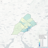
Southeastern Pennsylvania Population's High Frequency of Emergency Room Visits
This table uses data from Public Health Management Corporation's Household Health Survey's question asking how many times a respondent visited an emergency room for care in the past 12 month. Data are comprised of a composite measure from 2015 and 2018 survey waves.
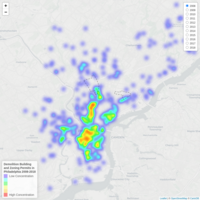
Demolition Permits - City of Philadelphia 2008-2018 - Tioga and Harrowgate
This density heatmap displays all major demolition building and zoning permits in the City of Philadelphia from 2008 to 2018. The permits are dummy-coded per individual parcel per year and are used as a proxy for development activity.
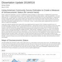
Dissertation Update - May 16, 2019: Philadelphia SES Maps and SES-Rise Measure
Visualization of socioeconomic status metric using factor analysis and measure of five-year change using a mixed effects model.
Dissertation Update - May 16, 2019: Boston SES Maps
Visualization of socioeconomic status metric using factor analysis and measure of five-year change using a mixed effects model.
