nmleon
Maria Nalivkina
Recently Published
Exploratory Factor Analsys - on the base of TIMSS2015 data
Note!
Comment received from a teacher was as follows:
EDA: the describe function is only suitable for interval variables
hetcor should be done before converting variables to numeric, so it just counts the same Pearson correlations
fa: you should either use cormatrix or argument cor="mixed". You cannot simply run fa on your dataframe
Not a very accurate interpretation of interaction in regression
And avoid using causal language such as influence, depend, etc.

Interactive plots with highcharter
Highcharter allows for nice visualizations. Example with gapminder data.
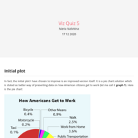
Improvement of a pie chart
The initial pie chart is a rather nice representation of the US Census Bureau survey results (2005). It provides information about how American people tended to get to work. Although it is beautiful, it is too complex in terms of colors and labels. The improvement is suggested.