Recently Published

Geographies of COVID-19 (open day exercise)
A short exercise for the University of Bristol open day in the School of Geographical Sciences
Levelling up? COVID and areas of affluence/deprivation in England
In their paper, Area level deprivation and monthly COVID-19 cases: The impact of government policy in England, Morrissey, Spooner, Salter & Shaddick (2021) show that area level deprivation is significantly associated with monthly COVID-19 cases in England – a finding that is substantiated by other research. Here that association is explored further with weekly and regional data over a longer period of 99 weeks. For much of the pandemic, if the most deprived neighbourhoods took on the attributes of the most affluent or their populations then there would have been fewer COVID cases. However, since the end of last year, and with the emergence of the Omicron variant, that situation has reversed – deprived neighbourhoods have now had fewer cases overall. Furthermore, for all of the pandemic, the differences between regions (and between sub-regions) are much greater than the differences between deprivation deciles are: regional (and sub-regional) effects exceed deprivation ones. However, this is not to say that deprivation does not matter because the geography of deprivation in England is related to the regional geography of COVID. In fact, a greater concentration of deprived neighbourhoods at a sub-regional scale is often related to higher COVID rates – much more that a greater concentration of affluent neighbourhoods is. The results are fully reproducible by using the code below.

Supplementary Material for 'Measuring the exposure of Black, Asian and other ethnic groups to Covid-infected neighbourhoods in English towns and cities'
This is a companion document to the paper, <i>Measuring the exposure of Black, Asian and other ethnic groups to Covid-infected neighbourhoods in English towns and cities, submitted for publication in the journal 'Applied Spatial Analysis and Policy'. It includes the data used in the paper and shows how to reproduce some of the analysis found in it. A preprint version of the paper can be downloaded from https://www.researchsquare.com/article/rs-299698/v1.
Tutorial for using a difference across spatial boundaries method to explore the neighbourhood-level correlates of Covid-19 deaths in London
This is a companion document to the paper "Exploring the neighbourhood-level correlates of Covid-19 deaths in London using a difference across spatial boundaries method" submitted for publication in the journal Health & Place. It includes the data used in the paper and shows how to reproduce the models found in it.
Visualizing multicollinearity using igraph
A short tutorial and interface to igraph allowing multicollinearity between variables (e.g. in a regression model) to be visualized and explored.
Exploring some of the area level correlates of Covid-19 deaths in London: Using a spatial difference-in-difference approach
This short and exploratory paper sets out a method of analysis known as spatial difference-in-difference to look at some of the area level correlates of higher Covid-19 death rates in London. It shows that, in particular, having higher percentages of those in their eighties or above raises the death rate compared to neighbouring locations but other factors include the percentage of the population that is Black Caribbean and the percentage that have never worked or are long-term unemployed. There is, however, a lot of unexplained variation (spatial heterogeneity). Local ‘hot spots’ (and ‘cold spots’) of the death rates are mapped - defined as places with a conditionally higher (or lower) death rate when compared to their neighbours.
Mapping And Modelling Geographic Data In R
Session 5: Spatial and Geographically Weighted Regression Analysis
Mapping And Modelling Geographic Data In R
Session 4: Spatial weights and neighbours
Mapping And Modelling Geographic Data In R
Session 3: Using R as a GIS
Mapping and Modelling Geographic Data in R
Session 2: Visualisation in R

Convincing Stories - practical exercise 1
In class exercise thinking about University league tables. This is a modified version with the output removed. A version that includes the output is at http://www.rpubs.com/profrichharris/uni-rankings

The Certain Uncertainy of University Rankings - a practical in R
An introduction to the problems of University Rankings and other 'league tables' with examples using R. Taught to students taking the 'Convincing Stories? Numbers as evidence in the social sciences' unit in the University of Bristol.
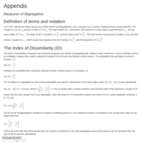
Measure of segregation
This is the technical appendix for the book 'Ethnic Segregation Between Schools: Is It Increasing or Decreasing in England?' co-authored with Ron Johnston. It sets out the formal definitions of the various segregation measures used in the book.

Mapping London
Mapping London exercise for use at outreach events

A Brief Introduction to Data Science in R (class exercise)
This is a class exercise taught as part of the Convincing Stories? Numbers as evidence in the social sciences unit as the University of Bristol
Hexograms: better maps of area based data
This tutorial explores the use of hexograms to produce better maps of area based data and population distributions. Hexograms are a cross between hexagonal binning and cartograms that aim to redress the problem of 'invisibility' prevalent in conventional maps and also the problem of distortion caused by cartograms.

What is chi-square? An example looking at Brexit
Chi-square has been described by the statistician Michael Crawley as something taught to geographers at school and misunderstood thereafter! It's a mischievous comment and a shame if true. Despite its off-putting calculations there is nothing particularly complicated about chi-square. It's just a way of asking if two 'things' are related to one another or not, and assessing the statistical evidence for it.
This tutorial:
- Shows how to fit a chi-square test to some data looking at the results of the referendum on leaving the EU
- Discusses how the chi-square test - what it is actually doing and why
- Notes that the chi-square test is often not that useful and that there are often better and simpler approaches that can be used instead
Fitting a multilevel index of segregation in R: using the MLID package
This tutorial introduces the tools and functions available in the MLID package to fit a multilevel index of dissimilarity, a measure of ethnic or social segregation that captures both of the two principal dimensions of segregation - unevenness and spatial clustering - and looks for scale effects as well as the contributions of particular places to the index value.

Using Maps and Data to look at the Geography of World Development
Produced as part of the Data Skills in Geography Project to support the use of quantitative data and methods in teaching the geography curricula in UK schools and colleges. The focus of the worksheet is on introducing data and data analysis in the context of global economic development issues.
Fitting a multilevel index of dissimilarity: a tutorial in R
This tutorial shows how to fit a multilevel Index of Dissimilarity (ID). The ID is one of the most widely used measures of segregation. It compares the geographical distribution of one group of people with the geographical distribution of another. Recently there has been interest in multilevel and multiscale methods of measuring segregation that allow the scales of segregation to be examined simultaneously, thereby considering the micro-, meso- and macro-level effects separately. The multilevel index of dissimilarity (MLID) takes forward this approach. As well as outlining how to fit the multilevel index, the tutorial explores various ways of examining spatial and scale effects and their impacts upon a traditional ID score.
Publish Presentation
Presented at the Royal Statistical Society conference, 2016, in an invited session entitled Social Statistics: Advances in segregation analysis.
