
shasui1
Shota Hasui - MPH, Johns Hopkins University
Recently Published

Analyzing Social Vulnerability and Mental Health Outcomes at the County Level
The idea for this project was to understand if there was an association, at the county level, between social vulnerability and mental health outcomes. To assess this, I used two publicly available datasets. The CDC’s Social Vulnerability Index (SVI) and the University of Wisconsin’s County Health Rankings . SVI is an index that quantifies social vulnerability which “refers to the potential negative effects on communities caused by external stresses on human health.” The County Health Rankings “measures the health of nearly all counties in the nation and ranks them within states. The Rankings are compiled using county-level measures from a variety of national and state data sources. These measures are standardized and combined using scientifically-informed weights.”
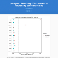
Love plot: Assessing Effectiveness of Propensity Score Matching
For this project, I created a love plot to assess the covariate balance between treatment and control groups in a sample dataset (synthetic) called “reiner”. The goal was to get the absolute mean differences below 0.2 for all variables in the table. As the plot shows, the matching was successful in achieving covariate balance on the two problem variables, age and income.
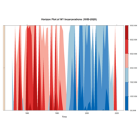
Horizon Plot: Concise Time Series Visualization with Negative Values
For this project, I created an horizon chart plot that shows how incarceration numbers in NY could vary over 70 years. The red areas represent increases and the blue areas represent decreases. The incarceration totals are randomly generated via R. A horizon chart is essentially a more efficient area line plot - useful for when you have limited room in a publication or slide.
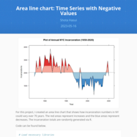
Area line chart: Time Series with Negative Values
For this project, I created an area line chart that shows how incarceration numbers in NY could vary over 70 years. The red areas represent increases and the blue areas represent decreases. The incarceration totals are randomly generated via R.
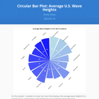
Circular Bar Plot: Average U.S. Wave Heights
For this project, I created a circular bar chart that displays the average wave heights for a sample of U.S. surf locations. The height data are randomly generated via R.
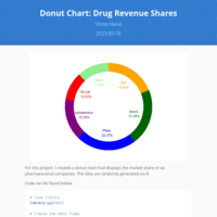
Donut Chart: Drug Revenue Shares
For this project, I created a donut chart that displays the market share of six pharmaceutical companies. The data are randomly generated via R.
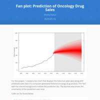
Fan Plot: Prediction of Oncology Drug Sales
For this project, I created a fan chart that displays the historical sales data along with predicted sales data of a computer-generated fictional oncology drug product. The "fan" with the colored background is where the prediction lies. The blurred area shows the uncertainty of the prediction over time.
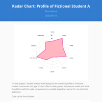
Radar Chart: Profile of Fictional Student A
For this project, I created a radar chart laying out the statistical profile of a fictional student. I encounter this type of chart often in video games and popular media and think it could be useful to make comparisons in a visually appealing manner for non-technical audiences.
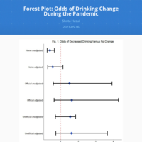
Forest Plot: Odds of Drinking Change During the Pandemic
For this project, I looked to identify the association between the typical place of alcohol consumption and change in alcohol use during the pandemic in a cohort of PLWH in Baltimore, MD.
The data are from the Alcohol Research Consortium in HIV (ARCH) cohort in Baltimore, MD.
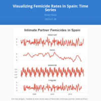
Visualizing Femicide Rates in Spain: Time Series
For this project, I looked at time series data of femicides (intimate partner violence) from 2003 to 2017. The below graph describes the rate of femicides by taking into account and stratifying for the trend, the season, and irregularities for each time period.
All credit for the instructions and data go to Crime Mapping and Spatial Data Analysis using R by Juanjo Medina and Reka Solymosi.
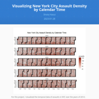
Visualizing New York City Assault Density by Calendar Time
For this project, I visualized the temporal data of assaults in NYC over the years of 2014 - 2018. The plot below is a heatmap calendar with the darker red colors representing higher density of assaults.
All credit for the instructions and data go to Crime Mapping and Spatial Data Analysis using R by Juanjo Medina and Reka Solymosi.
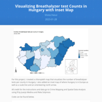
Visualizing Breathalyzer test Counts in Hungary with Inset Map
For this project, I created a chloropleth map that visualizes the number of breathalyser tests per county in Hungary. I also added an inset map of where Hungary is in Europe as well as a scale line and an orienteering north arrow.
All credit for the instructions and data go to Crime Mapping and Spatial Data Analysis using R by Juanjo Medina and Reka Solymosi.
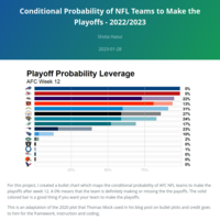
Conditional Probability of NFL Teams to Make the Playoffs - 2022/2023
For this project, I created a bullet chart which maps the conditional probability of AFC NFL teams to make the playoffs after week 12.This is an adaptation of the 2020 plot that Thomas Mock used in his blog post on bullet plots and credit goes to him for the framework, instruction and coding.
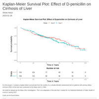
Kaplan-Meier Survival Plot: Effect of D-penicillin on Cirrhosis of Liver
For this project, I created a Kaplan-Meier survival plot from the results of a a double-blinded randomized trial on patients with primary biliary cirrhosis (PBC) of the liver was conducted at the Mayo clinic in 1984.
All credit for dataset go the Mayo clinic investigators. This is an adaptation of the plot that I created for my Statistical Methods in Public Health III course in spring 2023.
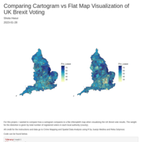
Comparing Cartogram vs Flat Map Visualization of UK Brexit Voting
For this project, I wanted to compare how a cartogram compares to a flat chloropleth map when visualizing the UK Brexit vote results. The weight for the distortion is given by total number of registered voters in each local authority (county).
All credit for the instructions and data go to Crime Mapping and Spatial Data Analysis using R by Juanjo Medina and Reka Solymosi.
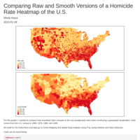
Comparing Raw and Smooth Versions of a Homicide Rate Heatmap of the U.S.
For this project, I wanted to compare how smoothed rates compare to the raw (unadjusted) rates when conducting a geospatial visualization. Data comes from the U.S. census in 1960, 1970, 1980, and 1990. All credit for the instructions and data go to Crime Mapping and Spatial Data Analysis using R by Juanjo Medina and Reka Solymosi.
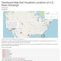
Dashboard Map that Visualizes Locations and Magnitude of U.S. Mass Shootings
For this project, I created an interactive dashboard map that plots the location and magnitude of mass shootings that occurred in the U.S. By clicking on the respective circles, a summary of the event can be viewed. Dashboard is adapted from the "building web applications with Shiny in R" course by Kaelen Medeiros, data is from Mother Jones, and all credit goes to the author for the original instruction. Interactive version of the dashboard can be accessed at https://shotahasuiw.shinyapps.io/mass_shootings_leaflet/
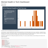
Mental Health in Tech Survey 2014 Interactive Dashboard
For this project, I created a dashboard from Open Sourcing Mental Illness' 2014 Mental Health in Tech survey. In particular, I visualized the age distribution of the answers to two specific questions. Dashboard is adapted from the "building web applications with Shiny in R" course by Kaelen Medeiros and all credit goes to the author for the original instruction. Interactive version of the dashboard can be accessed at https://shotahasuiw.shinyapps.io/mh_tech_dashboard/
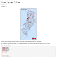
Interactive Chloropleth Map: Crime per Residential Population in Manchester
For this project, I created an interactive heat map that visualizes the crime rate per residential population in Manchester. All credit for the instructions and data go to Crime Mapping and Spatial Data Analysis using R by Juanjo Medina and Reka Solymosi
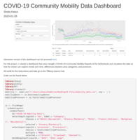
COVID-19 Community Mobility Data Dashboard
For this project, I created a dashboard that uses Google’s COVID-19 Community Mobility Reports of the Netherlands and visualizes the data so that the viewer can explore trends over time, differences between area categories, and provinces. All credit for the instructions and data go to the Tillburg Science Hub.
NOTE, The interactive version of the dashboard can be accessed at the following URL: https://shotahasuiw.shinyapps.io/covid_19/
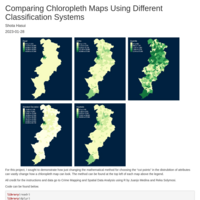
Comparing Chloropleth Maps Using Different Classification Systems
For this project, I sought to demonstrate how just changing the mathematical method for choosing the "cut points" in the distrubition of attributes can vastly change how a chloropleth map can look. The method can be found at the top left of each map above the legend. All credit for the instructions and data go to Crime Mapping and Spatial Data Analysis using R by Juanjo Medina and Reka Solymosi
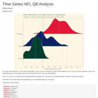
Analyzing NFL QB Performance Over Time
As a New York sports fan, I have been long jealous of the success of Kansas City QB Patrick Mahomes. So I set out to show, with data, how much better Mahomes is than either of the New York QBs (Daniel Jones and Zach Wilson). EPA is an "all in one" metric which essentially tells the analyst how many points a particular player is worth to the team, per play.
All credit for the instructions and inspiration go to the MockUp blog and Tom Mock.
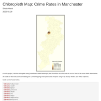
Chloropleth Map: Crime Rates in Manchester
For this project, I built a chloropleth map (sometimes called heatmaps) that visualizes the crime rate in each of the LSOA areas within Manchester. The tmap package was used for this map. All credit for the instructions and data go to Crime Mapping and Spatial Data Analysis using R by Juanjo Medina and Reka Solymosi.
Crime Counts per LSOA in Manchester
For this project, I visualized the crime counts per LSOA (Lower Super Output Area) in the city of Manchester.
All credit for the instructions and data go to Crime Mapping and Spatial Data Analysis using R by Juanjo Medina and Reka Solymosi.
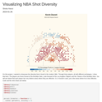
Visualizing NBA Shot Diversity
For this project, I wanted to showcase the diversity that is found in the modern NBA. Through three players, all with different archetypes, I show that here. The players are Kevin Durant of the Brooklyn Nets, Luke Kennard of the Los Angeles Clippers and Nic Claxton of the Brooklyn Nets. Credit to Owen Philips of the F5 for the instruction and inspiration.
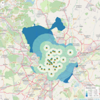
Visualizing the Relationship Between Violent Crime and Manchester Bars (Interactive)
For this project, I created an interactive leaflet map which visualizes the prevalence of violent crime around drinking establishments in Manchester. All credit for the instructions and data go to Crime Mapping and Spatial Data Analysis using R by Juanjo Medina and Reka Solymosi.
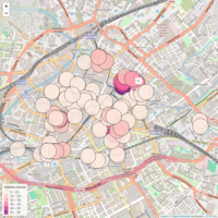
Visualizing The Distance Between Madrid Police Stations (Interactive)
For this project, I created an interactive leaflet map which visualizes the distance between police stations in Madrid. All credit for the instructions and data go to Crime Mapping and Spatial Data Analysis using R by Juanjo Medina and Reka Solymosi.
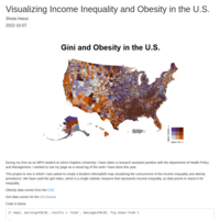
Visualizing Income Inequality and Obesity Rates in the U.S.
This bivalent chloropleth map visualizes the distribution of the Gini Index (a proxy for inequality) and obesity rates in the U.S. All obesity data comes from the CDC and Gini data comes from the US Census.
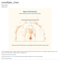
NBA Snowflake Chart - New York Knicks
This snowflake chart visualizes the density of where the New York Knicks take their shots relative to league average. All data are from the NBA 2021-2022 season. All credit goes to Owen Philips of the F5 for the tutorial, code, and inspiration for this project.