
timothyfraser
Timothy Fraser
Recently Published
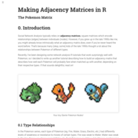
Making Adjacency Matrices in R: The Pokemon Matrix
All social network analysis tutorials need good sample data, so why go witha boring one when you could catch 'em all? Here's a short tutorial for producing a Pokemon Damage Adjacency Matrix, for making a weighted, directed unipartite network.
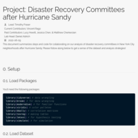
Hurricane Sandy Collaboration
Description of steps for collaborating on our study of disaster recovery committees after Hurricane Sandy.
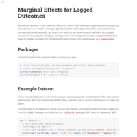
Workshop: Marginal Effects for Logged Outcomes
Quick tutorial on using the margins package with gamma models to get around the tricky back-transformation problems that occur when using logged outcome variables.
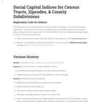
Social Capital Indices for Census Tracts, Zipcodes, & County Subdivisions
This RMarkdown document identifies each step necessary for creating a census-tract level social capital index. Download our indices at: https://doi.org/10.7910/DVN/OSVCRC

Teaching Portfolio
Details teaching statement, diversity statement, sample courses, research with undergrads, and sample syllabi
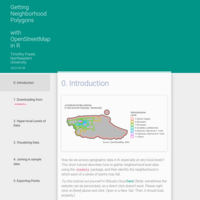
Working with OSMData
A brief tutorial, still in the works, for getting hyper local neighborhood boundaries from OpenStreetMap

Reviewing Modeling and Visualization
Welcome to Workshop 14: Final Review! In this workshop, we will review all key workshop concepts relevant to modeling, simulation, and geospatial visualization, through several review problems. Answers are posted below.
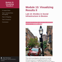
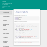
Lab: Divides in Social Infrastructure in Boston
This lab investigates divisions in social infrastructure in neighborhoods in the center of Boston. Social infrastructure refers to the physical spaces in our communities that build social ties between residents. These include community spaces, like libraries or community centers, places of worship, like mosques, synagogues, and churches, social businesses, like cafes, barbershops, and nail salons, and parks, like green belts, squares, and fountains. What if trends in social infrastructure differ more when we break them down by the type of social infrastructure? In this lab, you will use mapping in the sf package to visualize and tabulate your data, and then unleash your tidyverse and lm toolkit to analyze trends in one type of social infrastructure.
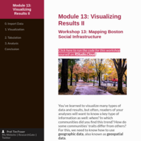
Workshop: Mapping Boston Social Infrastructure
This workshop introduces basic mapping visualization and spatial joins, by examining which some Boston neighborhoods host more social infrastructure than others. "Social infrastructure" refers to the physical spaces in our communities that build social ties between residents. These include community spaces, like libraries or community centers, places of worship, like mosques, synagogues, and churches, social businesses, like cafes, barbershops, and nail salons, and parks, like green belts, squares, and fountains.
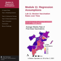
Lab: Boston Vaccination Rates over Time
This lab examines vaccination rates in Boston zipcodes, using 448 weekly records of Boston’s 29 zipcodes over 16 weeks, from July 20 to November 2, 2021. Peer effects, where you are more likely to get vaccinated if your friends and family nearby have been vaccinated, have been documented in past studies of vaccination campaigns. However, might other key variables, like time, partisanship, and identity groups, might shape the strength of these peer effects on our effort to stem the tide of the COVID-19 pandemic? In this lab, we will break our dataset into smaller groups of zipcodes-weeks to examine how these key variables shape vaccination rates. You will practice using ggcorr(), ggplot(), and Zelig to investigate your model results.
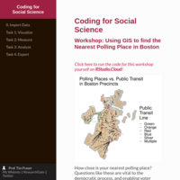
Workshop: Using GIS to find the Nearest Polling Place in Boston
How close is your nearest polling place? Questions like these are vital to the democratic process, and enabling voter turnout, but are perniciously difficult to answer! This tutorial uses the case of polling places in Boston precincts to demonstrate how to identify your distance from your nearest polling place, focusing on the sf and tidyverse packages in R.
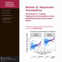
Workshop: Testing Regression Assumptions when Modeling Boston Vaccination Rates
This workshop examines a dataset of 448 weekly records of Boston’s 29 zipcodes over 16 weeks, from July 20 to November 2, 2021. This data documents what percentage of residents got vaccinated in the past week. Past studies suggest peer effects - whether friends and neighbors get vaccination - can boost vaccination rates, but what about during COVID, in Boston? We are going to investigate to to what degree we can predict changing local vaccination rates based on peer effects - whether people tend to go get their first shot if more people from their neighborhood got fully vaccinated 2 weeks prior. We will learn to use the GGally package and texreg packages to investigate colinearity, heteroskedasticity, and linear trends in our data.
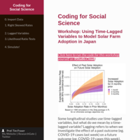
Workshop: Using Time-Lagged Variables to Model Solar Farm Adoption in Japan
Some longitudinal studies use time-lagged variables, but what do we mean by a time-lagged variable? Lagging refers to when we investigate the effect of a past outcome (eg. COVID-19 cases last week) on a future outcome (eg. COVID-19 cases this week). This workshop introduces time-lagged variables to modeling in R, applying tools from the tidyverse, lmtest, and Zelig packages to a dataset of Japanese solar farm adoption rates.
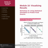
Workshop: Using Statistical Simulation to Predict Food Deserts
Social scientists, policy analysts, and coders often have vitally important findings to convey to key decision-makers. Instead of telling policymakers about our beta-coefficients, what if we could show them what our model predicts instead? This tutorial introduces statistical simulation using the example of the Food Environment Index from the University of Wisconsin's County Health Rankings, which measures access to healthy foods in each county. This workshop highlights how racial and ethnic minorities groups face systemic barriers to health, like "food deserts." Learn to use the Zelig package to simulate your model trends!
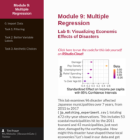
Lab: Visualizing Economic Effects of Disasters
This lab examines 96 disaster affected Japanese municipalities over 7 years, from 2011 to 2017. You will learn to make dot-and-whisker plots of regression coefficients using ggplot in R, by testing how disaster damage affected income per capita in years following Japan's 2011 earthquake and tsunami.
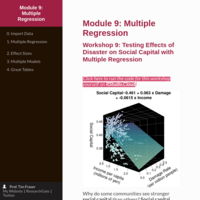
Workshop: Testing Effects of Disaster on Social Capital with Multiple Regression
Why do some communities see stronger social capital than others? Recent studies suggest that after disasters, residents' social capital actually increases, because people recognize the value of friends and family as they work to recover and rebuild. This workshop uses regression analysis to test this hypothesis on 151 Japanese municipalities over 7 years, from 2011 to 2017, totaling 1057 city-year observations. This includes 85 coastal municipalities hit by the 2011 tsunami and 66 municipalities as similar as possible, just next door, that were not hit. You'll learn to use OLS multivariate regression and the texreg package to summarize your results.

Lab: Modeling Carbon Footprints in Japan
This lab investigates trends in carbon emissions in Japanese municipalities, from 2005 to 2017. Japan held the landmark Kyoto Protocol in 1997, which started international commitments to reduce greenhouse gas emissions. How much have Japanese cities reduced their carbon footprint, and which ones have succeeded the most? In this lab, we hypothesize that each passing year has led to a statistically significant reduction in cities’ carbon footprints. Let’s test that hypothesis using regression models and lines of best fit!
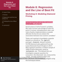
Regression and the Line of Best Fit
Today, we're going to investigate a popular dataset on commerce. The ggplot2 package's diamonds dataset contains 53,940 diamond sales gathered from the Loose Diamonds Search Engine in 2017. We're going to examine a random sample of 1000 of these diamonds, and learn how to generate scatterplots, correlation tests, and bivariate regression models with this data in R.
Choosing a Dataset for Your Project
For your first project, you will need a dataset! But how should you go about choosing your dataset and your variables? I’ve laid out some steps below that will help you get started. Here are a few great datasets on politics, the environment, economics, and health.
Lab: Effects on Political Polarization on Health
This lab investigates why some US counties experience worse health outcomes than others. You will conduct several experiments on county data using the t_test() function in the infer package in R. You have been commissioned to test two main hypotheses:
1. Is political polarization linked to worse health outcomes?
2. In communities that are polarized, is greater social capital linked to better health?

Reviewing the Tidyverse (Answer Key)
Answer Key for the following workshop:
http://rpubs.com/timothyfraser/workshop_6_review
This workshop contains 9 quick examples designed to review new coders' knowledge of the tidyverse, descriptive statistics, and inferential statistics. Students can do it themselves on RStudio.Cloud at the following link: https://rstudio.cloud/project/3023360
Reviewing the Tidyverse
This workshop contains 9 quick examples designed to review new coders' knowledge of the tidyverse, descriptive statistics, and inferential statistics. Students can do it themselves on RStudio.Cloud at the following link: https://rstudio.cloud/project/3023360
Lab: Testing the Fukushima Effect on Japanese Elections
This lab examines why some Japanese municipalities saw higher voter turnout than others in local elections in 2011, testing the effect of several aspects of the 3/11 disaster. It uses an adapted version of Yusaku Horuichi and Ryota Natori's terrific local elections dataset (https://doi.org/10.7910/DVN/TLC5R4). Students can apply their knowledge of t-tests and the difference of means in R.
Workshop 5: Learning Inferential Statistics
This tutorial introduces students to t-tests, chi-squared tests, and correlation tests in R. Through a series of short activities, students will gain foundations in these techniques, ask questions about a novel dataset about Japanese elections, and develop their own statistical tests.
Lab: Political Polarization in US Counties
This lab examines changes in political polarization over time, to verify whether or not American voters have grown more polarized over time. Users will utilize County Elections Outcomes in every presidential election since the year 2000, drawing from data from the MIT Elections Data. Designed for classroom use!
Mapping Raster Data in the Tidyverse
This tutorial introduces intermediate coders to how to work with raster data in the sf/tidyverse ecosystem. I demo several processing, including converting geospatial data recorded as rasters to a tidier sf spatial dataframe format, aggregating values on a fishnet grid, and measuring correlations between rasters at different levels.

Using Difference-in-Differences Models for Environmental Social Science
Increasingly, political scientists are using data on multiple cities, countries, or individuals, recorded over time. How do we work with this data? In addition to fixed effects or random effects, which show constant effects over time, we might also be interested in change over time. This is the main advantage of Difference-in-Differences, and can achieved using a simple OLS model with an interaction effect, with several simple steps for scaling up to more powerful models. This tutorial introduces several short lines of R code on how to run a Difference-in-Differences model and get useful visuals, which you can do in SPSS, Stata, or R.

Simulation in Zelig: How it Works
What is statistical simulation, and how does it work? This tutorial describes how to simulate your model's effects in the Zelig package in R, and then goes under the hood to make our own simulations.
Visualizing Predictions in R
Data scientists need compelling ways to visualize out regression model predictions. This tutorial introduces several common options, including functions like predict(), ggeffects(), and zelig() from popular packages.
Matching Experiments for Disaster Social Science
This tutorial introduces viewers to matching experiments, using coarsened exact matching in the CEM package in R. Using the case of COVID19 Test Positivity Rates in US cities, I demonstrate how you can quickly make better causal inference and visualize your results, all in R!
Importing and Tidying Data in R
This workshop in R introduces users to importing data into R, how to pivot data, and creative ways to visualize and compare categories using ggplot. Part of my Quantitative Techniques in R sequence.
This version is completed, intended for instructors or viewers. Please see the link below for a version students can work through on their own: http://rpubs.com/timothyfraser/quant_workshop_4
15 Ways to Visualize Regression Results
We're often taught in statistics courses to interpret models using beta coefficients, but are there more visually appealing, exciting ways to convey this information for our readers? Here are 15 different ways you could convey results, all using statistical simulation using the Zelig package in R.
Importing and Tidying Data in R (Student Version)
This workshop in R introduces users to importing data into R, how to pivot data, and creative ways to visualize and compare categories using ggplot. Part of my Quantitative Techniques in R sequence. This version is intentionally left incomplete, without visuals, for students to work through to discover the output.