
ericfrayer
Eric Frayer
Recently Published
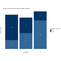
Number of Homes by Claims History and Weather Conditions
This is a plot from the MERA Insurance example using R and ggplot to create a bar chart. The data is synthetic and used as part of an exercise to illustrate using R, Python and Power BI for Data Visualization.
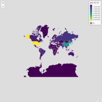
Mapping with R
This is a display of data using R and Shapefiles
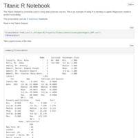
TitanicData
This is a commonly used data set highlighting how to use R Pubs for web presentation.