Recently Published


EncryptMethod
Comparison between Method of Encryption


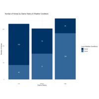
Number of Homes by Claims History and Weather Conditions
This is a plot from the MERA Insurance example using R and ggplot to create a bar chart. The data is synthetic and used as part of an exercise to illustrate using R, Python and Power BI for Data Visualization.

Prowrite: final evaluation
Analysis and results of the final evaluation of prowrite