
ww44ss
Winston Saunders
Recently Published
Seattle Rainfall 2022
Seattle has had a very dry Fall. To put it into context I got weather records for the last 100 years and analyzed them.
Upward Trend of Temperatures in Aberdeen WA
An analysis of the upward trend of nighttime temperatures in Aberdeen WA


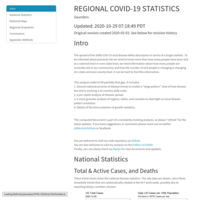
Regional_COVID_October_2020
Regional analysis of COVID stats,
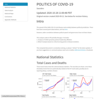
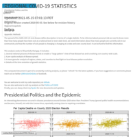
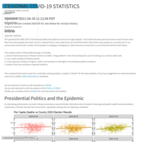
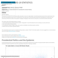
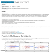
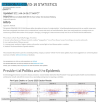
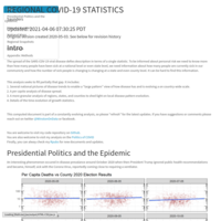
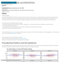
Politics of COVID 2
including presidential politics of 2016

Politics_of_Covid
Looking at the Red vs. Blue State Covid infection rate breakdown. (In an era where speaking truth is a political act).
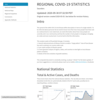
Regional_COVID_September_2020
Analysis of New York Times data

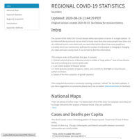
Regional COVID-19 August 2020
Based on NYTImes data. #rstats


COVID Regional Trends
Analysis based on NY Times dataset.
Regional COVID-19
Analysis of COVID-19 Pandemic for the Continental US
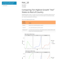
COVID_HOT_10
This is an analysis of the Hottest 10 COVID states.
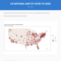
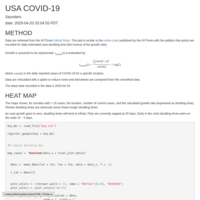
US_NATIONAL_MAP_COVID
This is a map of the COVID cases similar to the one the New York Times publishes.
Regional Covid Estimated Reproducton Rates from NYTimes data
Evolving analysis of COVID cases.

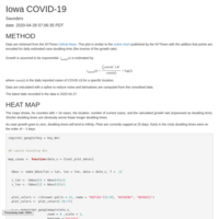
IOWA COVID-19 HEAT MAP
Data are from the NYTImes. Data analysis shows total cases and growth rate.
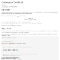
California COVID Heat Map
Heat map of COVID cases in California counties. Data from NY Times Github https://github.com/nytimes/covid-19-data
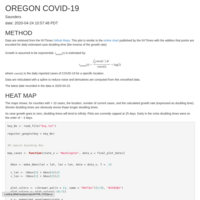
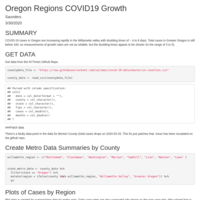
Oregon Heat Map
Heat Map of COVID-19 Growth. Points are color coded to reflect growth rate.
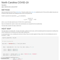
North Carolina COVID Heatmap
Heatmap of COVID-19 cases in North Carolina Counties. From data compiled by the NYTimes.
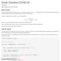
South Carolina COVID heatmap
Heatmap of South Carolina from data compiled by the NYTimes

Georgia COVID-19 Heatmap
Heatmap of Covid 19 cases in Georgia. From data compiled by the NYTimes.
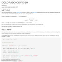
COLORADO COVID HEAT MAP
Heat Map of COVID-19 cases. From NYTimes data.

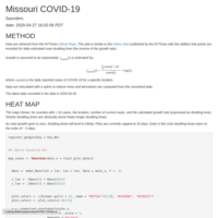
CALIFORNIA COVID HEAT MAP
Heat Map of COVID-19 cases and doubling times. Based on NYTimes Data
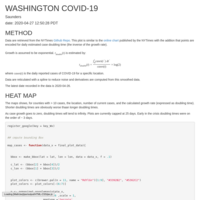
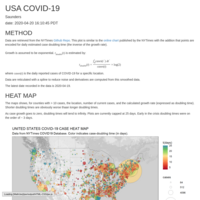
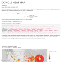
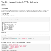
WASHINGTON COVID HEATMAP
Heatmap of Washington State Covid Cases. From NYTImes data
HEAT MAP US COVID revA
Covid data from NYTimes mapped with doubling rates encoded as color.
US COVID HEATMAP
Heat Map of COVID cases in the US. Case doubling time is estimated using a spline fit of the case data. Extrapolated values are used to estimate regional severity.
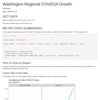
Washington Regional COVID-19 Growth
#COVID19 Regional Growth
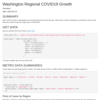
Washington Regional COVID-19 Growth 2020_04_08
COVID-19 Case analysis from the #NYTimes #COVID19 data

US COVID-19 HEAT MAP
An adaptation of the New York Times COVID-19 Map which includes an analysis of regional case growth rates.
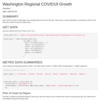
Washington Regional COVID-19 Growth
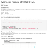
Tracking regional trends in COVID-19 growth rates. Cases are spreading much faster outside the Puget Sound region, with doubling times on the order of four days, while withing the Puget Sound region, cases are doubling approximately every 9 days. #COVID #rCOVID
California Regional COVID-19 Trends
Regional Trends for the Bay Area, Greater California, and Southern California
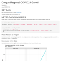
Oregon Covid Regional Trends
Trends in COVID-19 cases in the Willamette Valley versus Grater Oregon.
Washington Regional COVID-19 Growth
Analysis of COVID-19 case growth in Washington State. While cases are higher in the Puget Sound region, their growth rate is now effectively half of that in the rest of the State.
COVID-19 Cases in Oregon 2020_03_30
Compares COVID-19 cases in Greater Oregon to the Willamette Valley region.

Puget Sound & Greater Washington COVID-19 Cases
Analysis of COVID-19 cases fr the Puget Sound Region versus Greater Washington. Growth in Puget Sound has slowed while the rest of the state is accelerating.
Washington State COVID 19 Regional Analysis March 29 2020
A regional analysis of COVID-19 Cases for Washington State. Reveals substantial differences between the (largely urban) Puget Sound region and the (more rural) rest of the State. Growth in Puget Sound has achieved doubling times ~ 6 days while the rest of the State is still near ~3.
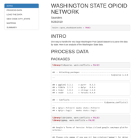
Washington State Opioid Network
Mapping analysis of the network of Opioid transations involving WA 2016 to 2912 based on the Washington Post Opioid Data
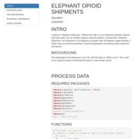
Elephant Opioid Shipments
Part of ongoing casual analysis of the Washington Post Opioid dataset.

Top Million Opioid Shipments 2006 to 2012
This is an analysis of the Washington Post Opiod Dataset looking at the top million shipments (by volume) in 2006 to 2012. An interesting relationship between shipment size and rank, akin to Zipf's Law, is observed.

Education Team
This is a draft document of learning from initial Education Survey
Sentiment Analysis of the Three 2016 Presidential Debates
I used some sentiment analysis tools just to look at trends

Oct 2016 Vice Presidential debate
This is an attempt to play around with animating sentiment analysis
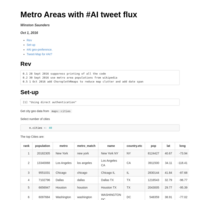
#AI tweet fluxes for Sept 2016
#AI tweet fluxes measured using twitteR package. Now normalized to metro areas.

#TrumpWon
Collection of #TrumpWon tweets from the 2016 Presidential Debate
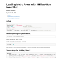
#HillaryWon
Updated method to include metro populations and areas.
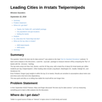
Tweet densities of #rstats in the US
I use `twitteR` and `ggmap` to display data on the usage of #rstats in tweets.

Understanding Digital Privacy based on OkCupid data
I use the recently published OkCupid data to understand from a practical standpoint what private information can be inferred from more public information.

Publish Document
Exploratory analysis of OkCupid data set from library(okcupid)

Machine Learning for High Performance Reverse-Geo-Coding
Several options for reverse geo-coding (i.e. determining a specific State and County from (latitude, longitude) coordinate pairs) are explored for both performance and accuracy. Direct reverse-geo-code API calls, which take about 200msec per point, are compared to computation via “point-in-polygon”, as well as machine-learning randomForest and nnet classification models.
A Random Forest model with accuracy approaching 98% improves throughput by a factor of 104 over a web-based API call. A neural network model has faster prediction times, but its accuracy was lower and modeling times were prohibitively long.

CanonicalExamplesWordVectors
This explores some canonical examples of word vectors based on the GloVe vectors from Pennington et al.
Heat Map of Presidential Debate Speech
Plots a heat map of frequent words. Provides ability to filter for specific topics
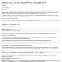
GloVe 100d Word Vectors in R
playing aournd with GloVe 100d word vectors
GloVe 200d Word Vectors in R
Playing around with GloVe Vectors in R
GloVe 300d Word Vectors in R
This is just some playing around with word vectors


Canonical Examples of Word VectoRs
Using the GloVe word vectors I explore some well known examples of word vector relations. The GloVe word vectors are from Jeffrey Pennington, Richard Socher, and Christopher D. Manning. 2014, http://nlp.stanford.edu/pubs/glove.pdf
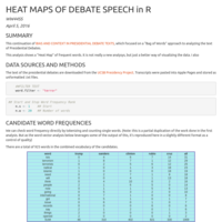
2016 Presidential Debate Speech
An analysis of word frequencies used in the Debates by Presidential Candidates for the 2016 election cycle.
Santiam Pass Crash Analysis
Analysis of Santiam Pass Oregon Crashes and their correlation to snow and other factors.
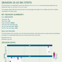
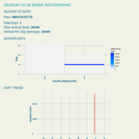
Season 15-16
Visualization of ski days at Mt Bachelor Ski Area for the season of 2015-2016
Ski Trend HB
Draft of Ski Analytics Visualization
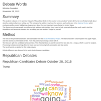
Debate Word Processing
Looks at different methods of analyzing speech from Presidential Debates 2015
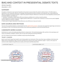
Word Analysis of Presidential Debates 2015
This is a word-frequency analysis of the 2015 Presidential debate texts. The point of the analysis is to explore whether word analytics can reveal biases in the positions of candidates.

Exascalar June 2015
A data visualization exploration and analysis of the June2015 Top and Green500 Supercomputers.


Word RippeR
Presentation on Coursera Capstone NLP word predictor
Ski Pass Exploratory
This is a "preliminary" analysis of data from 10 seasons of skiing.
Data_Text_Analysis_Rev_1_4
A short exploratory analysis of four different text corpora for the Coursera Capstone. In addition to looking at basic statistics like word number and frequency, adherence to Zipf's Law is examined.

Presentation on mtcars model
This is my presentation on the motor trend cars data. Very swank.
Predicting_Road_Safety_from_Twitter
This analysis uses data from the Oregon DOT real time Twitter feeds on road conditions to understand historical trends affecting road safety. It shows the data have reasonable predictive value.
Architectural Influencers
AN Exascalar analysis of the Top500/Green500 Supercomputers for architectural influencers. This is a first quick analysis. To be updated.
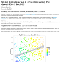
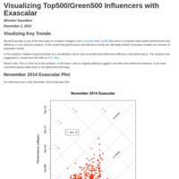
Exascalar as a lens correlating the Top500 and Green500
The Top500 and Green500 lists appear to be largely uncorrelated. However, but using Exascalar as an intermediate analysis point a linkage can be understood.
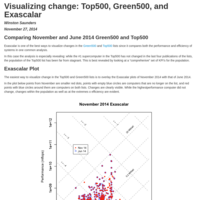
Exascalar November 2014 Delta
An analysis of the change of the Top500 and Green500 supercomputer populations between November and April 2014 using Exascalar
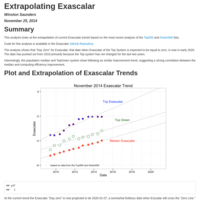
Power_Trend_of_Exascalar
Short blog on Exascalar trends and some extrapolation
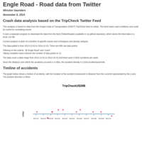

Twitter-based Santiam Pass Accident Analysis
This is an analysis of the locations, dates, and density of accidents on Santiam Pass, Oregon, based on ODOT twitter feed data which reports realtime accident data.
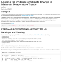
Looking for Evidence of Climate Change in Temp Records
This analysis uses threshold detection to look for increases in TMIN (daily minimum temperatures) in data from the NOAA National Climate Data Center http://www.ncdc.noaa.gov/cdo-web/datasets.
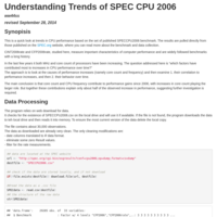
Analysis of SPECCPU2006 dependence on MHz and Cores
This is a quick analysis of the dependency of CPU performance, as measured by SPECCPU2006 on core count and MHz.

Number and Severity of Hacks and Data Breaches
Hardly as week goes by without a data breach being reported. I found some data online that I was able to clean and analyze to partially answer the question: are the number and severity of hacking attacks increasing relative to the overall population of data breaches. The answer is surprising.
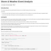
Storm_Analysis1
Analysis of storm event data for reproducible research class from JHU on Coursera.